Cell Selection
- 4 minutes to read
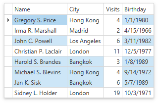
The GridControl allows you to select cells and their ranges.
Enable Multiple Cell Selection
To enable multiple cell selection:
- Check that the DataViewBase.NavigationStyle property is set to GridViewNavigationStyle.Cell (default value).
- Set the DataControlBase.SelectionMode property to MultiSelectMode.Cell.
In this mode, the GridControl considers the row with the focused cell as a focused row.
| Property | Description |
|---|---|
| DataControlBase.CurrentItem | Returns the latest selected object (focused row). |
| DataControlBase.SelectedItem | Returns the first selected object (the first item in the DataControlBase.SelectedItems collection). |
| DataControlBase.SelectedItems | Contains the row’s data items that contain the selected cells. |
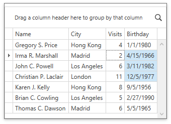
Refer to the Select Multiple Cells topic for information on how end users can select cells in the multiple cell selection mode.
Selection Availability
Handle the TableView.CanSelectCell / TreeListView.CanSelectCell or TableView.CanUnselectCell / TreeListView.CanUnselectCell event to control whether users can select or unselect cells:
<dxg:GridControl x:Name="grid"
                 SelectionMode="Cell">
    <dxg:GridControl.View>
        <dxg:TableView x:Name="view"
                       CanSelectCell="View_CanSelectCell"
                       CanUnselectCell="View_CanUnselectCell">
        </dxg:TableView>
    </dxg:GridControl.View>
</dxg:GridControl>
void View_CanSelectCell(object sender, CanSelectCellEventArgs e) {
    e.CanSelectCell = e.Column.FieldName != "Visits";
}
void View_CanUnselectCell(object sender, CanUnselectCellEventArgs e) {
    e.CanUnselectCell = e.Column.FieldName != "Birthday";
}
Select Cells
| API | Description |
|---|---|
| DataControlBase.BeginSelection | Prevents selection updates until the DataControlBase.EndSelection method is called. |
| DataControlBase.EndSelection | Enables selection updates previously suppressed by a DataControlBase.BeginSelection method call. Forces a selection update. |
| TableView.SelectCell / TreeListView.SelectCell | Selects the cell identified by its row handle and column. |
| TableView.SelectCells / TreeListView.SelectCells | Selects multiple cells. |
| TableView.UnselectCell / TreeListView.UnselectCell | Unselects the specified cell. |
| TableView.UnselectCells / TreeListView.UnselectCells | Unselects multiple cells. |
| TableView.GetSelectedCells / TreeListView.GetSelectedCells | Returns a collection of selected cells in the TableView / TreeListView. |
| GridControl.GetSelectedRowHandles | Returns the handles of the rows that contain the selected cells. |
| DataControlBase.SelectedItemChanged | This event occurs after the GridControl‘s primary selected item is changed. |
| GridControl.SelectionChanged / TreeListControlBase.SelectionChanged | This event occurs after the GridControl‘s / TreeListControl‘s selection is changed. |
The following code sample demonstrates how to iterate through cells and select cells that contain the specified value:
void Button_Click(object sender, RoutedEventArgs e) {
    SelectCellInColumn(8);
}
public void SelectCellInColumn(object value) {
    grid.BeginSelection();
    grid.UnselectAll();
    for (int index = 0; index < grid.VisibleRowCount; index++) {
        var rowHandle = grid.GetRowHandleByVisibleIndex(index);
        var cellValue = grid.GetCellValue(rowHandle, "Visits");
        if (cellValue != null && cellValue.Equals(value))
            view.SelectCell(rowHandle, grid.Columns["Visits"]);
    }
    grid.EndSelection();
}
Obtain Selected Cells
Use the TableView.GetSelectedCells / TreeListView.GetSelectedCells method to obtain selected cells. This method returns an array of GridCell objects that contain cell coordinates (row and column).
This code sample demonstrates how to obtain display text from selected cells:
public IEnumerable<string> GetCellsDisplayText() {
    var list = new List<string>();
    foreach (var cell in view.GetSelectedCells())
        list.Add(grid.GetCellDisplayText(cell.RowHandle, cell.Column));
    return list;
}
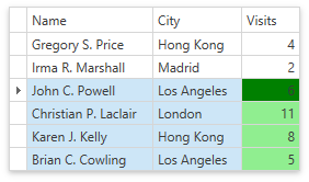
Change Selected Cell Appearance
You can change a cell’s appearance according to its selection state. To set a cell’s appearance for the entire GridControl, use the DataViewBase.CellStyle property; for individual columns, use ColumnBase.CellStyle.
Use the LightweightCellEditor.SelectionState property to determine the cell state:
| Name | Description |
|---|---|
| None | A cell is not focused and is not selected. |
| Focused | A cell is focused but is not selected. |
| Selected | A cell is selected but is not focused. |
| FocusedAndSelected | A cell is focused and selected. |
| Highlighted | A cell is highlighted. |
| CellMerge | A cell is not focused and is not selected, and the TableView.AllowCellMerge property is set to true. |
The following code sample changes the background color of cells based on their states:
<dxg:GridColumn FieldName="Visits" IsSmart="True">
    <dxg:GridColumn.CellStyle>
        <Style TargetType="dxg:LightweightCellEditor">
            <Style.Triggers>
                <Trigger Property="SelectionState" Value="Selected">
                    <Setter Property="Background" Value="LightGreen"/>
                </Trigger>
                <Trigger Property="SelectionState" Value="FocusedAndSelected">
                    <Setter Property="Background" Value="Green"/>
                </Trigger>
            </Style.Triggers>
        </Style>
    </dxg:GridColumn.CellStyle>
</dxg:GridColumn>