Themes
- 6 minutes to read
The DevExpress WPF Subscription ships with over 30 custom designed application themes. You can use each of these themes without modification or manipulate them in our free WPF Theme Designer application.
Refer to the Theme List topic to get the available theme list. You can apply each theme to the DevExpress WPF Controls and the supported Standard WPF Controls.
Tip
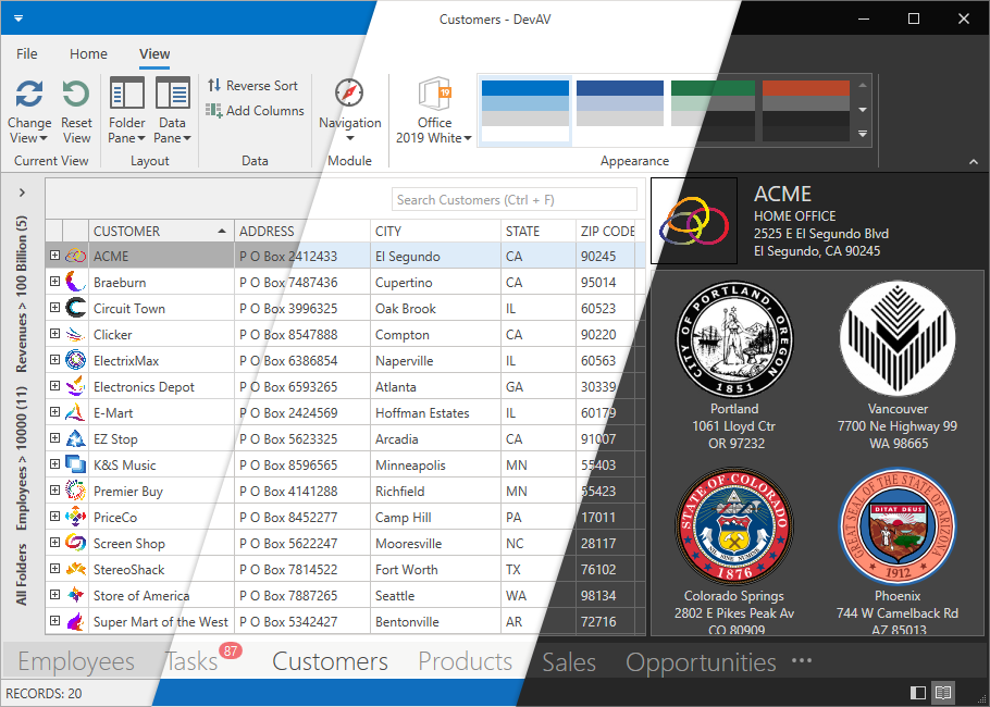
Demo: Outlook Inspired Demo
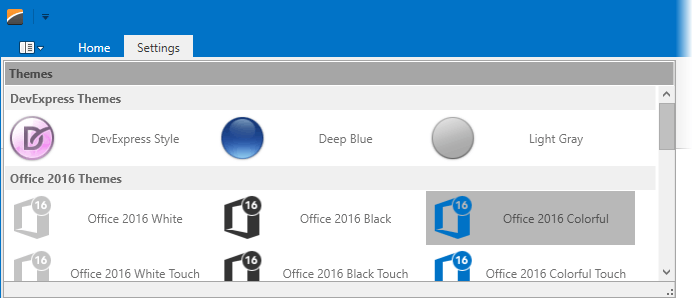
Use the integrated Theme Selector to preview themes inspired by Microsoft Office, Visual Studio, and Windows.
Requires installation of WPF Subscription. Download
When you reference a DevExpress WPF library in an application, the application applies the Office2019Colorful theme. This theme affects all the DevExpress WPF Controls and the supported Standard WPF Controls. You can reset the DevExpress Theme applied to Standard WPF Controls.
Apply a Theme
Apply a Theme to an Application
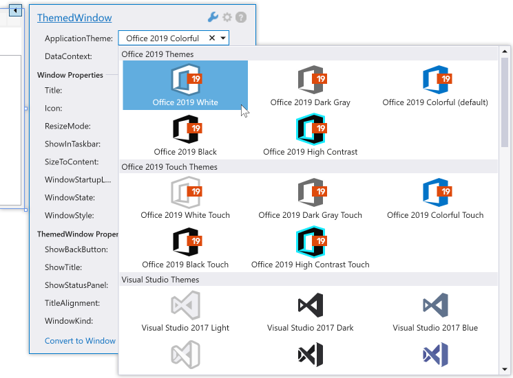
Design Time
Open the Window’s or the User Control’s Smart Tag, expand the ApplicationTheme drop-down list, and select a theme:
In result the App.config file looks as follows.
...
<configSections>
    <sectionGroup name="userSettings"
                  type="System.Configuration.UserSettingsGroup, System, Version=4.0.0.0, Culture=neutral, PublicKeyToken=b77a5c561934e089">
        <section name="DXThemeManager"
                    type="System.Configuration.ClientSettingsSection, System, Version=4.0.0.0, Culture=neutral,PublicKeyToken=b77a5c561934e089"
                    allowExeDefinition="MachineToLocalUser" requirePermission="false" />
    </sectionGroup>
    </configSections>
   ...
<userSettings>
    <DXThemeManager>
        <setting name="ApplicationThemeName" serializeAs="String">
            <value>Office2019White</value>
        </setting>
    </DXThemeManager>
</userSettings>
...
In Code
Set the ApplicationThemeHelper.ApplicationThemeName property to a theme name at application startup:
public partial class App : Application {
    protected override void OnStartup(StartupEventArgs e) {
        ApplicationThemeHelper.ApplicationThemeName = Theme.MetropolisLightName;
        base.OnStartup(e);
    }
}
Tip
You can add Theme Galleries to your application.
Apply a Theme to a Subtree
Specify the attached ThemeManager.ThemeName property. You can apply the property to the DevExpress WPF Controls, Supported WPF Standard Controls, or UIElements. The following code sample applies the Office2016SEWhite theme to the ThemedWindow and the Office2019Black theme to the GridControl:
<ThemedWindow ...
    xmlns:dx="http://schemas.devexpress.com/winfx/2008/xaml/core"
    xmlns:dxg="http://schemas.devexpress.com/winfx/2008/xaml/grid"
    dx:ThemeManager.ThemeName="Office2016SEWhite">
    <dxg:GridControl dx:ThemeManager.ThemeName="Office2019Black">
        ...
    </dxg:GridControl>
</ThemedWindow>
Apply a Touch Theme
The DevExpress WPF Touch Themes affect only element appearance (size, paddings, margins, etc.). Refer to Touch Support for more information.
Append ;Touch to a theme name to apply the touch-friendly theme version.
Note
The TouchlineDark theme is touch-friendly by default. You do not need to append ;Touch to its theme name.
<ThemedWindow ...
    xmlns:dx="http://schemas.devexpress.com/winfx/2008/xaml/core"
    dx:ThemeManager.ThemeName="Office2013;Touch">
    ...
</ThemedWindow>
| Name | ThemeManager.ThemeName |
|---|---|
| Office 2019 Black | Office2019Black;Touch |
| Office 2019 Colorful | Office2019Colorful;Touch |
| Office 2019 DarkGray | Office2019DarkGray;Touch |
| Office 2019 HighContrast | Office2019HighContrast;Touch |
| Office 2019 White | Office2019White;Touch |
| Office 2016 Black SE | Office2016BlackSE;Touch |
| Office 2016 Colorful SE | Office2016ColorfulSE;Touch |
| Office 2016 DarkGray SE | Office2016DarkGraySE;Touch |
| Office 2016 White SE | Office2016WhiteSE;Touch |
| Office 2016 Black | Office2016Black;Touch |
| Office 2016 Colorful | Office2016Colorful;Touch |
| Office 2016 White | Office2016White;Touch |
| Office 2013 | Office2013;Touch |
| Office 2013 DarkGray | Office2013DarkGray;Touch |
| Office 2013 LightGray | Office2013LightGray;Touch |
| TouchlineDark | TouchlineDark |
Apply a Legacy Default Theme
Applications that reference DevExpress WPF Controls use Office2019Colorful as a default theme. You can use the CompatibilitySettings.LegacyDefaultTheme property to specify a legacy default theme:
using DevExpress.Xpf.Core;
...
    public partial class App : Application {
        protected override void OnStartup(StartupEventArgs e) {
            CompatibilitySettings.LegacyDefaultTheme = LegacyDefaultTheme.Office2016White;
            base.OnStartup(e);
        }
    }
Reset the Applied Theme
When you reset a theme, DevExpress WPF Themes no longer affect Standard WPF Controls. DevExpress WPF Controls get their appearance from the DeepBlue theme built into the controls’ assemblies.
Reset the Applied Theme to an Application
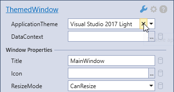
Design Time
Click the  button in the Window’s Smart Tag:
In result the App.config file is as follows:
...
<userSettings>
    <DXThemeManager>
        <setting name="ApplicationThemeName" serializeAs="String">
            <value>None</value>
        </setting>
    </DXThemeManager>
</userSettings>
...
In Code
Set the ApplicationThemeHelper.ApplicationThemeName property to Theme.NoneName at application startup:
using DevExpress.Xpf.Core;
...
    public partial class App : Application {
        protected override void OnStartup(StartupEventArgs e) {
            ApplicationThemeHelper.ApplicationThemeName = Theme.NoneName;
            base.OnStartup(e);
        }
    }
Reset a DevExpress Theme Applied to a Subtree
Set the attached ThemeManager.ThemeName property to None:
<ThemedWindow ...
    xmlns:dx="http://schemas.devexpress.com/winfx/2008/xaml/core"
    xmlns:dxg="http://schemas.devexpress.com/winfx/2008/xaml/grid">
    <dxg:GridControl dx:ThemeManager.ThemeName="None">
        ...
    </dxg:GridControl>
</ThemedWindow>
Reset a DevExpress Theme Only For the Standard WPF Controls
To reset a DevExpress Theme only for container with Standard WPF Controls:
- Reset the application theme
- Apply a theme only to containers that contain the DevExpress WPF Controls.
...
<userSettings>
    <DXThemeManager>
        <setting name="ApplicationThemeName" serializeAs="String">
            <value>None</value>
        </setting>
    </DXThemeManager>
</userSettings>
...
<ThemedWindow ...
    xmlns:dx="http://schemas.devexpress.com/winfx/2008/xaml/core"
    xmlns:dxg="http://schemas.devexpress.com/winfx/2008/xaml/grid">
    <dxg:GridControl dx:ThemeManager.ThemeName="Office2019White">
        ...
    </dxg:GridControl>
    <ComboBox>
        ...
    </ComboBox>
</ThemedWindow>
Save a Theme Applied at Runtime
The application applies a theme specified in the application’s configuration file at its startup. Call the ApplicationThemeHelper.SaveApplicationThemeName method to save the current theme to the application’s configuration file:
ApplicationThemeHelper.ApplicationThemeName = Theme.MetropolisLightName;
ApplicationThemeHelper.SaveApplicationThemeName();
List of Supported Standard Controls
The following Standard WPF Controls support the DevExpress WPF Themes.
- System.Windows.Button
- System.Windows.CheckBox
- System.Windows.ComboBox
- System.Windows.ComboBoxItem
- System.Windows.ContextMenu *
- System.Windows.Expander
- System.Windows.GridSplitter
- System.Windows.GroupBox
- System.Windows.Label
- System.Windows.ListBox
- System.Windows.ListBoxItem
- System.Windows.Menu*
- System.Windows.Page
- System.Windows.PasswordBox*
- System.Windows.ProgressBar
- System.Windows.RadioButton
- System.Windows.Controls.Primitives.ScrollBar
- System.Windows.ScrollViewer
- System.Windows.Separator
- System.Windows.Slider
- System.Windows.TabControl
- System.Windows.TabItem
- System.Windows.TextBox
- System.Windows.ToolTip
- System.Windows.TreeView
- System.Windows.TreeViewItem
* These controls are supported only in the Office2016SE, VS2017, Office2019, and VS2019 themes.
Lightweight Templates
Lightweight Templates contain fewer amount of visual elements and decrease the loading time of the DevExpress WPF Controls. The following themes support the Lightweight Templates:
| Theme Family | Themes |
|---|---|
| Office 2019 | Black, Colorful, Dark Gray, White, HighContrast |
| Visual Studio 2019 | Blue, Dark, Light |
| Office 2016 SE | Black, Colorful, Dark Gray, White |
| Visual Studio 2017 | Blue, Dark, Light |
The following table lists the DevExpress WPF Controls which support the Lightweight Templates and the control’s property you should use to enable\disable the Lightweight Template:
Standard WPF Control’s Properties
You can specify the Background, BorderBrush, and BorderThickness property values to change the Standard WPF Controls’ appearance when an application uses one of the following DevExpress WPF Themes:
| Theme Family | Themes |
|---|---|
| Office 2019 | Black, Colorful, Dark Gray, White, HighContrast |
| Visual Studio 2019 | Blue, Dark, Light |
| Office 2016 SE | Black, Colorful, Dark Gray, White |
| Visual Studio 2017 | Blue, Dark, Light |
The following code sample sets the Standard WPF Button‘s Background property to Red when the Office2016WhiteSE theme is applied:
<dx:ThemedWindow
    ...
    xmlns:dx="http://schemas.devexpress.com/winfx/2008/xaml/core"
    dx:ThemeManager.Theme="Office2016WhiteSE">
    <Grid>
        <Button Content="Button" Background="Red" />
    </Grid>
</dx:ThemedWindow>
Theme Galleries
You can display a list of registered themes in the Bar\Ribbon items. A user can choose an application theme from these lists.
Use the following MVVM behaviors to add the lists to your application:
| Behaviour Name | Associated Item |
|---|---|
| RibbonGalleryThemeSelectorBehavior | RibbonGalleryBarItem |
| BarSplitItemThemeSelectorBehavior | BarSplitButtonItem |
| BarSubItemThemeSelectorBehavior | BarSubItem |