In this mode, multiple data and/or group rows can be selected at one time. In a CardView, you can select multiple cards. In a TreeListView, you can select multiple nodes. To enable this mode, set the DataControlBase.SelectionMode property to MultiSelectMode.Row or MultiSelectMode.MultipleRow. The DataViewBase.NavigationStyle property must be set to GridViewNavigationStyle.Cell or GridViewNavigationStyle.Row.
Selecting Records in UI
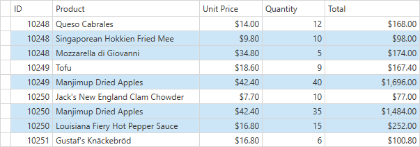
End users can select multiple rows using Shift or Ctrl keys. Enable the TableView.UseIndicatorForSelection/TreeListView.UseIndicatorForSelection option to allow an end user to select a range of rows/nodes/cells by dragging the mouse along the Row Indicator Panel.
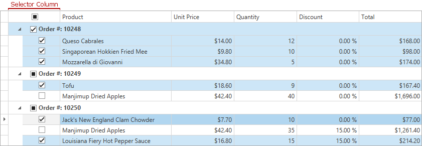
Web-style Row Selection
You can enable the Web Style Row Selection. When this feature is enabled, a Selector Column can be used to select/deselect individual rows and groups. To activate this feature, set the view’s TableView.ShowCheckBoxSelectorColumn property to true.
Selecting Records in Code
The GridControl provides multiple members which allow you to select/unselect multiple rows/cards/nodes:
Selection Availability
You can dynamically control selection availability and prevent end-users from selecting or unselecting rows/nodes/cards.
Handle the DataViewBase.CanSelectRow or DataViewBase.CanUnselectRow event to dynamically allow or prevent any row/node/card selection.
Appearance Customization
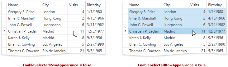
Set the DataViewBase.EnableSelectedRowAppearance property to false, to disable the specific decoration of selected rows.
The image below demonstrates the visual difference between two controls with the disabled and enabled DataViewBase.EnableSelectedRowAppearance option. The first four rows are selected in both the grids.
Example: How To Select Rows That Contain The Specified Value
This example shows how to select rows whose UnitPrice column contains a value equal to or greater than 20. To select rows, click the Select button.
<Window x:Class="DXGrid_SelectRows.Window1"
        xmlns="http://schemas.microsoft.com/winfx/2006/xaml/presentation"
        xmlns:x="http://schemas.microsoft.com/winfx/2006/xaml"
        xmlns:dxg="http://schemas.devexpress.com/winfx/2008/xaml/grid"
        Title="Window1" Height="293" Width="494">
    <StackPanel>
        <dxg:GridControl Name="grid" AutoGenerateColumns="AddNew" SelectionMode="Row" Height="220">
            <dxg:GridControl.View>
                <dxg:TableView Name="tableView" AutoWidth="True" />
            </dxg:GridControl.View>
        </dxg:GridControl>
        <Button Content="Select" Width="50" Height="30" Margin="5"
                HorizontalAlignment="Left" Click="Button_Click" />
    </StackPanel>
</Window>
using System;
using System.Collections.Generic;

public class Product {
    public string CompanyName { get; set; }
    public string Country { get; set; }
    public string City { get; set; }
    public double UnitPrice { get; set; }
    public int Quantity { get; set; }
}

public class ProductList {
    static public List<Product> GetData() {
        List<Product> list = new List<Product>();
        list.Add(new Product() { CompanyName = "Island Trading",
            Country = "UK", City = "Cowes", UnitPrice = 19, Quantity = 10 });
        list.Add(new Product() { CompanyName = "Reggiani Caseifici",
            Country = "Italy", City = "Reggio Emilia", UnitPrice = 12.5, Quantity = 16 });
        list.Add(new Product() { CompanyName = "Ricardo Adocicados",
            Country = "Brazil", City = "Rio de Janeiro", UnitPrice = 19, Quantity = 12 });
        list.Add(new Product() { CompanyName = "QUICK-Stop",
            Country = "Germany", City = "QUICK-Stop", UnitPrice = 22, Quantity = 50 });
        list.Add(new Product() { CompanyName = "Split Rail Beer & Ale",
            Country = "USA", City = "Reggio Emilia", UnitPrice = 18, Quantity = 20 });
        list.Add(new Product() { CompanyName = "Ernst Handel",
            Country = "Austria", City = "Graz", UnitPrice = 21, Quantity = 52 });
        list.Add(new Product() { CompanyName = "Save-a-lot Markets",
            Country = "USA", City = "Boise", UnitPrice = 7.75, Quantity = 120 });
        list.Add(new Product() { CompanyName = "Tortuga Restaurante",
            Country = "Mexico", City = "México D.F.", UnitPrice = 21, Quantity = 15 });
        list.Add(new Product() { CompanyName = "Bottom-Dollar Markets",
            Country = "Canada", City = "Tsawwassen", UnitPrice = 44, Quantity = 16 });
        return list;
    }
}
using System.Windows;

namespace DXGrid_SelectRows {
    public partial class Window1 : Window {
        public Window1() {
            InitializeComponent();
            grid.ItemsSource = ProductList.GetData();
        }

        private void Button_Click(object sender, RoutedEventArgs e) {
            SelectProducts(20);
        }

        private void SelectProducts(double minPrice) {
            grid.BeginSelection();
            grid.UnselectAll();
            for (int i = 0; i < grid.VisibleRowCount; i++) {
                int rowHandle = grid.GetRowHandleByVisibleIndex(i);
                if (!grid.IsGroupRowHandle(rowHandle)) {
                    double price = (double)grid.GetCellValue(rowHandle,
                        grid.Columns["UnitPrice"]);
                    if (price >= minPrice)
                        grid.SelectItem(rowHandle);
                }
            }
            grid.EndSelection();
        }
    }
}
Imports Microsoft.VisualBasic
Imports System
Imports System.Collections.Generic

Public Class Product
    Private privateCompanyName As String
    Public Property CompanyName() As String
        Get
            Return privateCompanyName
        End Get
        Set(ByVal value As String)
            privateCompanyName = value
        End Set
    End Property
    Private privateCountry As String
    Public Property Country() As String
        Get
            Return privateCountry
        End Get
        Set(ByVal value As String)
            privateCountry = value
        End Set
    End Property
    Private privateCity As String
    Public Property City() As String
        Get
            Return privateCity
        End Get
        Set(ByVal value As String)
            privateCity = value
        End Set
    End Property
    Private privateUnitPrice As Double
    Public Property UnitPrice() As Double
        Get
            Return privateUnitPrice
        End Get
        Set(ByVal value As Double)
            privateUnitPrice = value
        End Set
    End Property
    Private privateQuantity As Integer
    Public Property Quantity() As Integer
        Get
            Return privateQuantity
        End Get
        Set(ByVal value As Integer)
            privateQuantity = value
        End Set
    End Property
End Class

Public Class ProductList
    Public Shared Function GetData() As List(Of Product)
        Dim list As New List(Of Product)()
        list.Add(New Product() With {.CompanyName = "Island Trading", _
            .Country = "UK", .City = "Cowes", .UnitPrice = 19, .Quantity = 10})
        list.Add(New Product() With {.CompanyName = "Reggiani Caseifici", _
            .Country = "Italy", .City = "Reggio Emilia", .UnitPrice = 12.5, .Quantity = 16})
        list.Add(New Product() With {.CompanyName = "Ricardo Adocicados", _
            .Country = "Brazil", .City = "Rio de Janeiro", .UnitPrice = 19, .Quantity = 12})
        list.Add(New Product() With {.CompanyName = "QUICK-Stop", _
            .Country = "Germany", .City = "QUICK-Stop", .UnitPrice = 22, .Quantity = 50})
        list.Add(New Product() With {.CompanyName = "Split Rail Beer & Ale", _
            .Country = "USA", .City = "Reggio Emilia", .UnitPrice = 18, .Quantity = 20})
        list.Add(New Product() With {.CompanyName = "Ernst Handel", _
            .Country = "Austria", .City = "Graz", .UnitPrice = 21, .Quantity = 52})
        list.Add(New Product() With {.CompanyName = "Save-a-lot Markets", _
            .Country = "USA", .City = "Boise", .UnitPrice = 7.75, .Quantity = 120})
        list.Add(New Product() With {.CompanyName = "Tortuga Restaurante", _
            .Country = "Mexico", .City = "México D.F.", .UnitPrice = 21, .Quantity = 15})
        list.Add(New Product() With {.CompanyName = "Bottom-Dollar Markets", _
            .Country = "Canada", .City = "Tsawwassen", .UnitPrice = 44, .Quantity = 16})
        Return list
    End Function
End Class
Imports Microsoft.VisualBasic
Imports System.Windows

Namespace DXGrid_SelectRows
    Partial Public Class Window1
        Inherits Window
        Public Sub New()
            InitializeComponent()
            grid.ItemsSource = ProductList.GetData()
        End Sub

        Private Sub Button_Click(ByVal sender As Object, ByVal e As RoutedEventArgs)
            SelectProducts(20)
        End Sub

        Private Sub SelectProducts(ByVal minPrice As Double)
            grid.BeginSelection()
            grid.UnselectAll()
            For i As Integer = 0 To grid.VisibleRowCount - 1
                Dim rowHandle As Integer = grid.GetRowHandleByVisibleIndex(i)
                If (Not grid.IsGroupRowHandle(rowHandle)) Then
                    Dim price As Double = CDbl(grid.GetCellValue( _
                        rowHandle, grid.Columns("UnitPrice")))
                    If price >= minPrice Then
                        grid.SelectItem(rowHandle)
                    End If
                End If
            Next i
            grid.EndSelection()
        End Sub
    End Class
End Namespace
Highlight Rows On Hover
Set the TableView.HighlightItemOnHover/TreeListView.HighlightItemOnHover property to true to enable highlighting rows when hovering:
<dxg:GridControl SelectionMode="Row">
    <dxg:GridControl.View>
        <dxg:TableView HighlightItemOnHover="True" />
    </dxg:GridControl.View>
    <!-- ... --->
</dxg:GridControl>
See Also