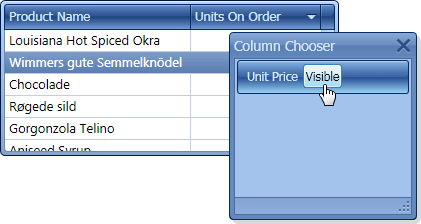
This example shows how to provide custom content within the UnitPrice column’s header when it is displayed within the Column Band Chooser. This includes the caption that identifies the hidden column, and the button that when clicked, makes the column visible.
The image below shows the result:
public Window1() {
    InitializeComponent();
    grid.DataSource = new dsNwindProductsTableAdapters.ProductsTableAdapter().GetData();
}
private void Button_Click(object sender, RoutedEventArgs e) {
    grid.Columns["UnitPrice"].Visible = true;
}
<Window.Resources>
    <Grid x:Key="headerCaption">
        <Grid.ColumnDefinitions>
            <ColumnDefinition Width="*"/>
            <ColumnDefinition Width="Auto"/>
        </Grid.ColumnDefinitions>
        <TextBlock Margin="5">Unit Price</TextBlock>
        <Button Grid.Column="1" Click="Button_Click">Visible</Button>
    </Grid>
</Window.Resources>
<dxg:GridControl x:Name="grid">
    <dxg:GridControl.Columns>
        <dxg:GridColumn FieldName="ProductName"/>
        <dxg:GridColumn FieldName="UnitPrice"
                        ColumnChooserHeaderCaption="{StaticResource headerCaption}">
        </dxg:GridColumn>
        <dxg:GridColumn FieldName="UnitsOnOrder"/>
    </dxg:GridControl.Columns>
    <dxg:GridControl.View>
        <dxg:TableView AutoWidth="True">
        </dxg:TableView>
    </dxg:GridControl.View>
</dxg:GridControl>