Lesson 1 - Create a Simple Carousel
- 3 minutes to read
This topic describes the basic steps of carousel control customization.
The first step is to add a CarouselPanel control onto the form. Once you’ve done this, you can populate the control with items. In this example, we’ll use basic shapes (a set of colored rectangles). When you finish, your XAML should look like the following:
<Page x:Class="CarouselTutorial.TutorialPage1"
    xmlns="http://schemas.microsoft.com/winfx/2006/xaml/presentation"
    xmlns:x="http://schemas.microsoft.com/winfx/2006/xaml"
    xmlns:dxca="http://schemas.devexpress.com/winfx/2008/xaml/carousel"
    >
    <dxca:CarouselPanel AttractorPointIndex="2" VisibleItemCount="5" x:Name="myCarousel">
        <Rectangle Fill="Red"/>
        <Rectangle Fill="Green"/>
        <Rectangle Fill="Blue"/>
        <Rectangle Fill="Yellow"/>
        <Rectangle Fill="Purple"/>
    </dxca:CarouselPanel>
</Page>
You’ll see that rectangles aren’t distributed along the path, and your form will look as shown in the following image:
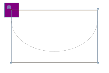
This happens because the carousel doesn’t know anything about the type of its elements, and how you want to distribute or animate them. You can manually bind any item property to Carousel Functions that will specify how these properties change, depending on the item position on the carousel path. While you have the freedom to customize, you can get started by using the built-in element style that automatically binds a few element properties - including proper element positioning, and size modification depending on the position and opacity.
To apply the default style to all Rectangles, you can use the following XAML within your CarouselPanel tag.
<dxca:CarouselPanel.Resources>
    <Style TargetType="{x:Type Rectangle}" BasedOn="{StaticResource {ComponentResourceKey
      TypeInTargetAssembly={x:Type dxca:CarouselPanel}, ResourceId=advancedCarouselItemStyle}}"/>
</dxca:CarouselPanel.Resources>
You can run the application at this time, and see that the carousel is working.
As you’ve noticed, the default style name is “advancedCarouselItemStyle”. You can modify this style if you don’t like some of its characteristics. For instance, we can add an Ellipse to the item list, specify a style for ellipses and override the opacity setting. The resulting code will look like this.
<Page x:Class="CarouselTutorial.TutorialPage1"
    xmlns="http://schemas.microsoft.com/winfx/2006/xaml/presentation"
    xmlns:x="http://schemas.microsoft.com/winfx/2006/xaml"
    xmlns:dxca="http://schemas.devexpress.com/winfx/2008/xaml/carousel"
    >
    <dxca:CarouselPanel AttractorPointIndex="2" VisibleItemCount="5" x:Name="myCarousel">
        <dxca:CarouselPanel.Resources>
            <Style TargetType="{x:Type Rectangle}" BasedOn="{StaticResource {ComponentResourceKey
              TypeInTargetAssembly={x:Type dxca:CarouselPanel}, ResourceId=advancedCarouselItemStyle}}"/>
            <Style TargetType="{x:Type Ellipse}" BasedOn="{StaticResource {ComponentResourceKey
              TypeInTargetAssembly={x:Type dxca:CarouselPanel}, ResourceId=advancedCarouselItemStyle}}">
                <Setter Property="Opacity" Value="1" />
            </Style>
        </dxca:CarouselPanel.Resources>
        <Rectangle Fill="Red"/>
        <Rectangle Fill="Green"/>
        <Rectangle Fill="Blue"/>
        <Rectangle Fill="Yellow"/>
        <Rectangle Fill="Purple"/>
        <Ellipse Fill="OrangeRed"/>
    </dxca:CarouselPanel>
</Page>
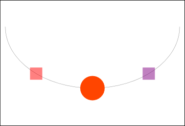
The following images show what you will see if you run the application at this time. All elements are aligned along the path. Rectangles are transparent, while the ellipse is opaque, as specified by its style.
Now you can try to further customize the carousel using the following properties: CarouselPanel.ActivateItemOnClick, CarouselPanel.IsInvertedDirection, CarouselPanel.IsRepeat, CarouselPanel.ItemMovingPath, CarouselPanel.PathVisible. See the CarouselPanel member list, to learn more about available settings.