Layout (Dock) Panels
- 3 minutes to read
Overview
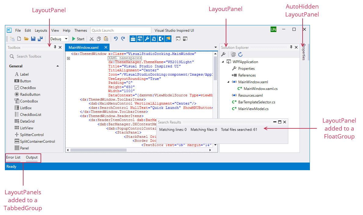
Layout Panels (LayoutPanel objects) are regular dock panels. They can be docked, made floating or auto-hidden. Visually, a panel consists of a caption and client area that displays custom controls.
Layout panels support the following dock features:
- They can be displayed side-by-side (vertically or horizontally) with other panels or other dock objects (to form this layout in code or XAML, you need to combine panels into a Layout Group).
- They can be combined into a tab container, with the help of a Tabbed Group.
- They can be made floating by using a Float Group.
- They can be made auto-hidden by using an Auto-Hide Group.
Content
A panel’s content can be either a single UIElement object, or a Layout Group, arranging your controls in a specific layout. To get or set the panel’s content, use the ContentItem.Content property. To initialize this property in XAML, declare an object (a UIElement or LayoutGroup) between the LayoutPanel start and end tags.
A Layout Panel can display multiple controls. This can be accomplished by creating a Layout Group, and arranging your controls within this group using Layout Control Item wrappers. In this scenario, the created LayoutGroup is the root container for the layout of the controls. In code, you can access the panel’s root Layout Group from the LayoutPanel.Layout property, which returns the value of the ContentItem.Content property, type-cast to the LayoutGroup type.
Caption and Image
To specify a caption and image for a panel, use the inherited BaseLayoutItem.Caption and BaseLayoutItem.CaptionImage properties.
Dock Operations
Layout panels support all docking features (the default setting). You can use the following inherited properties to disable specific features: BaseLayoutItem.AllowActivate, BaseLayoutItem.AllowClose, BaseLayoutItem.AllowDock, BaseLayoutItem.AllowFloat, BaseLayoutItem.AllowHide, and BaseLayoutItem.AllowRestore.
The DockLayoutManager.DockItemStartDocking, DockLayoutManager.DockItemDocking and DockLayoutManager.DockItemEndDocking events allow dock operations to be dynamically controlled.
In code, you can use the DockLayoutManager.DockController object methods to perform dock operations on panels.
Closed Panels
You can create a closed (hidden) panel. This can be accomplished in XAML by adding the panel to the DockLayoutManager.ClosedPanels collection. In code, you can use the DockControllerBase.Close method of the DockLayoutManager.DockController object to close a panel. An end user can use the Closed Panels bar to access the Closed panels. Use the DockLayoutManager.ClosedPanelsBarVisibility property to control the Closed Panels bar visibility. To restore a closed panel in code, use the DockController.Restore or DockController.Dock method.