Bars
- 3 minutes to read
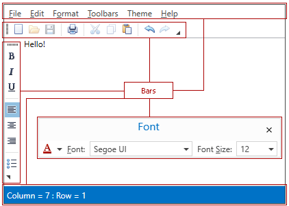
Bars are containers of commands, sub-menus, static text, editors, etc.
Unlike Standalone Bar Controls, Bars cannot be used separately and require a parent Bar Manager component. Bar Managers store their child bars in the Bar object collections.
Bar Types
Depending on the Bar.IsMainMenu and Bar.IsStatusBar property values, bars are considered as either main menu bars, status bars or regular toolbars.
Main menu and status bars have the following features:
- cannot be hidden or moved by an end-user at runtime;
- always occupy the entire row (see the Bar.UseWholeRow property);
- painted in a different manner than other bars.
Main menu bars receive focus when an end-user presses the ALT key.
Populating Bars
A bar can be populated with either links to existing bar items (use the BarItemLinkHolderBase.ItemLinks collection to do that), or directly with new bar items (the BarItemLinkHolderBase.Items collection). In the latter case, a Bar Manager will automatically generate a bar item link for each bar item added.
The following example creates two Bar objects, named “Edit” and “Main”, which are docked to the right and top of the window respectively. A single element of the Main toolbar is a sub-menu whose elements are bar item links (these bar item links refer to bar items declared in other locations). The Edit toolbar displays three bar items (Cut, Copy and Paste) and one bar item link that refers to the btnFormatPainter item declared in the BarManager.Items collection.
<dxb:BarManager CreateStandardLayout="True">
    <dxb:BarManager.Items>
        <dxb:BarButtonItem Content="Format Painter" x:Name="btnFormatPainter"/>
    </dxb:BarManager.Items>

    <dxb:BarManager.Bars>
        <dxb:Bar Caption="Edit">
            <dxb:Bar.DockInfo>
                <dxb:BarDockInfo ContainerType="Right"/>
            </dxb:Bar.DockInfo>
            <dxb:BarButtonItem x:Name="biCut" Content="Cut" Glyph="{dx:DXImage Image=Cut_16x16.png}" LargeGlyph="{dx:DXImage Image=Cut_32x32.png}"/>
            <dxb:BarButtonItem x:Name="biCopy" Content="Copy" Glyph="{dx:DXImage Image=Copy_16x16.png}" LargeGlyph="{dx:DXImage Image=Copy_32x32.png}"/>
            <dxb:BarButtonItem x:Name="biPaste" Content="Paste" Glyph="{dx:DXImage Image=Paste_16x16.png}" LargeGlyph="{dx:DXImage Image=Paste_32x32.png}"/>
            <dxb:BarButtonItemLink BarItemName="btnFormatPainter"/>
        </dxb:Bar>
        <dxb:Bar Caption="Main" IsMainMenu="True">
            <dxb:BarSubItem x:Name="biEdit" Content="Edit">
                <dxb:BarButtonItemLink BarItemName="biCut"/>
                <dxb:BarButtonItemLink BarItemName="biCopy"/>
                <dxb:BarButtonItemLink BarItemName="biPaste"/>
                <dxb:BarButtonItemLink BarItemName="btnFormatPainter"/>
            </dxb:BarSubItem>
        </dxb:Bar>
    </dxb:BarManager.Bars>
    <Grid/>
</dxb:BarManager>
Arranging Bars
Bar objects can be docked to the window, or they can be floating. To allow bars to be docked to the window, you need to add BarContainerControl objects to the window, as bars can only be docked to these containers. BarContainerControls can be created either implicitly by enabling the BarManager.CreateStandardLayout option or manually. After bar containers have been created, a bar can be docked to the target container using the Bar.DockInfo property. See Bar Containers to learn more.
If you want to create a floating bar, set the Bar.DockInfo.ContainerType (BarDockInfo.ContainerType) property to BarContainerType.Floating. There is no need to manually create floating bar containers.