Legends
- 7 minutes to read
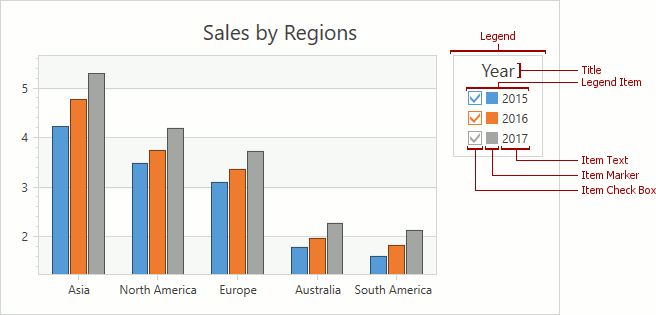
A legend is a chart element that allows you to distinguish between series on a chart. In addition to series, a legend can display series points, indicators, strips and constant lines. To identify chart elements, a legend displays a marker (check box or both) with the specified text. Marker appearance (shape and color) differs depending on an element’s type.
This topic consists of the following sections:
- How to Add a Legend
- How to Specify Legend Layout
- How to Add a Title to a Legend
- How to Enable Check Boxes in a Legend
- How to Format Legend Item Text
- How to Add a Custom Legend Item
How to Add a Legend
The legend occupies the default position at the top-right corner of a chart, if legend position’s options are undefined. Use the following XAML to add a legend to a chart:
<dxc:ChartControl.Legends>
        <dxc:Legend/>
</dxc:ChartControl.Legends>
The example above uses the following classes and properties:
| Member | Description |
|---|---|
| ChartControlBase.Legends | The chart legends’ collection. |
| Legend | A legend. |
A legend displays chart elements (series, indicator, constant line, and strip) whose Visible and ShowInLegend properties are enabled. To specify a text that identifies a series in a legend, use the Series.DisplayName property. Use the Indicator.LegendText, ConstantLine.LegendText, Strip.LegendText property to define a legend text for an indicator, constant line, or a strip. When the DisplayName or LegendText property is set to Empty, a legend does not show a chart element.
In addition to series, indicators, constant lines, and strips, a legend can contain series points’ values. A Simple 2D Diagram (Simple 3D Diagram)’s legend displays points’ values by default. Enable the XYSeries.ColorEach property to show points in legends of the Cartesian (2D XY Diagram, 3D XY Diagram) and Circular (2D Polar Diagram, 2D Radar Diagram) diagrams.
You can add multiple legends to a chart as shown below:
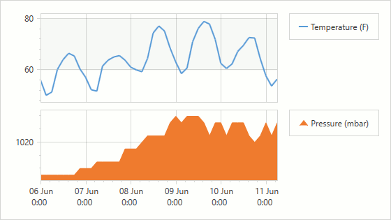
The following example shows how to add several legends:
<dxc:ChartControl>
    <dxc:ChartControl.Legends>
        <dxc:Legend x:Name="topLegend" DockTarget="{Binding ElementName=topPane}"/>
        <dxc:Legend x:Name="bottomLegend" DockTarget="{Binding ElementName=bottomPane}"/>
    </dxc:ChartControl.Legends>
    <dxc:XYDiagram2D>
        <dxc:XYDiagram2D.DefaultPane>
            <dxc:Pane x:Name="topPane"/>
        </dxc:XYDiagram2D.DefaultPane>
        <dxc:XYDiagram2D.Panes>
            <dxc:Pane x:Name="bottomPane"/>
        </dxc:XYDiagram2D.Panes>
        <dxc:AreaSeries2D DisplayName="Pressure (mbar)"
                          Pane="{Binding ElementName=bottomPane}"
                          Legend="{Binding ElementName=bottomLegend}"/>
    </dxc:XYDiagram2D>
</dxc:ChartControl>
The markup uses the following API members:
| Member | Description |
|---|---|
| Legend.DockTarget | Specifies the pane (or its View Model) that contains a legend. |
| Series.Legend | Gets or sets the legend (or its View Model) that displays information about the series. |
How to Specify Legend Layout
You can modify vertical and horizontal legend’s position, and place a legend within or outside a diagram. Also, you can display legend items in a column or row, and show them in the reversed order.
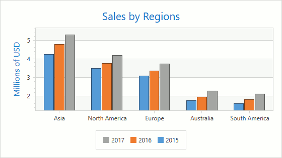
Use the notation below to place a legend to the bottom of the chart outside the diagram and align it horizontally to center as shown in the previous image.
<dxc:ChartControl.Legends>
    <dxc:Legend HorizontalPosition="Center"
                VerticalPosition="BottomOutside"
                Orientation="Horizontal"
                ReverseItems="True"
                IndentFromDiagram="0,16,0,0"/>
</dxc:ChartControl.Legends>
The following API members manage legend and its items’ positions:
| Member | Description |
|---|---|
| Legend.HorizontalPosition | Specifies the legend’s horizontal position within a chart. |
| Legend.VerticalPosition | Specifies the legend’s vertical position within a chart. |
| Legend.Orientation | Defines vertical or horizontal legend items’ orientation. |
| Legend.ReverseItems | Gets or sets whether legend items have an original order or reversed. |
| Legend.IndentFromDiagram | Specifies a space between a legend and a diagram. |
Also, you can use the Legend.ItemsPanel property to customize legend items’ layout.
How to Add a Title to a Legend
A legend can only contain a single title. You can configure the title’s content and its horizontal alignment within a legend.
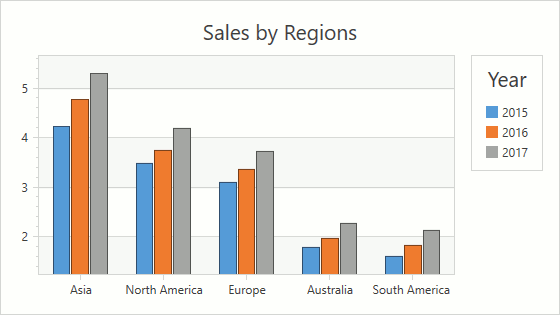
Use the code below to configure a legend’s title:
<dxc:ChartControl.Legends>
    <dxc:Legend>
        <dxc:Legend.Title>
            <dxc:LegendTitle Content="Year"
                             HorizontalAlignment="Center"/>
        </dxc:Legend.Title>
    </dxc:Legend>
</dxc:ChartControl.Legends>
The following classes and properties allow you to add and modify a legend’s title:
| Member | Description |
|---|---|
| Legend.Title | Specifies a legend title. |
| LegendTitle | A legend title. |
| TitleBase.Content | Gets or sets the title’s content. |
| TitleBase.HorizontalAlignment | Specifies how the title is horizontally aligned. |
How to Enable Check Boxes in a Legend
You can manage chart elements’ visibility using check boxes in a legend as shown below:
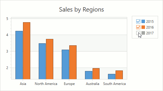
Use the following code to display legend items with check boxes:
<dxc:ChartControl.Legends>
    <dxc:Legend MarkerMode="CheckBoxAndMarker"/>
</dxc:ChartControl.Legends>
The markup above uses the following API members:
| Member | Description |
|---|---|
| Legend.MarkerMode | Specifies a mode defying how to display legend markers. |
| LegendMarkerMode | Lists values that specify which marker type a legend uses. |
Use the chart element’s CheckableInLegend (Series.CheckableInLegend, Indicator.CheckableInLegend, ConstantLine.CheckableInLegend, Strip.CheckableInLegend) property to specify whether a legend shows a check box for the element.
Use the CheckedInLegend (Series.CheckedInLegend, Indicator.CheckedInLegend, ConstantLine.CheckedInLegend, Strip.CheckedInLegend, CustomLegendItem.CheckedInLegend) property to select or clear an element’s legend check box.
How to Format Legend Item Text
When the ColorEach mode is enabled, you can format legend items’ text using format specifiers, placeholders and plain text.
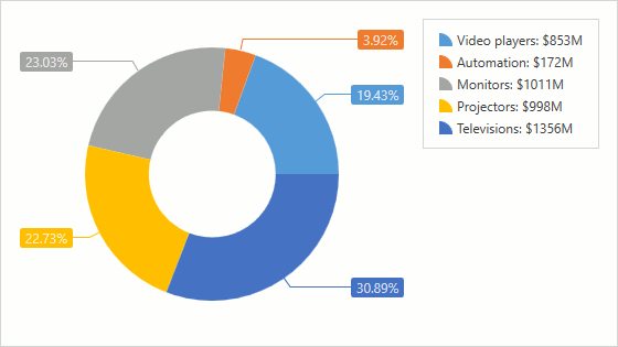
The following markup shows how to format text that identifies series points in a legend. In the format string, the A and V placeholders define point argument and value.
<dxc:PieSeries2D LegendTextPattern="{}{A}: ${V}M">
      <!-- Other series settings. -->
</dxc:PieSeries2D>
The example demonstrates how to use the following property.
| Member | Description |
|---|---|
| Series.LegendTextPattern | Specifies a pattern formatting legend text for series points. |
A full list of available placeholders is detailed below.
| Pattern | Description |
|---|---|
| {S} | Displays the name of the series. |
| {A} | Displays a series point argument. |
| {V} | Displays series point values. |
| Pie (Donut) series specific placeholders | |
| {VP} | Displays series point values as percentages. |
| {TV} | Displays a total group value. |
| Stacked series specific placeholders | |
| {VP} | Displays series point values as percentages. |
| {G} | Displays the name of a stacked group. |
| {TV} | Displays a total group value. |
| Bubble series specific placeholders | |
| {W} | Displays the weight. |
| Range series specific placeholders | |
| {V1} | Displays the first value. |
| {V2} | Displays the second value. |
| {VD} | Displays the duration between the first and second data point values formatted using a common time format (e.g. HH:MM:SS for date time values and #.## for numeric values). |
| {VDTD} | Displays the duration between the first and second date-time data point values in days. |
| {VDTH} | Displays the duration between the first and second date-time data point values in hours. |
| {VDTM} | Displays the duration between the first and second date-time data point values in minutes. |
| {VDTS} | Displays the duration between the first and second date-time data point values in seconds. |
| {VDTMS} | Displays the duration between the first and second date-time data point values in milliseconds. |
| Financial series specific placeholders | |
| {OV} | Displays the open value. |
| {HV} | Displays the high value. |
| {LV} | Displays the low value. |
| {CV} | Displays the close value. |
Note
Make sure before using the {S} placeholder that the Series.Name property is specified.
You can also use standard and custom format specifiers, together with the placeholders and data field values (e.g., {V:F1}).
When the chart control or a series is bound to data, the text pattern may contain data field values in addition to default placeholders. For example, the data source contains the Discount field and the text pattern may looks like: {S}: {V:F2} (Discount: {Discount:P0}).
Define the Legend.ItemTemplate property to specify legend item appearance.
How to Add a Custom Legend Item
You can add custom legend items in addition to items that automatically generated by default.
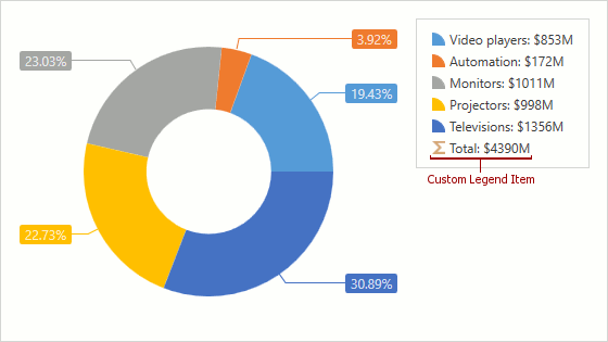
The following code shows how to create a custom legend item:
<dxc:ChartControl.Legends>
    <dxc:Legend ItemVisibilityMode="AutoGeneratedAndCustom">
        <dxc:Legend.CustomItems>
            <dxc:CustomLegendItem Text="Total: $4390M"
                                  MarkerBrush="#FFC3C3C3">
                <dxc:CustomLegendItem.MarkerTemplate>
                    <DataTemplate>
                        <Image Source="/Images/sum.png"/>
                    </DataTemplate>
                </dxc:CustomLegendItem.MarkerTemplate>
            </dxc:CustomLegendItem>
        </dxc:Legend.CustomItems>
    </dxc:Legend>
</dxc:ChartControl.Legends>
The example uses the following classes and properties:
| Member | Description |
|---|---|
| Legend.CustomItems | The legend’s custom items collection. |
| CustomLegendItem | A custom legend item. |
| CustomLegendItem.Text | Text the custom legend item displays. |
| CustomLegendItem.MarkerBrush | Specifies a brush that is used to draw a legend item’s marker. |
| CustomLegendItem.MarkerTemplate | Gets or sets the template that defines a custom legend item’s marker appearance. |
| Legend.ItemVisibilityMode | Defines the mode used to display custom and automatically generated items. |
| LegendItemVisibilityMode | Lists modes that specify custom and default legend items’ visibility. |
To generate a chart element collection from a chart’s View Model, bind the Legend.CustomItemsSource property to the View Model’s property and specify the Legend.CustomItemTemplate or Legend.CustomItemTemplateSelector to bind the element’s properties to the element view model’s properties.