Series Point Labels
- 6 minutes to read
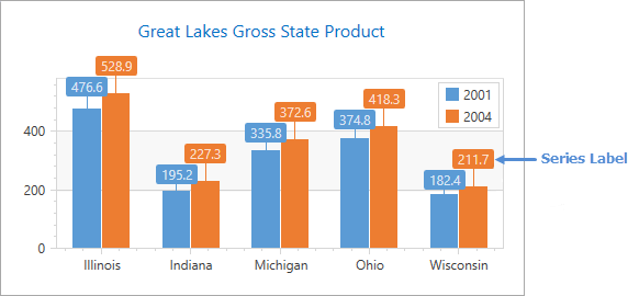
Labels can accompany series points to provide additional information. The following image demonstrates labels that show the series point’s actual value:
This document consists of the following sections:
- How to Display Series Labels
- How to Set a Series Label Text Pattern
- How to Resolve Series Label Overlapping
- How to Show Labels for Zero Values
- How to Modify Labels’ Layout
- How to Customize Label Appearance
How to Display Series Labels
Series labels are hidden by default. Set the Series.LabelsVisibility property to true to show labels containing point values.
<dxc:LineSeries2D DisplayName="series" LabelsVisibility="True">
       <!-- Other series settings here. -->
</dxc:LineSeries2D>
How to Set a Series Label Text Pattern
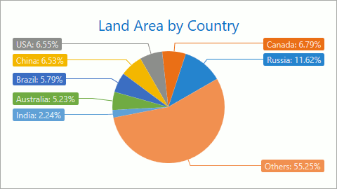
Specify the SeriesLabel.TextPattern property to format series label text. The pattern comprises regular text (which is displayed as is) and placeholder strings enclosed in braces. Placeholders define which values are shown in labels. You can also apply format specifiers to these values (e.g., {V:F1}).
In the following image, series labels display points values with the series display name:
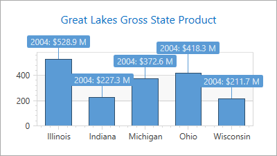
The code below shows how to assign the {}{S}: ${V:F1} M string to the TextPattern property.
<dxc:BarSideBySideSeries2D DisplayName="series"
                           LabelsVisibility="True">
      <dxc:BarSideBySideSeries2D.Label>
            <dxc:SeriesLabel TextPattern="{}{S}: ${V:F1} M"
                             dxc:BarSideBySideSeries2D.LabelPosition="Outside"
                             ResolveOverlappingMode="Default"
                             Indent="15"/>
      </dxc:BarSideBySideSeries2D.Label>
      <!--...-->
</dxc:BarSideBySideSeries2D>
Note: In XAML, insert empty brackets into the beginning of a pattern if it starts with a placeholder.
Below is a list of available placeholders.
| Pattern | Description |
|---|---|
| {S} | Displays the name of the series. |
| {A} | Displays a series point argument. |
| {V} | Displays series point values. |
| A Pie (Donut) series specific placeholders | |
| {VP} | Displays series point values as percentages. |
| {TV} | Displays total group value. |
| Stacked series specific placeholders | |
| {VP} | Displays series point values as percentages. |
| {G} | Displays the name of a stacked group. |
| {TV} | Displays total group value. |
| A Bubble series specific placeholders | |
| {W} | Displays the weight. |
| Range series specific placeholders | |
| {V1} | Displays the first value. |
| {V2} | Displays the second value. |
| {VD} | Displays the duration between the first and second data point values formatted using a common time format (e.g. HH:MM:SS for date time values and #.## for numeric values). |
| {VDTD} | Displays the duration between the first and second date-time data point values in days. |
| {VDTH} | Displays the duration between the first and second date-time data point values in hours. |
| {VDTM} | Displays the duration between the first and second date-time data point values in minutes in minutes. |
| {VDTS} | Displays the duration between the first and second date-time data point values in seconds. |
| {VDTMS} | Displays the duration between the first and second date-time data point values in milliseconds. |
| Financial series specific placeholders | |
| {OV} | Displays the open value. |
| {HV} | Displays the high value. |
| {LV} | Displays the low value. |
| {CV} | Displays the close value. |
Before specifying a series’s {S} placeholder, make sure a series name is specified in the Series.DisplayName property.
When the Chart control or a series is bound to data, the pattern may contain data field values in addition to placeholders. For example, the data source contains the Discount field and the pattern may look like: {S}: {V:F2} (Discount: {Discount:P0}).
How to Resolve Series Label Overlapping
The possibility that series labels overlap increases with the number of series points you have on a chart. The Chart control provides several algorithms to resolve these overlapping problems using the SeriesLabel.ResolveOverlappingMode property. The following table describes the various algorithms used to resolve label overlapping and shows an image with the result:
| The Property Value | The Resulting Image | Description |
|---|---|---|
| SeriesLabel.ResolveOverlappingMode = Default | 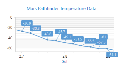 |
The default algorithm changes label positions to avoid overlapping. |
| SeriesLabel.ResolveOverlappingMode = HideOverlapped | 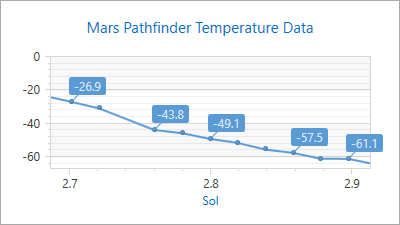 |
Some labels are automatically hidden to avoid overlapping if two or more labels overlap. |
| SeriesLabel.ResolveOverlappingMode = JustifyAroundPoint | 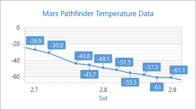 |
Only labels that overlap change their positions. They are moved around their corresponding points, but their indents from the point center do not change. |
| SeriesLabel.ResolveOverlappingMode = JustifyAllAroundPoint | 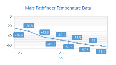 |
All labels (not only overlapped) change their positions. They are moved around their corresponding points, but their indents from the point center do not change. |
| SeriesLabel.ResolveOverlappingMode = None | 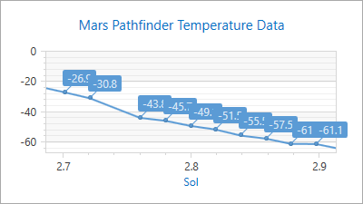 |
No attempt is made to resolve labels’ overlapping issues. |
You can also adjust the gap between series labels using the LabelsResolveOverlappingMinIndent properties:
- CircularDiagram2D.LabelsResolveOverlappingMinIndent
- PieSeries.LabelsResolveOverlappingMinIndent
- XYDiagram2D.LabelsResolveOverlappingMinIndent
Use the following markup to set the Default overlapping mode, and specify minimal space between labels to 10:
<dxc:XYDiagram2D LabelsResolveOverlappingMinIndent="10">
      <dxc:LineSeries2D DisplayName="series"
                        LabelsVisibility="True">
            <dxc:LineSeries2D.Label>
                  <dxc:SeriesLabel ResolveOverlappingMode="Default"/>
            </dxc:LineSeries2D.Label>
            <!--...-->
      </dxc:LineSeries2D>
</dxc:XYDiagram2D>
The following table lists the classes and properties that are used to resolve overlapping labels:
| Class or Property | Description |
|---|---|
| XYDiagram2D.LabelsResolveOverlappingMinIndent | Specifies the minimal distance between series labels. |
| SeriesLabel.ResolveOverlappingMode | Specifies the resolve overlapping mode. |
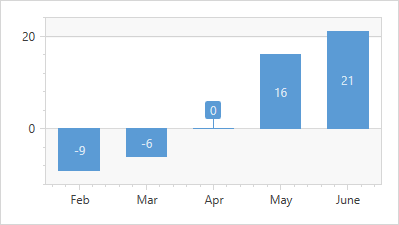
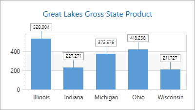
How to Show Labels for Zero Values
The Chart control does not display labels for points with zero values by default. To show them, use the BarSeries2D.ShowZeroValueLabels attached property as demonstrated in the example below:
<dxc:BarSideBySideSeries2D>
    <dxc:BarSideBySideSeries2D.Label>
        <dxc:SeriesLabel Visible="True"
                         dxc:BarSeries2D.ShowZeroValueLabels="True"/>
    </dxc:BarSideBySideSeries2D.Label>
    <!-- ...  -->
</dxc:BarSideBySideSeries2D>
The results of the code are on the following image:
How to Modify Labels’ Layout
Use the LabelPosition attached property to define labels’ position.
- BarSideBySideSeries2D.LabelPosition
- BubbleSeries2D.LabelPosition
- FunnelSeries2D.LabelPosition
- MarkerSeries3D.LabelPosition
- PieSeries.LabelPosition
- WaterfallSeries2D.LabelPosition
In the following image, Pie series labels are positioned in two columns:
The following code demonstrates how to accomplish this:
<dxc:PieSeries2D DisplayName="series" LabelsVisibility="True">
      <dxc:PieSeries2D.Label>
            <dxc:SeriesLabel dxc:PieSeries.LabelPosition="TwoColumns"
                             ResolveOverlappingMode="Default"/>
            <!--...-->
      </dxc:PieSeries2D.Label>
</dxc:PieSeries2D>
You can set an angle that specifies how a label is tilted relative to a series point. The MarkerSeries2D.Angle property defines this angle (measured in degrees) and counterclockwise from the horizontal. A value of 0 is to the left, 90 is up, 180 is to the right, etc.
The table shows the Angle property in action:
| The property value | Image |
|---|---|
| MarkerSeries2D.Angle = 0 | 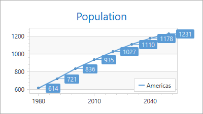 |
| MarkerSeries2D.Angle = 90 |  |
Use the following markup to set a label’s tilt angle:
<dxc:LineSeries2D DisplayName="series" LabelsVisibility="True">
      <dxc:LineSeries2D.Label>
            <dxc:SeriesLabel dxc:MarkerSeries2D.Angle="90"/>
      </dxc:LineSeries2D.Label>
      <!--...-->
</dxc:LineSeries2D>
How to Customize Label Appearance
You can change the label text settings, or label shape using a DataTemplate class instance. The following image shows an example:
The code example below customizes the Side-by-Side Bar series labels using data templates:
<Window.Resources>
      <DataTemplate x:Key="seriesLabel">
            <Border BorderThickness="1"
                    Opacity="1.0"
                    BorderBrush="DarkGray">
                <Border.Background>
                    <SolidColorBrush Color="{Binding Path=Color}"/>
                </Border.Background>
                <Label Content="{Binding Path=Text}"
                       Padding="5,1"
                       Foreground="Black"
                       FontFamily="SegoeUI"
                       FontStyle="Normal"
                       FontSize="10"
                       FontWeight="Light"
                       FontStretch="Normal"
                       Background="White"/>
            </Border>
      </DataTemplate>
</Window.Resources>
<!--...-->
<dxc:BarSideBySideSeries2D DisplayName="series"
                           LabelsVisibility="True">
      <dxc:BarSideBySideSeries2D.Label>
            <dxc:SeriesLabel dxc:BarSideBySideSeries2D.LabelPosition="Outside"
                             ResolveOverlappingMode="Default"
                             Indent="15"
                             ConnectorThickness="1"
                             ElementTemplate="{StaticResource seriesLabel}"/>
      <!--...-->
</dxc:BarSideBySideSeries2D>
The markup above uses the following properties:
Property | Description |
|---|---|
Specifies the length of the connector that joins a label and a series point. | |
Defines label connector visibility. | |
Defines the template that specifies how to display series labels. | |
Foreground, FontFamily, FontStyle, FontSize, FontWeight and FontStretch (inherited from System.Windows.Controls.Control) | Customize label text. |