Card Settings
- 2 minutes to read
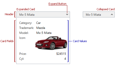
A Card View represents data as cards. Cards represent data records in a data source. A card arranges data source fields vertically, in a single column.
The image below highlights the major card settings:
| Member | Description |
|---|---|
| CardView.FixedSize | Gets or sets a card’s width (or height). By default, a card’s size (its width or height depending on the layout) is automatically calculated to display its content in an optimal way. As a result, different cards can have different sizes. To avoid this, and specify the same size for all cards displayed within a view, use the FixedSize property. |
| CardView.MinFixedSize | Specifies the minimum size to which cards can be resized by an end-user, or in code. |
| CardView.CardHeaderBinding | Gets or sets the binding that specifies the content of card headers. |
| CardView.CardMargin | Specifies the outer margin of a card. |
| CardView.CardHeaderTemplate | Specifies the template that represents card headers. |
| CardView.CardTemplate | Specifies the templates that represents cards. |
| CardView.CardStyle | Specifies a card’s style. |
How to Bind Card Headers to Data
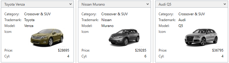
This example shows how to display product names within card headers. To do this, the CardView.CardHeaderBinding property is used.
The image below shows the result:
<dxg:GridControl x:Name="grid">
    <!-- -->
    <dxg:GridControl.View>
        <dxg:CardView CardHeaderBinding="{DXBinding 'RowData.Row.TrademarkName + ` ` + RowData.Row.Name'}"/>
    </dxg:GridControl.View>
</dxg:GridControl>