Cards Layout
- 2 minutes to read
Card Arrangement
A Card View can arrange cards in columns or rows. This is specified by the CardView.CardLayout property.
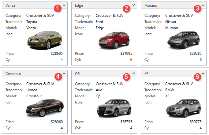
Columns Layout
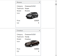
By default, a Card View arranges cards in columns. The first card is displayed at a View’s top-left corner. Subsequent cards are positioned under the previous ones. If a card cannot be placed there without being truncated, it is placed at the top of the next column. Subsequent cards are positioned under this card, etc.
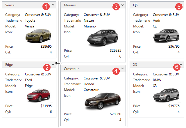
Rows Layout
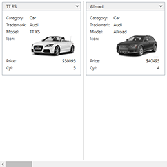
Cards can also be arranged in rows. In this instance, set the CardView.CardLayout property to CardLayout.Rows. In this case, the first card is displayed at a View’s top left corner. Subsequent cards are positioned next to the previous ones. If a card cannot be entirely displayed, it is displayed on the next row, etc.
The maximum number of cards in a row (or column) is specified by the CardView.MaxCardCountInRow property.
Card Alignment
The alignment of cards is specified by the CardView.CardAlignment property. The table below shows all possible card alignments:
Rows Alignment
| Center | Far | Near |
|---|---|---|
 |
 |
 |
Columns Alignment
| Center | Far | Near |
|---|---|---|
 |
 |
 |
Card Size
By default, a card’s size (its width or height depending on the layout) is automatically calculated to display its content in the optimal way. As a result, different cards can have different sizes. To avoid this, and specify the same size for all cards displayed within a view, use the CardView.FixedSize property. The minimum size to which a card can be resized is specified by the CardView.MinFixedSize property.
An end-user can resize cards by dragging a Card Separator if the CardView.FixedSize property is specified and the CardView.AllowCardResizing property is set to true.