Views
- 2 minutes to read
Views Overview
The GridControl uses a View to display data from a data source. A View specifies the layout of data fields and records, and has multiple options and settings that control the availability of individual data management capabilities (for example, sorting, grouping, and editing) and the appearance of grid elements.
The GridControl includes three types of views.
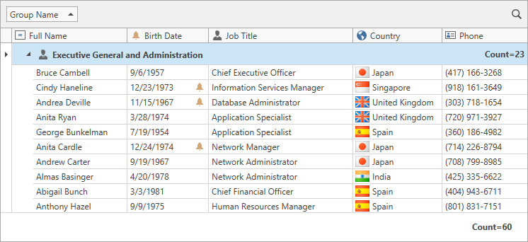
Table View (Default View)
A Table View displays data in a two-dimensional table. Data source fields are grid columns, data records are data rows.
-
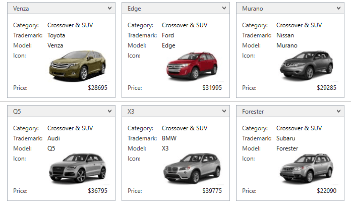
A Card View displays data records as cards. A card arranges data source fields vertically in a single column.
-
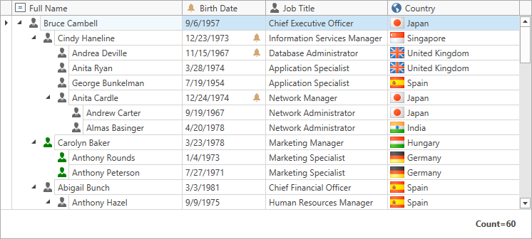
A TreeList View is designed to display information in a tree from hierarchical data structures. Data records are nodes.
Note
We do not recommend that you switch grid views at runtime.
Main Features Supported by All View Types
-
Data can be sorted against one or multiple columns. When sorting is applied, rows are rearranged to meet the current sort settings.
-
Filters allow you to display a subset of records from a data source. Users can apply a filter using a column’s drop-down filter. When a filter is applied, only those records that meet the current filter criteria are displayed. Data can be filtered against multiple columns.
-
Summaries allow you to display brief information about groups of rows or specific columns. For instance, you can display the number of records, minimum or maximum values within group rows, or a Summary Panel.
-
Users can edit cell values. Data editing can be disabled for individual columns.
-
Users can reorder columns or card fields with drag-and-drop actions.
-
Users can temporarily hide columns from a View at runtime using drag and drop. To hide a column from the View, users can drag a column header and drop it onto the Column Chooser. If they drag a column header from the Column Chooser back to the View, the column becomes visible.
- Display Popup Menus