Learn the Basics
|
This section contains topics that cover essential concepts of the Dock Windows interfaces.
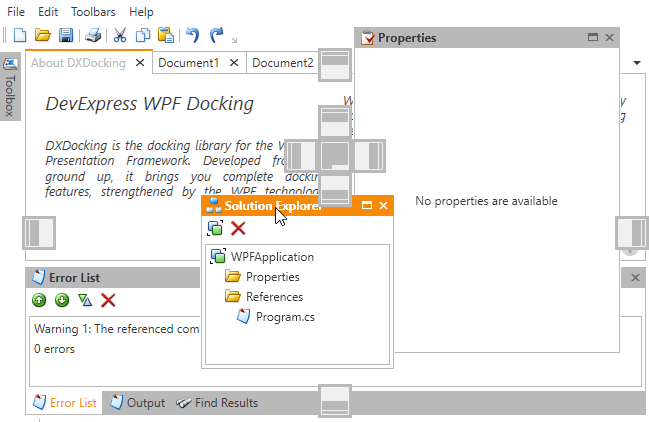
Getting Started
A step-by-step walkthrough that guides you through all stages of creation of a dock panel layout.
Dock Layout Manager
The DockLayoutManager component is a cornerstone of the entire Dock Windows library that provides centralized access to all panels and containers within your window.
Dock and Layout Object Hierarchy
This document contains a diagram that illustrates all types of panels and containers provided by the Dock Windows library, shows their relationships and briefly describes what each of them does.
Examples
A set of detailed task-based examples.
| 
|
Dock Functionality
|
The DockLayoutManager component solves two tasks, reflected in the component’s name: implementing a docking UI and building a control layout. This section is dedicated to the first task.
Note If you only need to dock multiple simple panels to either side of your window and do not require advanced Visual Studio-like features, use the Dock Layout Control instead.
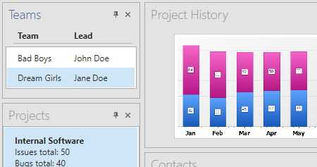
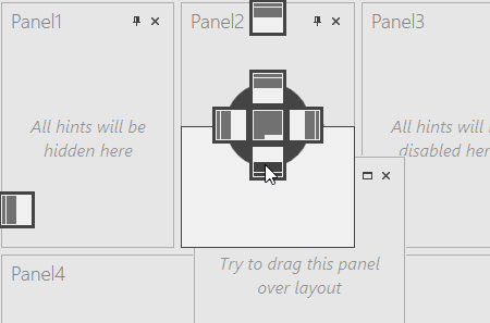
Layout Groups
Layout groups are base containers that arrange their items either horizontally or vertically. Can host individual panels, panel containers or other layout groups. Each layout contains at least one LayoutGroup (a root group). To build a docking interface, you first need to break down your client area into blocks by adding more LayoutGroup objects to this root group. Then, populate each block with the required content (an individual panel, panel group, tabbed group, etc.).
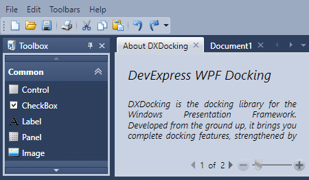
Layout (Dock) Panels
Regular dock panels that display your content and can be grouped into various containers. Panels can be docked, floating, auto-hidden or closed (hidden).
Tabbed Groups
Containers that host layout panels and present them as tabs. Each tab can display a Pin button. Clicking this button transforms the parent TabbedGroup into an Auto-Hide Group and hides all panels from view, leaving only their tab headers visible.
Document Groups and Panels
DocumentGroup objects implement multi-document interfaces (MDI) with tabbed or floating documents. Documents are represented by the DocumentPanel class instances. Your end-users can also drag regular layout panels to Document Groups.
Other Dock Items
Typically, you build your dock windows layout by breaking the root layout group into multiple regions. Groups listed below are not included in this root group, but rather kept in corresponding collections of the DockLayoutManager itself.
Float Groups
FloatGroup containers allow you to represent any dock item as a floating panel. Dock items can be docked to valid dock regions within root layout group. In this case, their float groups are destroyed automatically.
Auto-Hide Groups
These containers provide auto-hide functionality for layout panels. At runtime, when end-users click panel Pin buttons, AutoHideGroup objects are created automatically. Panels are added to these objects and removed from view, leaving only their headers visible. To view these panels again, end-users should click or hover related headers.
| 
|
Layout Functionality
|
Not only does the DockLayoutManager allow you to build the docking UI, it also provides you with the ability to build a layout of controls within individual layout panels. To do so, place a layout group to the required panel and populate it with layout control items. See the links below to learn more.
Note If you require a powerful layout management solution without a docking functionality, use the Layout Control component.
Layout Control Items
UIElements cannot be added directly to your layout. Instead, use layout control items - objects that wrap any control and provide labels for their child elements.
Customization Mode
Allows end-users to customize your controls layout at runtime.
Customization Window
The dialog used by your customers to modify, save and restore the layout of controls.
| 
|
Runtime Features
|
Documents in this section are dedicated to features available for your customers at runtime.
| 
|
Miscellaneous
|
This section gathers other features, provided by the Dock Layout Manager component.
| 
|