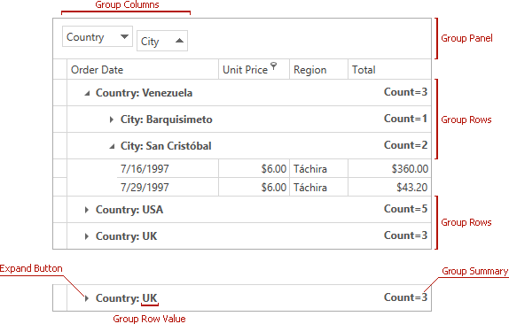
Grouping
- 3 minutes to read
The GridControl allows data to be grouped by an unlimited number of columns. When a View is grouped by a single column, data rows that have identical values in this column are arranged into groups. Each group is identified by a group row. If the View is grouped by another column, data rows within each group are arranged into second level groups based on the values of the new group column.
Group rows are used to organize data rows into a tree when data grouping is applied. Each group row is assigned a unique integer value - row handle. Group row handles are negative (starting from -1).
Rows are always sorted against group columns. If data is grouped against a column that isn’t sorted, the grid will automatically apply sorting to the column in ascending order.
Group columns can be accessed from the GridViewBase.GroupedColumns property. This property returns the list of group columns, which allows individual columns to be accessed using indexed notation.
The GridControl hides group columns from the View. Their headers are displayed within the Group Panel. Set the GridViewBase.ShowGroupedColumns property to true to show these columns in the View.
It is possible to hide the group row for groups that consist of a single row. To do this, set the TableView.AllowPartialGrouping property to true. When this option is enabled, grouped columns are displayed within a view regardless of the current value of the GridViewBase.ShowGroupedColumns property. This feature is not compatible with the Instant Feedback UI Mode.
Note
The GridControl ignores custom CellTemplates when users group data. Use other techniques to format cell values if you want to affect group operations.
End-User Capabilities
End users can group data in two ways:
- Drag a column’s header to the group panel (requires the GridViewBase.ShowGroupPanel property to be set to true).
- Invoke a column’s context menu by right-clicking its header, and select the Group By This Column menu item.
Both methods are allowed if the view’s GridViewBase.AllowGrouping property is set to true.
Individual columns provide the GridColumn.AllowGrouping property, which allows the default behavior specified by the view to be overridden. For example, this allows you to prevent an end user from grouping data by the values of individual columns.
Note
The GridControl sorts data against group column values. Users can only group data if data sorting is allowed (DataViewBase.AllowSorting).
Customize Appearance
The table below lists properties used to customize appearance of group rows:
| Property | Description |
|---|---|
| GridViewBase.GroupRowStyle | Gets or sets the style applied to group rows. This is a dependency property. |
| GridViewBase.GroupRowTemplate | Gets or sets the template that defines the presentation of group rows. This is a dependency property. |
| GridViewBase.GroupValueTemplate / GridColumn.GroupValueTemplate | Gets or sets the template that defines the presentation of column values displayed within group rows. This is a dependency property. |
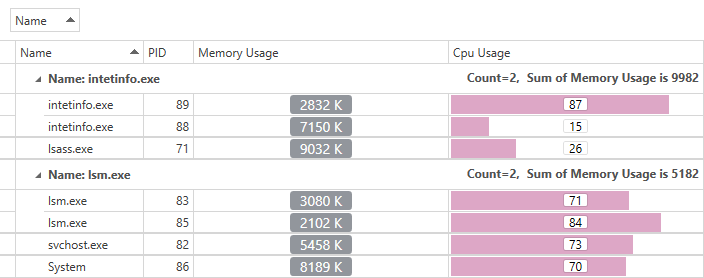
Refer to the following help topic for information on how to customize group summaries: Group Summary Customization.
Concepts
- Grouping in Code
- Processing Group Rows
- Group Modes and Custom Grouping
- Expanding and Collapsing Group Rows
- Identifying Rows and Cards
- Fixed Group Rows
- Grouping
- Group Row
- Group Summary