Group Summary
- 2 minutes to read
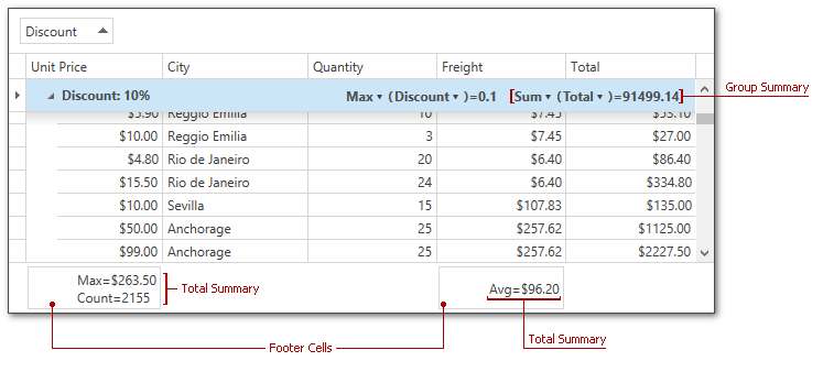
A group summary represents a value of the aggregate function calculated over all data rows within a group. Group summaries are displayed within group rows, and are stored within the grid’s GridControl.GroupSummary collection.
Displaying Group Summaries
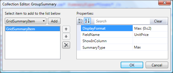
To create a group summary item at design time, use the GroupSummary Collection Editor.
<dxg:GridControl.GroupSummary>
    <dxg:GridSummaryItem DisplayFormat="Max: {0:c2}" FieldName="UnitPrice"
        ShowInColumn="" SummaryType="Max" />
</dxg:GridControl.GroupSummary>
To display group summaries in code, create a new instance of the GridSummaryItem class, specify its properties and add it to the GridControl.GroupSummary collection.
DevExpress.Xpf.Data.GridSummaryItem groupSummaryItem = new DevExpress.Xpf.Data.GridSummaryItem();
groupSummaryItem.FieldName = "UnitPrice";
groupSummaryItem.DisplayFormat = "Max: {0:c2}";
groupSummaryItem.SummaryType = DevExpress.Data.SummaryItemType.Max;
grid.GroupSummary.Add(groupSummaryItem);
Obtaining Summary Values
To obtain a group summary value displayed within the specified group row, use the GridControl.GetGroupSummaryValue method.
Align Group Summaries by Columns
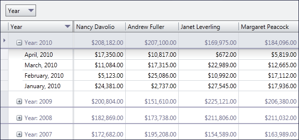
By default, group summaries are displayed to a group row’s right. To display group summaries under corresponding columns, set the TableView.GroupSummaryDisplayMode to GroupSummaryDisplayMode.AlignByColumns.
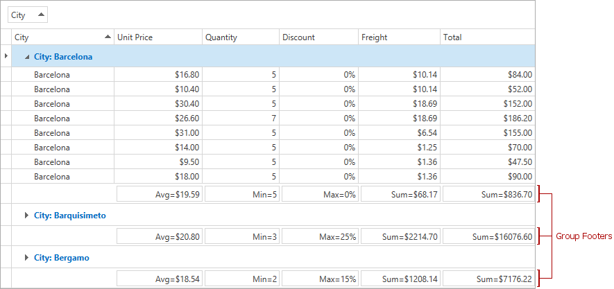
Group Footers
To show group footer rows, use the view’s TableView.ShowGroupFooters property. To display a summary item within group footer rows, use its GridSummaryItem.ShowInGroupColumnFooter property.
Group Summaries Appearance Customization
The GridViewBase.GroupSummaryItemTemplate property allows you to change the presentation of the group summaries. The following code shows you how to change the group summary caption and background color using a custom template.
<dxg:GridControl ItemsSource="{Binding Customers}">
    <dxg:GridControl.GroupSummary>
        <dxg:GridSummaryItem SummaryType="Count"/>
    </dxg:GridControl.GroupSummary>
    <dxg:GridControl.View>
        <dxg:TableView>
            <dxg:TableView.GroupSummaryItemTemplate>
                <DataTemplate>
                    <StackPanel Orientation="Horizontal" Background="Bisque">
                        <TextBlock Text="Total Items: "/>
                        <TextBlock Text="{Binding Value}" Background="LightBlue"/>
                    </StackPanel>
                </DataTemplate>
            </dxg:TableView.GroupSummaryItemTemplate>
        </dxg:TableView>
    </dxg:GridControl.View>
</dxg:GridControl>
In case the TableView.GroupSummaryDisplayMode property is set to AlignByColumns, TableView.GroupColumnSummaryItemTemplate should be used to define a group summary template. The code example below shows how to display two group summaries aligned by columns with a custom background.
<dxg:GridControl ItemsSource="{Binding Customers}">
    <dxg:GridControl.GroupSummary>
        <dxg:GridSummaryItem SummaryType="Max" FieldName="Visits"/>
        <dxg:GridSummaryItem SummaryType="Min" FieldName="Visits"/>
    </dxg:GridControl.GroupSummary>
    <dxg:GridControl.View>
        <dxg:TableView GroupSummaryDisplayMode="AlignByColumns">
            <dxg:TableView.GroupColumnSummaryItemTemplate>
                <DataTemplate>
                    <TextBlock Text="{Binding Value}" Background="Bisque"/>
                </DataTemplate>
            </dxg:TableView.GroupColumnSummaryItemTemplate>
        </dxg:TableView>
    </dxg:GridControl.View>
</dxg:GridControl>
You can also define multiple templates and implement custom logic to choose the required one. To do this, use the GridViewBase.GroupSummaryItemTemplateSelector property.