Columns and Card Fields
- 2 minutes to read
The GridControl uses records and data fields to display tabular information in Views.
| View | Records | Data Fields |
|---|---|---|
| TableView | Rows | Columns |
| TreeListView | Tree nodes | Columns |
| CardView | Cards | Card fields |
Columns and card fields are encapsulated by GridColumn objects. These objects are stored within the GridControl.Columns collection.
Columns
A column consists of the following elements:
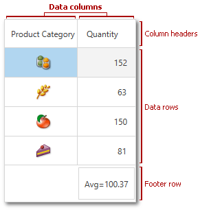
- A column header identifies a column. This header displays the column’s caption and allows users to move and resize the column, apply sorting and filtering, etc. To change a column’s caption, specify the BaseColumn.Header property. For more information about column header settings, see Column Header Customization.
- Cells display values from the corresponding field in a data source.
- A footer cell displays total summaries.

TreeList Hierarchy Column
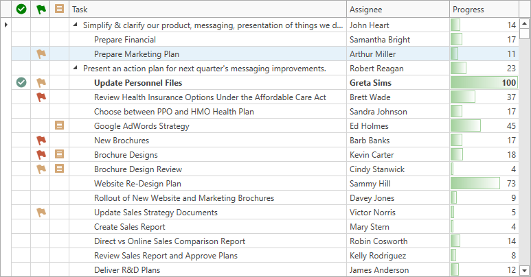
The TreeList’s hierarchy column is the first visible column. This column displays expand and collapse buttons. Use the TreeListView.TreeColumnFieldName property to explicitly specify the hierarchy column and move this column and its associated hierarchy information to any position.

Card Fields
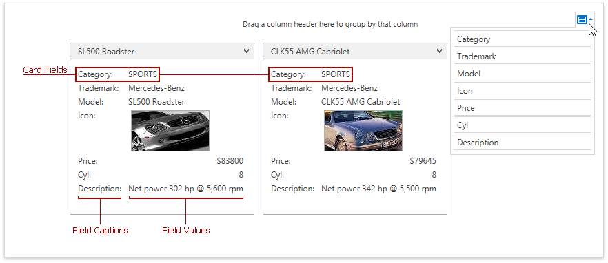
A card field consists of the following elements:
- The caption indicates a data source field to which the card field corresponds.
- A field value.

For more information on card settings, see Card Settings.
Band Columns
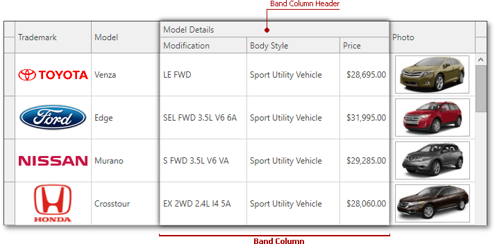
The TableView allows you to organize columns into groups (bands) and display them within multi-row headers. A band column is represented by a header displayed above the grouped columns’ headers.

For detailed information on band column settings, see Bands.