Chart Themes and Palettes
- 3 minutes to read
This document explains how to apply a theme to your chart, use built-in palettes to change the appearance of a particular chart element and create your custom palette.
DXCharts provides the capability to not only customize the appearance (font, style, color, etc.) of any chart element (diagram, axis, point, label, etc.) but also assign a theme to the entire chart. In addition, several built-in palettes can be used to automatically color bars in a bar series view, sectors in a pie view, etc., in minimal time and with minimal effort.
This document includes the following sections.
Assign a Theme to a Chart
A theme specifies the appearance of all of the chart’s visual elements, and thus defines the overall look and feel.
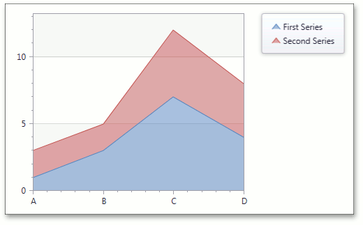
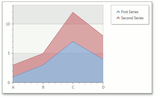
The following images show a Stacked Area chart with two different themes applied: DXStyle and LightGray.
| ThemeName = DXStyle | ThemeName = LightGray |
|---|---|
 |
 |
To assign a theme to your chart, add the corresponding assemblies to the Reference list of your project.
For a full list of available theme assemblies, see the List of DevExpress WPF Themes document.
Next, add the following reference to your application’s Window.
<Window xmlns:core="http://schemas.devexpress.com/winfx/2008/xaml/core">
Set the ThemeManager.ThemeName property to the required theme name.
<dxc:ChartControl core:ThemeManager.ThemeName="MetropolisDark"/>
The ThemeName property affects the look and feel of the entire application. In case this property is defined multiple times (e.g., with different themes assigned to various controls), only the most recent assignment is taken into account.
For an example of theme use, see How to: Use Themes to Define the Look and Feel of Your Chart.
Built-in Palettes
The ChartControlBase.Palette property defines colors in which to paint series or series points. When the XYSeries.ColorEach property is enabled, the color of each point is specified from the current palette.
The Palette property can be set either to one of the standard palettes, or to a CustomPalette object.
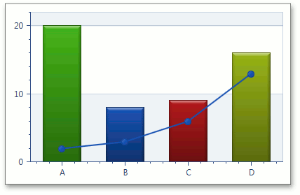
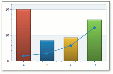
The two built-in palettes applied to a chart with Bar (the ColorEach property is enabled) and Line series are shown below.
| Palette = DXChartsPalette | Palette = PastelKitPalette |
|---|---|
 |
 |
The name of the currently selected palette can be accessed via its PaletteName property (e.g., DXChartsPalette.PaletteName, PastelKitPalette.PaletteName, etc.). If some of the default palette colors were manually changed, you can obtain the currently used set of colors via the ChartControlBase.Palette property.
The following example shows how to use palettes: How to: Use the Chart Palette for Painting Series and their Points
Custom Palette
To create a custom palette, do the following:
- assign a CustomPalette object to the ChartControlBase.Palette property;
- add the desired colors to the ColorCollection, which is accessible via the CustomPalette.Colors property.
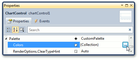
The second step can be implemented using the Color Collection Editor.
To invoke this editor, click the Colors ellipsis button in the Properties window, as shown in the image below.
In the image below, you can see the Color Collection Editor with Blue, Yellow and Magenta colors added to the color collection.
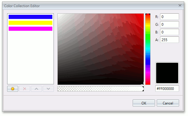
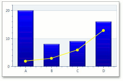
Chart series color from this custom palette are shown below:
For more information on chart appearance customization, see the Series and Marker Models and Custom Draw topics.