Appearance Customization
- 3 minutes to read
This topic describes properties that you can use to customize the appearance of common UI elements.
Supported Themes
The appearance properties listed in this topic are available only in the following DevExpress themes:
| Theme Family | Themes |
|---|---|
| Windows 10 | Light |
| Office 2019 | Black, Colorful, Dark Gray, White, HighContrast |
| Visual Studio 2019 | Blue, Dark, Light |
| Office 2016 SE | Black, Colorful, Dark Gray, White |
| Visual Studio 2017 | Blue, Dark, Light |
Editor-Specific UI Elements
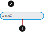
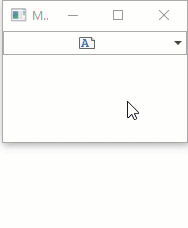
Edit Box
Default State
<Window ...
    xmlns:dxe="http://schemas.devexpress.com/winfx/2008/xaml/editors">
    <dxe:TextEdit NullTextForeground="#FFACACAC" NullText="Input a Name" Text="William" CornerRadius="14"
                  Foreground="#FF505050" Background="#FFE9EBEC" BorderBrush="#FF0D3A50" BorderThickness="2"/>
</Window>
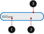
Focused State
<Window ...
    xmlns:dxe="http://schemas.devexpress.com/winfx/2008/xaml/editors">
    <dxe:TextEdit Text="William" Foreground="#FF505050" Background="#FFE9EBEC" CornerRadius="14"
                  BorderBrush="#FF0D3A50" BorderThickness="2" Height="30" Foreground="#FF505050"
                  dxe:EditorAppearanceProperties.FocusedBorderBrush="#FF149EE3" CaretBrush="#FF14E3C1" />
</Window>
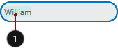
ReadOnly State
<Window ...
    xmlns:dxe="http://schemas.devexpress.com/winfx/2008/xaml/editors">
    <dxe:TextEdit Text="William" Foreground="#FF505050" Background="#FFE9EBEC" CornerRadius="14"
                  BorderBrush="#FF0D3A50" BorderThickness="2" Height="30" IsReadOnly="True"
                  Foreground="#FF505050" dxe:EditorAppearanceProperties.ReadOnlyBackground="#FFDEDEDE"
                  dxe:EditorAppearanceProperties.ReadOnlyBorderBrush="#FFBABABA"/>
</Window>
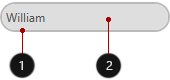
Text Selection
<Window ...
    xmlns:dxe="http://schemas.devexpress.com/winfx/2008/xaml/editors">
    <dxe:TextEdit Text="William" Foreground="#FF505050" Background="#FFE9EBEC"
                  CornerRadius="14" BorderThickness="2" BorderBrush="#FF0D3A50"
                  SelectionBrush="#FF14E3C1" SelectionOpacity="0.1" />
</Window>
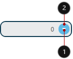
Editor Buttons
The following code snippet changes the default editor button’s appearance:
<Window ...
    xmlns:dxe="http://schemas.devexpress.com/winfx/2008/xaml/editors">
    <dxe:PopupCalcEdit BorderThickness="2" Foreground="#ff505050" AllowDefaultButton="False"
                       Background="#FFE9EBEC" BorderBrush="#FF0D3A50" CornerRadius="10">
        <dxe:PopupCalcEdit.Buttons>
            <dxe:ButtonInfo IsDefaultButton="True" GlyphKind="DropDown"
                            Background="#FF5FB9E5" Foreground="#FFFFFFFF"
                            Margin="3" Padding="3,0,3,0" CornerRadius="10"/>
        </dxe:PopupCalcEdit.Buttons>
    </dxe:PopupCalcEdit>
</Window>
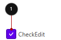
Check Mark
EditorAppearanceProperties.CheckEditGlyphBrush,
EditorAppearanceProperties.CheckedStateBackground,
EditorAppearanceProperties.CheckedStateBorderBrush,
Foreground, CornerRadius, BorderBrush, BorderThickness, CheckBoxHeight, CheckBoxWidth.
<Window ...
    xmlns:dxe="http://schemas.devexpress.com/winfx/2008/xaml/editors">
    <dxe:CheckEdit
        dxe:EditorAppearanceProperties.CheckEditGlyphBrush="White"
        dxe:EditorAppearanceProperties.CheckedStateBackground="#FF6200EE"
        dxe:EditorAppearanceProperties.CheckedStateBorderBrush="#FF4E00BE"
        Foreground="#FF505050" BorderBrush="#FF4E00BE" BorderThickness="2"
        CheckBoxHeight="20" CheckBoxWidth="20" Content="CheckEdit"
        CornerRadius="2" IsChecked="True" />
</Window>
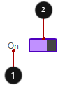
Toggle
- Foreground, CheckedStateContent, UncheckedStateContent,
- EditorAppearanceProperties.CheckedStateBackground, EditorAppearanceProperties.CheckedStateBorderBrush, CornerRadius, BorderBrush, BorderThickness, ToggleSwitchHeight, ToggleSwitchWidth.
<Window ...
    xmlns:dxe="http://schemas.devexpress.com/winfx/2008/xaml/editors">
    <dxe:ToggleSwitch
        dxe:EditorAppearanceProperties.CheckedStateBackground="#FFC090FF"
        dxe:EditorAppearanceProperties.CheckedStateBorderBrush="#FF4E00BE"
        BorderBrush="#FF4E00BE"
        BorderThickness="2"
        CornerRadius="2"
        Foreground="#FF505050"
        ToggleSwitchHeight="20"
        ToggleSwitchWidth="40"
        CheckedStateContent="On"
        UncheckedStateContent="Off" />
</Window>
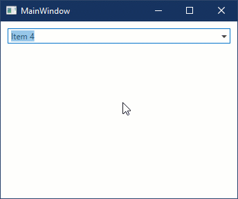
ListBox and ComboBox Item
You can use the LookUpEditBase.ItemContainerStyle property to customize ListBox and ComboBox item appearance:
<Window ...
    xmlns:dxe="http://schemas.devexpress.com/winfx/2008/xaml/editors">
     <StackPanel>
        <StackPanel.Resources>
            <Style x:Key="itemStyle" TargetType="ListBoxItem">
                <Setter Property="Padding" Value="15,7" />
                <Setter Property="FontSize" Value="14" />
                <Setter Property="Foreground" Value="Black" />
                <Setter Property="Background" Value="#FFF2F2F2" />
                <Style.Triggers>
                    <Trigger Property="IsMouseOver" Value="True">
                        <Setter Property="Background" Value="#FFDADADA" />
                    </Trigger>
                    <Trigger Property="IsSelected" Value="True">
                        <Setter Property="Background" Value="#FFF7C991" />
                    </Trigger>
                </Style.Triggers>
            </Style>
        </StackPanel.Resources>
        <dxe:ComboBoxEdit ItemContainerStyle="{StaticResource itemStyle}" ... />
    </StackPanel>
</Window>
Popup
The following table lists available appearance customization properties:
| Property | Description |
|---|---|
| PopupMaxHeight | Gets or sets the dropdown’s maximum height. This is a dependency property. |
| PopupMaxWidth | Gets or sets the dropdown’s maximum width. |
| PopupMinHeight | Gets or sets the dropdown’s minimum height. This is a dependency property. |
| PopupMinWidth | Gets or sets the dropdown’s minimum width. |
| PopupHeight | Gets or sets the dropdown’s height. |
| PopupWidth | Gets or sets the dropdown’s width. |
<Window ...
    Width="200" Height="150" xmlns:dxe="http://schemas.devexpress.com/winfx/2008/xaml/editors">
    <dxe:MemoEdit PopupMinHeight="50" PopupMaxHeight="150" PopupHeight="90" PopupMaxWidth="180"
                  MemoTextWrapping="WrapWithOverflow" Text="With over 120 controls and libraries, the DevExpress WPF Subscription will help you deliver high-performance line of business applications that meet and exceed the needs of your enterprise."/>
</Window>
Common UI Elements
You can use the properties listed below to customize the appearance of UI elements common for all data editors.
Button
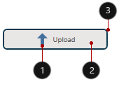
- Glyph, GlyphHeight, GlyphWidth.
- Background, Foreground, FontSize
- Height, BorderBrush, BorderThickness, CornerRadius, Width
<Window ...
    xmlns:dxc="http://schemas.devexpress.com/winfx/2008/xaml/core">
    <dxc:SimpleButton Background="#FFE9EBEC" BorderThickness="2" BorderBrush="#FF0D3A50"
                      CornerRadius="5" Height="30" Width="150" Content="Upload" FontSize="10"
                      Foreground="#ff505050" Glyph="{dxc:DXImage SvgImages/Arrows/MoveUp.svg}"
                      GlyphHeight="20" GlyphWidth="20"/>
</Window>
Text
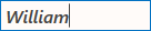
The following table lists available appearance customization properties.
| Property | Description |
|---|---|
| FontFamily | Gets or sets the font family of the control. Inherited from Control. |
| FontSize | Gets or sets the font size. Inherited from Control. |
| FontStretch | Gets or sets the degree to which a font is condensed or expanded on the screen. Inherited from Control. |
| FontStyle | Gets or sets the font style. Inherited from Control. |
| FontWeight | Gets or sets the weight or thickness of the specified font. Inherited from Control. |
<Window ...
    xmlns:dxe="http://schemas.devexpress.com/winfx/2008/xaml/editors">
    <dxe:TextEdit EditValue="William" FontFamily="Segoe UI" FontSize="16"
                  FontStyle="Italic" FontWeight="DemiBold"/>
</Window>