How to: Customize Column and Row Headings
- 4 minutes to read
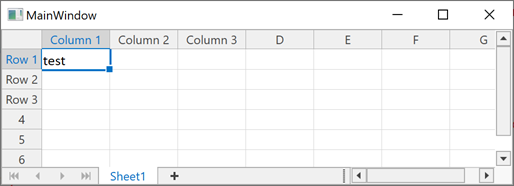
The following code example shows how to change captions in row and column headings.
Note
A complete code sample project is available at https://github.com/DevExpress-Examples/how-to-customize-columns-and-rows-headings-t466836.
Create a View Model
Create a CustomHeaderCaption class used to store the original and new heading.
public class CustomHeaderCaption
    {
        public CustomHeaderCaption(string oldText, string newText)
        {
            this.OriginalCaption = oldText;
            this.NewHeader = newText;
        }
        public string OriginalCaption { get; set; }

        public string NewHeader { get; set; }
    }
Create the SpreadsheetViewModelModel class. Declare the Captions property to access the collection of custom headings, and fill the collection in the ViewModel’s constructor.
public class SpreadsheetViewModel
    {
        public SpreadsheetViewModel()
        {
            Captions = new ObservableCollection<CustomHeaderCaption>();
            FillCaptions();
        }
        public ObservableCollection<CustomHeaderCaption> Captions { get; set; }

        void FillCaptions()
        {
            Captions.Add(new CustomHeaderCaption("A", "Column 1"));
            Captions.Add(new CustomHeaderCaption("B", "Column 2"));
            Captions.Add(new CustomHeaderCaption("C", "Column 3"));

            Captions.Add(new CustomHeaderCaption("1", "Row 1"));
            Captions.Add(new CustomHeaderCaption("2", "Row 2"));
            Captions.Add(new CustomHeaderCaption("3", "Row 3"));
        }
    }
Create a Converter
Create a converter class to convert old captions. In this example, the HeaderConverter class implements the IMultiValueConverter interface to specify multiple bindings in XAML. The converter compares the original heading with the CustomHeaderCaption collection item’s OriginalCaption property value. If values are the same, the converter changes the heading to the item’s NewHeader value.
public class HeaderConverter : IMultiValueConverter
{

    public object Convert(object[] value, Type targetType, object parameter, CultureInfo culture)
    {
        if (value == null || value[0] == null)
            return null;
        string columnHeader = value[0].ToString();
        ObservableCollection<CustomHeaderCaption> collection = value[1] as ObservableCollection<CustomHeaderCaption>;
        if (collection == null || collection.Count == 0)
            return columnHeader;

        string result = collection.Where(l => l.OriginalCaption == columnHeader).Select(caption => caption.NewHeader).FirstOrDefault();
        if (result != null)
            return result;

        return columnHeader;
    }

    public object[] ConvertBack(object value, Type[] targetTypes, object parameter, CultureInfo culture)
    {
        return null;
    }
}
Add Row and Column Templates
- In XAML, bind the ViewModel to the DataContext property, and the HeaderConverter to the resources.
Add resource templates for rows and columns.
The TextBlock object in the templates represents the row or column heading. Specify multiple bindings for the TextBlock.Text property in both templates. Use the HeaderConverter as the binding converter, and set the TextBlock.Text and SpreadsheetViewModelModel.Captions property as binding parameters. These values are passed to the HeaderConverter.Convert method as the value parameter.
Tip
Change the SpreadsheetViewOptions.RowHeaderWidth property value to change the size of the new row caption in the row header.
<dx:ThemedWindow.DataContext>
    <local:SpreadsheetViewModel/>
</dx:ThemedWindow.DataContext>
<dx:ThemedWindow.Resources>
<local:HeaderConverter x:Key="HeaderConverter"/>

    <!--Column Header Template-->
    <ControlTemplate x:Key="{themes:SpreadsheetThemeKey ResourceKey=VerticalHeaderItem, IsThemeIndependent=True}" TargetType="{x:Type dxspsi:HeaderItem}">
        <Grid x:Name="Root">
            <Border x:Name="IsDefault" Background="#FFF0F0F0" BorderBrush="#FFABABAB" BorderThickness="0,0,1,1">
                    <TextBlock x:Name="Content" Foreground="#FF444444" HorizontalAlignment="Center" TextAlignment="Center" VerticalAlignment="Center" FontSize="{Binding Path=FontHeight, RelativeSource={RelativeSource TemplatedParent}}">
                <!--Specify multiple binding-->
                    <TextBlock.Text>
                        <MultiBinding Converter="{local:HeaderConverter}">
                            <Binding Path="Text" RelativeSource="{RelativeSource TemplatedParent}"/>
                            <Binding Path="Captions" Mode="OneWay"/>
                        </MultiBinding>
                    </TextBlock.Text>
                </TextBlock>
            </Border>
            <Border x:Name="IsSelection" Background="#FF0173C7" HorizontalAlignment="Right" Opacity="0" Width="2"/>
        </Grid>
        <ControlTemplate.Triggers>
            <Trigger Property="IsMouseOver" Value="True">
                <Setter Property="Foreground" TargetName="Content" Value="#FF0173C7" />
                <Setter Property="Background" TargetName="IsDefault" Value="#FFE6F2FA" />
                <Setter Property="BorderBrush" TargetName="IsDefault" Value="#FFABABAB"/>
            </Trigger>
            <Trigger Property="IsSelected" Value="True">
                <Setter Property="Foreground" TargetName="Content" Value="#FF0173C7"/>
                <Setter Property="Background" TargetName="IsDefault" Value="#FFD5D5D5"/>
                <Setter Property="BorderBrush" TargetName="IsDefault" Value="#FFABABAB"/>
                <Setter Property="Opacity" TargetName="IsSelection" Value="1"/>
            </Trigger>
        </ControlTemplate.Triggers>
    </ControlTemplate>

    <!--Row Header Template-->
    <ControlTemplate x:Key="{themes:SpreadsheetThemeKey ResourceKey=HorizontalHeaderItem, IsThemeIndependent = true}" TargetType="{x:Type dxspsi:HeaderItem}">
        <Grid x:Name="Root">
            <Border x:Name="IsDefault" Background="#FFF0F0F0" BorderBrush="#FFABABAB" BorderThickness="0,0,1,1">
                    <TextBlock x:Name="Content" Foreground="#FF444444" HorizontalAlignment="Center" TextAlignment="Center" VerticalAlignment="Center" FontSize="{Binding Path=FontHeight, RelativeSource={RelativeSource TemplatedParent}}">
                    <!--Specify multiple binding-->
                    <TextBlock.Text>
                        <MultiBinding Converter="{local:HeaderConverter}">
                            <Binding Path="Text" RelativeSource="{RelativeSource TemplatedParent}" />
                            <Binding Path="Captions" Mode="OneWay"/>
                        </MultiBinding>
                    </TextBlock.Text>
                </TextBlock>
            </Border>
            <Border x:Name="IsSelection" Background="#FF0173C7" Height="2" Opacity="0" VerticalAlignment="Bottom"/>
        </Grid>
        <ControlTemplate.Triggers>
            <Trigger Property="IsMouseOver" Value="True">
                <Setter Property="Foreground" TargetName="Content" Value="#FF0173C7"/>
                <Setter Property="Background" TargetName="IsDefault" Value="#FFE6F2FA"/>
                <Setter Property="BorderBrush" TargetName="IsDefault" Value="#FFABABAB"/>
            </Trigger>
            <Trigger Property="IsSelected" Value="True">
                <Setter Property="Foreground" TargetName="Content" Value="#FF0173C7" />
                <Setter Property="Background" TargetName="IsDefault" Value="#FFD5D5D5" />
                <Setter Property="BorderBrush" TargetName="IsDefault" Value="#FFABABAB"/>
                <Setter Property="Opacity" TargetName="IsSelection" Value="1"/>
            </Trigger>
        </ControlTemplate.Triggers>
    </ControlTemplate>
</dx:ThemedWindow.Resources>

<Grid>
    <dxsps:SpreadsheetControl x:Name="ssControl1" DocumentSource="Book1.xlsx">
        <dxsps:SpreadsheetControl.Options>
            <dxsps:SpreadsheetControlOptions>
                <dxsps:SpreadsheetControlOptions.View>
                    <dxsps:SpreadsheetViewOptions RowHeaderWidth="80"/>
                </dxsps:SpreadsheetControlOptions.View>
            </dxsps:SpreadsheetControlOptions>
        </dxsps:SpreadsheetControl.Options>
    </dxsps:SpreadsheetControl>
</Grid>