Customize Colors
- 4 minutes to read
How Elements are Colorized
Built-in application themes can be divided into two groups: Modern and Classic.
Modern Themes
- Office2019 (White, DarkGray, Colorful, Black)
- VisualStudio2017 (Light, Dark, Blue)
- Office2016SE (White, DarkGray, Colorful, Black)
- Metropolis (Light, Dark)
- DeepBlue
In the themes listed above, resource and derived colors are used to paint resource headers, date headers, and navigation buttons.
An appointment’s color depends on its label color. If the label color is set to transparent, the appointment has the same color as its resource.
Tip
The default None label is transparent in modern themes.
Classic Themes
- DXStyle
- LightGray
- Office2013 (DarkGray, LightGray)
- Office2010 (Black, Blue, Silver)
- Office2007 (Black, Blue, Silver)
- Seven
- VS2010
In the themes listed above, resource colors and derived colors are used to paint time slots.
The color of an appointment corresponds to its label color. If the label color is set to transparent, the appointment has the same color as its resource.
Brushes and Customization
The following properties allow you to explicitly set brushes used to paint scheduler resources, labels, statuses and time regions:
Brush Palette
You can use the SchedulerControl.BrushSet property to define a custom set of brushes. See the example below.
<dxsch:SchedulerControl.BrushSet>
    <dxsch:BrushSet>
        <dxsch:BrushInfo Name="Red" Brush="Red"/>
        <dxsch:BrushInfo Name="Blue" Brush="Blue"/>
    </dxsch:BrushSet>
</dxsch:SchedulerControl.BrushSet>
You can then use the properties listed below to access a brush from SchedulerControl.BrushSet by its Name value:
- ResourceItem.BrushName
- AppointmentLabelItem.BrushName
- AppointmentStatusItem.BrushName
- TimeRegionItem.BrushName
The Brush properties have a higher priority than the BrushName properties. If both are specified, the Brush property value is used.
DefaultBrushNames
The static DefaultBrushNames class contains names of default brushes. These brushes are theme-dependent.
The XAML snippet below illustrates how to assign a theme-dependent brush to a label item:
 <dxsch:SchedulerControl>
    <dxsch:SchedulerControl.AppointmentLabelItems>
        <dxsch:AppointmentLabelItem Id="0" Caption="Important" BrushName="{x:Static dxsch:DefaultBrushNames.LabelImprotant}"/>
    </dxsch:SchedulerControl.AppointmentLabelItems>
 </dxsch:SchedulerControl>
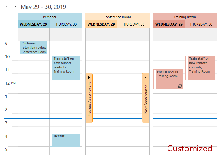
You can redefine the default brushes for all themes as shown in the XAML snippet below:
<dxsch:SchedulerControl.BrushSet>
    <dxsch:BrushSet>
        <dxsch:BrushInfo Name="{x:Static dxsch:DefaultBrushNames.Resource1}" Brush="LightBlue"/>
        <dxsch:BrushInfo Name="{x:Static dxsch:DefaultBrushNames.Resource2}" Brush="Bisque"/>
        <dxsch:BrushInfo Name="{x:Static dxsch:DefaultBrushNames.Resource3}" >
            <SolidColorBrush Color="#E9AFA3"/>
        </dxsch:BrushInfo>
    </dxsch:BrushSet>
</dxsch:SchedulerControl.BrushSet>
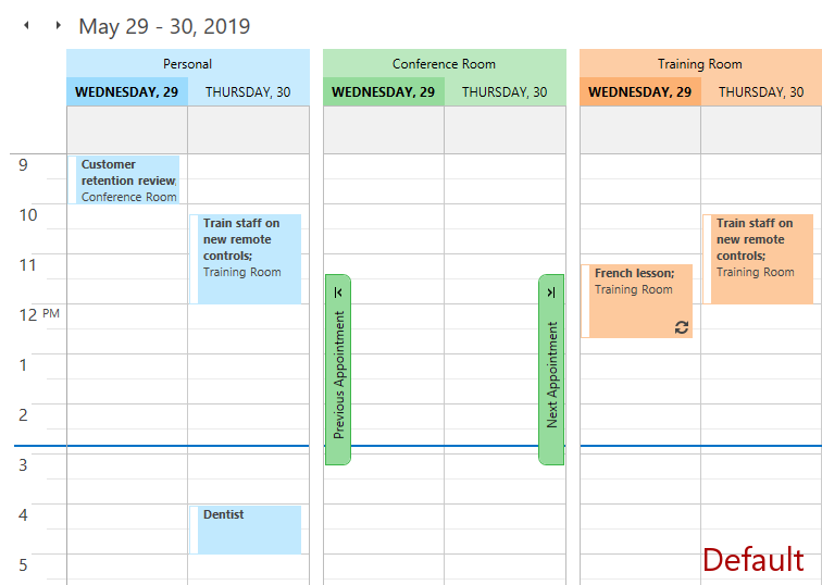
The images below illustrate the result of this customization.
Customize Specific Themes
You can associate the brush set with a specific theme and style. The example below illustrates how to configure brush sets for the Office2019Colorful and Office2019Black themes.
xmlns:dxscht="http://schemas.devexpress.com/winfx/2008/xaml/scheduling/themekeys"

<UserControl.Resources>
    <dxsch:BrushSet x:Key="{dxscht:SchedulerThemeKey
    ResourceKey=BrushSet, ThemeName=Office2019Colorful}">
        <dxsch:BrushInfo Name="{x:Static dxsch:DefaultBrushNames.Resource1}" Brush="LightBlue"/>
        <dxsch:BrushInfo Name="{x:Static dxsch:DefaultBrushNames.Resource2}" Brush="Bisque"/>
        <dxsch:BrushInfo Name="{x:Static dxsch:DefaultBrushNames.Resource3}" >
            <SolidColorBrush Color="#E9AFA3"/>
        </dxsch:BrushInfo>
    </dxsch:BrushSet>

    <dxsch:BrushSet x:Key="{dxscht:SchedulerThemeKey
ResourceKey=BrushSet, ThemeName=Office2019Black}">
        <dxsch:BrushInfo Name="{x:Static dxsch:DefaultBrushNames.Resource1}">
            <SolidColorBrush Color="#3B7547"/>
        </dxsch:BrushInfo>
        <dxsch:BrushInfo Name="{x:Static dxsch:DefaultBrushNames.Resource2}" Brush="CadetBlue"/>
        <dxsch:BrushInfo Name="{x:Static dxsch:DefaultBrushNames.Resource3}" >
            <SolidColorBrush Color="#171729"/>
        </dxsch:BrushInfo>
    </dxsch:BrushSet>

</UserControl.Resources>
Brush Provider
The BrushProvider provides an alternative way to customize the Scheduler’s colors.
The BrushProvider stores colorization settings for all Scheduler elements.
The BrushProvider implementation is unique for each theme. DevExpress themes are located in the C:\Program Files (x86)\DevExpress 19.2\Components\Sources\DevExpress.Xpf.Themes\ directory. To access the default BrushProvider implementation, locate the \Scheduling\Generic\DefaultBrushProvider.xaml file within a theme directory.
If the SchedulerControl.GroupType property is set to None, BrushProvider properties with the Default prefix define the brush used to paint the Scheduler elements.
DefaultNavigationButtonNormalForeground
DefaultNavigationButtonNormalBackground
DefaultNavigationButtonNormalBorderBrush
DefaultNavigationButtonHoverForeground
DefaultNavigationButtonHoverBackground
DefaultNavigationButtonHoverBorderBrush
DefaultNavigationButtonPressedForeground
DefaultNavigationButtonPressedBackground
DefaultNavigationButtonPressedBorderBrush
DefaultNavigationButtonDisabledBackground
DefaultNavigationButtonDisabledBorderBrush
DefaultLightCellLightBorderBrush
DefaultLightCellDarkBorderBrush
DefaultDarkCellLightBorderBrush
If the SchedulerControl.GroupType property is set to GroupByResource or GroupByDate, the BrushProvider properties of the IBrushTransform type define the transformations of the default brushes.
ResourceHeaderTodayBorderBrush
ResourceNavigationButtonNormalForeground
ResourceNavigationButtonNormalBackground
ResourceNavigationButtonNormalBorderBrush
ResourceNavigationButtonHoverForeground
ResourceNavigationButtonHoverBackground
ResourceNavigationButtonHoverBorderBrush
ResourceNavigationButtonPressedForeground
ResourceNavigationButtonPressedBackground
ResourceNavigationButtonPressedBorderBrush
ResourceNavigationButtonDisabledBackground
ResourceNavigationButtonDisabledBorderBrush
ResourceLightCellLightBorderBrush
ResourceLightCellDarkBorderBrush
ResourceDarkCellLightBorderBrush
If the SchedulerControl.GroupType property is set to None, appointments that have multiple associated resources and a transparent label are painted with the BrushProvider.DefaultLabelBrush.
Customization
Use the SchedulerControl.BrushProvider property to add customizations that override the default BrushProvider values in all themes. The Scheduler provides the following predefined transformations:
The example below shows how to override a default brush in all themes.
<dxsch:SchedulerControl.BrushProvider>
    <dxsch:BrushProvider DefaultLabelBrush="LightBlue" />
</dxsch:SchedulerControl.BrushProvider>
The example below shows how to override a default brush and its transformation in the DXStyle theme.
xmlns:dxscht="http://schemas.devexpress.com/winfx/2008/xaml/scheduling/themekeys"

 <UserControl.Resources>
     <dxsch:BrushProvider
         x:Key="{dxscht:SchedulerThemeKey ResourceKey=BrushProvider, ThemeName=DXStyle}"
         BasedOn="{DynamicResource {dxscht:SchedulerThemeKey ResourceKey=BrushProvider, ThemeName=DXStyle}}"
         DefaultHeaderTodayBackground="Red"
         ResourceHeaderTodayBackground="{dxsch:OverrideBrushTransform OverrideBrush=Green}"
         ResourceHeaderBackground="{dxsch:BrightnessBrushTransform Brightness=-0.5}"/>
 </UserControl.Resources>
The BrushProvider supports conditions. The following example illustrates how to override a brush transformation in the Timeline view:
<dxsch:SchedulerControl.BrushProvider>
    <dxsch:BrushProvider>
        <dxsch:BrushProviderOverride
            ConditionViewType="TimelineView"
            ResourceHeaderBackground="{dxsch:BrightnessBrushTransform Brightness=-0.5}"/>
    </dxsch:BrushProvider>
</dxsch:SchedulerControl.BrushProvider>
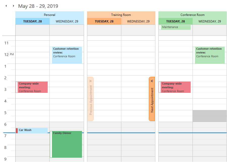
New and Legacy UI Styles
Starting with v19.1, the Scheduler uses the new Outlook2019 UI style. The new style uses resource colors and derived colors to paint the Scheduler’s elements. This improves readability and facilitates customization.
In v18.2 and earlier, the Scheduler uses the Classic Scheduler UI style based on a fixed theme color scheme.
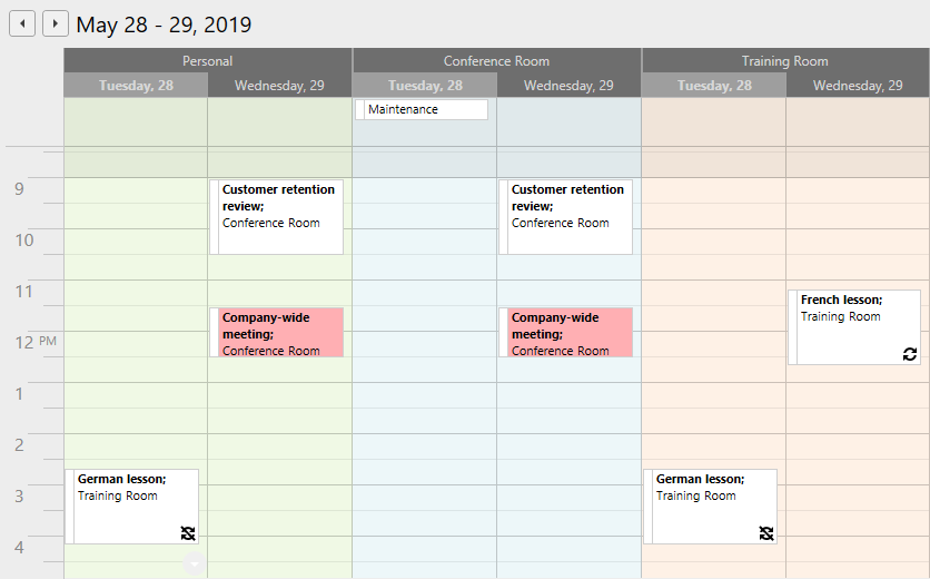
To roll back to the Classic style, set the DevExpress.Xpf.Core.CompatibilitySettings.SchedulerAppearanceStyle static property to SchedulerAppearanceStyle.Classic.
The Classic style has its own resource keys for resource and label palettes.
Element | Resource key |
|---|---|
Resources | SchedulerThemeKeys.ResourceColors_Classic |
Labels | SchedulerThemeKeys.LabelColors_Classic |