Appearance Customization
- 4 minutes to read
How Elements are Colorized
Starting with v19.1, the Scheduler uses the new Outlook2019 UI style.
In v18.2 and earlier, the Scheduler’s UI style uses a fixed color scheme based on the theme. The new Outlook2019 style uses resource colors and derived colors to paint the Scheduler’s elements. This improves readability and facilitates customization.
Modern Themes
- Office2019 (White, DarkGray, Colorful, Black)
- VisualStudio2017 (Light, Dark, Blue)
- Office2016SE (White, DarkGray, Colorful, Black)
- Metropolis (Light, Dark)
- DeepBlue
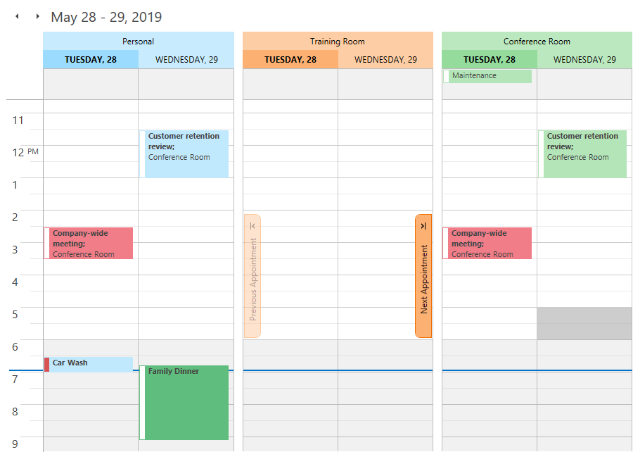
In the themes listed above, resource and derived colors are used to paint resource headers, date headers, and navigation buttons.
An appointment’s color depends on its label color. If the label color is set to transparent, the appointment has the same color as its resource.
Tip
The default None label is transparent in modern themes.
Classic Themes
- DXStyle
- LightGray
- Office2013 (DarkGray, LightGray)
- Office2010 (Black, Blue, Silver)
- Office2007 (Black, Blue, Silver)
- Seven
- VS2010
In the themes listed above resource colors and derived colors are used to paint time slots.
The color of an appointment corresponds to its label color. If the label color is set to transparent, the appointment has the same color as its resource.
Palettes
The ResourceItem.Color property specifies the resource color. If you do not specify this property, the Scheduler uses the resource item color from the SchedulerControl.ResourceColors palette.
In a similar manner, the AppointmentLabelItem.Color and SchedulerControl.LabelColors properties specify the label color and label palette. If the AppointmentLabelItem.Color property is not specified, a SchedulerControl.LabelColors collection item is used instead.
Customization
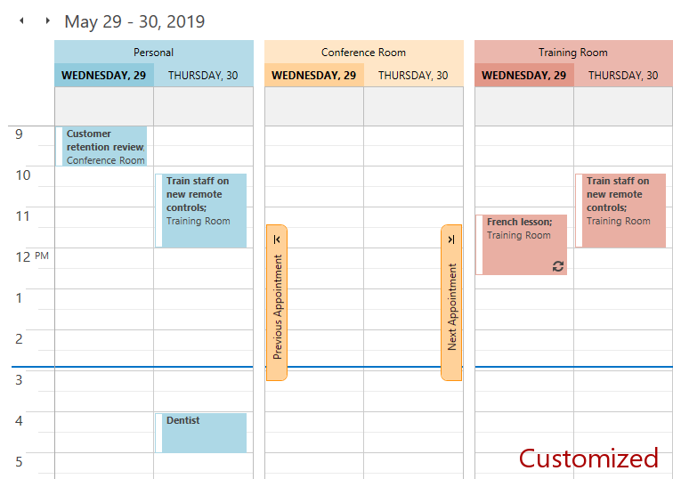
Use the SchedulerControl.ResourceColors collection to configure the resource palette. Colors that are derived from the resource colors are automatically adjusted for consistency.
You can set ResourceColors and LabelColors directly for all themes:
<dxsch:SchedulerControl.ResourceColors>
    <Color>LightBlue</Color>
    <Color>Bisque</Color>
    <Color>#E9AFA3</Color>
</dxsch:SchedulerControl.ResourceColors>
<dxsch:SchedulerControl.LabelColors>
    <Color>Transpared</Color>
    <Color>Red</Color>
</dxsch:SchedulerControl.LabelColors>
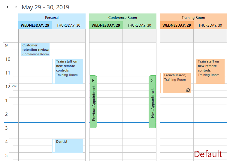
The images below illustrate the result of this customization.
You can associate the resource and label palettes with a specific theme and style. To do this, create a DevExpress.Xpf.Scheduling.ColorCollection and assign the corresponding resource key to it:
Element | Resource key |
|---|---|
Resources | SchedulerThemeKeys.ResourceColors |
Labels | SchedulerThemeKeys.LabelColors |
The example below illustrates how to configure resource palettes for the Office2019Colorful and Office2019Black themes.
xmlns:dxscht="http://schemas.devexpress.com/winfx/2008/xaml/scheduling/themekeys"

<UserControl.Resources>
 <dxsch:ColorCollection x:Key="{dxscht:SchedulerThemeKey
  ResourceKey=ResourceColors, ThemeName=Office2019Colorful}">
  <Color>LightBlue</Color>
  <Color>Bisque</Color>
  <Color>#E9AFA3</Color>
</dxsch:ColorCollection>

<dxsch:ColorCollection x:Key="{dxscht:SchedulerThemeKey
  ResourceKey=ResourceColors, ThemeName=Office2019Black}">
  <Color>#3B7547</Color>
  <Color>CadetBlue</Color>
  <Color>#171729</Color>
</dxsch:ColorCollection>
</UserControl.Resources>
Brush Provider
The BrushProvider stores colorization settings for all Scheduler elements.
The BrushProvider implementation is unique for each theme. DevExpress themes are located in the C:\Program Files (x86)\DevExpress 19.1\Components\Sources\DevExpress.Xpf.Themes\ directory. To access the default BrushProvider implementation, locate the \Scheduling\Generic\DefaultBrushProvider.xaml file within a theme directory.
If the SchedulerControl.GroupType property is set to None, BrushProvider properties with the Default prefix define the brush used to paint the Scheduler elements.
DefaultNavigationButtonNormalForeground
DefaultNavigationButtonNormalBackground
DefaultNavigationButtonNormalBorderBrush
DefaultNavigationButtonHoverForeground
DefaultNavigationButtonHoverBackground
DefaultNavigationButtonHoverBorderBrush
DefaultNavigationButtonPressedForeground
DefaultNavigationButtonPressedBackground
DefaultNavigationButtonPressedBorderBrush
DefaultNavigationButtonDisabledBackground
DefaultNavigationButtonDisabledBorderBrush
DefaultLightCellLightBorderBrush
DefaultLightCellDarkBorderBrush
DefaultDarkCellLightBorderBrush
If the SchedulerControl.GroupType property is set to GroupByResource or GroupByDate, the BrushProvider properties of the IBrushTransform type define the transformations of the default brushes.
ResourceHeaderTodayBorderBrush
ResourceNavigationButtonNormalForeground
ResourceNavigationButtonNormalBackground
ResourceNavigationButtonNormalBorderBrush
ResourceNavigationButtonHoverForeground
ResourceNavigationButtonHoverBackground
ResourceNavigationButtonHoverBorderBrush
ResourceNavigationButtonPressedForeground
ResourceNavigationButtonPressedBackground
ResourceNavigationButtonPressedBorderBrush
ResourceNavigationButtonDisabledBackground
ResourceNavigationButtonDisabledBorderBrush
ResourceLightCellLightBorderBrush
ResourceLightCellDarkBorderBrush
ResourceDarkCellLightBorderBrush
If the SchedulerControl.GroupType property is set to None, appointments that have multiple associated resources and a transparent label are painted with the BrushProvider.DefaultLabelBrush.
Customization
Use the SchedulerControl.BrushProvider property to add customizations that override the default BrushProvider values in all themes. The Scheduler provides the following predefined transformations:
- BrightnessBrushTransform
- GroupBrushTransform
- IdentityBrushTransform
- MultiplyBrushTransform
- OverrideBrushTransform
The example below shows how to override a default brush in all themes.
<dxsch:SchedulerControl.BrushProvider>
    <dxsch:BrushProvider DefaultLabelBrush="LightBlue" />
</dxsch:SchedulerControl.BrushProvider>
The example below shows how to override a default brush and its transformation in the DXStyle theme.
xmlns:dxscht="http://schemas.devexpress.com/winfx/2008/xaml/scheduling/themekeys"

 <UserControl.Resources>
     <dxsch:BrushProvider
         x:Key="{dxscht:SchedulerThemeKey ResourceKey=BrushProvider, ThemeName=DXStyle}"
         BasedOn="{DynamicResource {dxscht:SchedulerThemeKey ResourceKey=BrushProvider, ThemeName=DXStyle}}"
         DefaultHeaderTodayBackground="Red"
         ResourceHeaderTodayBackground="{dxsch:OverrideBrushTransform OverrideBrush=Green}"
         ResourceHeaderBackground="{dxsch:BrightnessBrushTransform Brightness=-0.5}"/>
 </UserControl.Resources>
The BrushProvider supports conditions. The following example illustrates how to override a brush transformation in the Timeline view:
<dxsch:SchedulerControl.BrushProvider>
    <dxsch:BrushProvider>
        <dxsch:BrushProviderOverride
            ConditionViewType="TimelineView"
            ResourceHeaderBackground="{dxsch:BrightnessBrushTransform Brightness=-0.5}"/>
    </dxsch:BrushProvider>
</dxsch:SchedulerControl.BrushProvider>
The Classic (Legacy) Style
The Classic Scheduler UI style is used in v18.2 and earlier.
To roll back to the Classic style, set the DevExpress.Xpf.Core.CompatibilitySettings.SchedulerAppearanceStyle static property to SchedulerAppearanceStyle.Classic.
The Classic style has its own resource keys for resource and label palettes.
Element | Resource key |
|---|---|
Resources | SchedulerThemeKeys.ResourceColors_Classic |
Labels | SchedulerThemeKeys.LabelColors_Classic |