Date Navigation Panel
- 3 minutes to read
The DateNavigationPanel extends end-user functionality of a Scheduler Control. The panel includes navigation controls, allows users to switch between Views, and indicates the date interval of the scheduler’s current view.
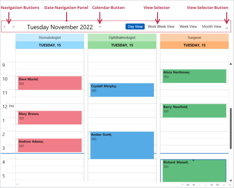
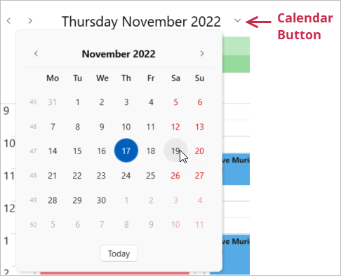
The SchedulerControl includes a pre-configured DateNavigationPanel that shows the Navigation Buttons, the current date, and the Calendar Button. Users can click the Calendar Button to display the drop-down calendar, pick a date, and update the scheduler’s current date interval.
Hide or Show Date Navigation Panel Elements
You can use the following properties to customize the DateNavigationPanel:
ShowViewSelector- Gets or sets whether to display the View selector on the DateNavigationPanel. This is a dependency property.
ShowCalendarButton- Gets or sets whether to display the Calendar Button on the DateNavigationPanel. This is a dependency property.
ShowButtons- Gets or sets whether to display the Back and Next navigation buttons. This is a dependency property.
ShowText- Gets or sets whether to display the text in the panel that indicates the currently visible interval. This is a dependency property.
Use either of the following techniques to apply customization properties to the DateNavigationPanel:
Specify properties in a SchedulerControl.DateNavigationPanelStyle element:
<dxsch:SchedulerControl>
<!---->
    <dxsch:SchedulerControl.DateNavigationPanelStyle>
        <Style TargetType="dxsch:DateNavigationPanel">
            <Setter Property="ShowViewSelector" Value="False" />
            <Setter Property="ShowCalendarButton" Value="True" />
        </Style>
    </dxsch:SchedulerControl.DateNavigationPanelStyle>
<!---->
</dxsch:SchedulerControl>
Set the SchedulerControl.ShowDateNavigationPanel property to
falseand specify properties in a standalone DateNavigationPanel element:<dxsch:SchedulerControl x:Name="scheduler" ShowDateNavigationPanel="False" /> <!----> <dxsch:DateNavigationPanel Scheduler="{Binding ElementName=scheduler}" ShowViewSelector="True" />
Note
The Scheduler hides its built-in Date Navigation Panel if a user switches to List View. A standalone DateNavigationPanel hides its text and navigation buttons but stays visible. If you want to hide the entire control, handle the scheduler’s ActiveViewChanged event.
Date Navigation Panel Caption
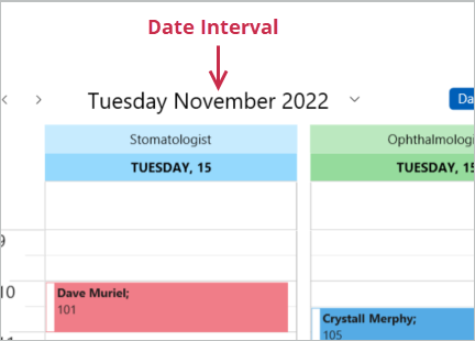
The DateNavigationPanel displays the scheduler’s current date interval. The DisplayMode property specifies whether the text includes dates or month and year information only. You can also customize individual format strings that depend on the current date interval.
The table below shows the text formatting properties for the DisplayMode.Day value.
| Selected Interval | Formatting property | Example |
|---|---|---|
| Single day | DayModeSameDayFormat |
{0:MM.d.yy} |
| Single month | DayModeSameMonthFormat |
{0:dddd.MM.yyyy} - {1:dddd.MM.yyyy} |
| Single year | DayModeSameYearFormat |
{0:d.MM.yyyy} - {1:d.MM.yyyy} |
| One year or more | DayModeFullFormat |
{0:d.MM.yy} - {1:d.MM.yy} |
The table below shows the text formatting properties for the DisplayMode.Month value.
| Selected Interval | Formatting Property | Example |
|---|---|---|
| Single month | MonthModeSameMonthFormat |
{0:d MMMM yyyy} |
| Single year | MonthModeSameYearFormat |
{0:d.MM} - {1:d.MM yyyy} |
| One year or more | MonthModeFullFormat |
{0:MM, yyyy} - {1:MM, yyyy} |
Text Customization Example
This example shows how to customize the text that displays the date interval on the DateNavigationPanel.
Set the following settings:
<dxsch:SchedulerControl.DateNavigationPanelStyle>
    <Style TargetType="dxsch:DateNavigationPanel">
        <Setter Property="ShowViewSelector" Value="True" />
        <Setter Property="DisplayMode" Value="Day" />
        <Setter Property="DayModeSameDayFormat" Value=" {0:dddd MMMM yyyy} " />
        <Setter Property="DayModeSameMonthFormat" Value=" {0:dd.MM.yyyy} - {1:dd.MM.yyyy} " />
        <Setter Property="DayModeSameYearFormat" Value=" {0:dd.MM.yy} - {1:dd.MM.yy} " />
        <Setter Property="DayModeFullFormat" Value=" {0:MM.yy} - {1:MM.yy} " />
    </Style>
</dxsch:SchedulerControl.DateNavigationPanelStyle>
The table below illustrates how the text on the DateNavigationPanel is displayed for different time intervals.
| Interval | Example |
|---|---|
| Single day | 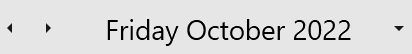 |
| Single month | 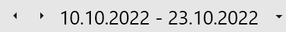 |
| Single year | 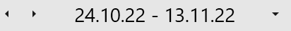 |
| One year or more | 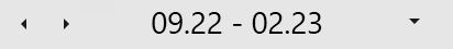 |