Customize Header Layout
- 2 minutes to read
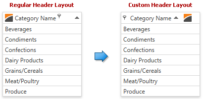
You can customize a column header layout to rearrange its elements. The following image shows a layout change:
The following code sample demonstrates how to rearrange column header elements as shown in the image above:
<dx:ThemedWindow.Resources>
   <ControlTemplate x:Key="{dxgt:GridColumnHeaderThemeKey ResourceKey=Layout, IsThemeIndependent=True}">
      <Grid>
         <Grid.ColumnDefinitions>
            <ColumnDefinition Width="*"></ColumnDefinition>
            <ColumnDefinition Width="4"></ColumnDefinition>
         </Grid.ColumnDefinitions>
         <StackPanel Orientation="Horizontal">
            <ContentControl Name="PART_Filter" VerticalAlignment="Center" />
            <ContentControl Name="PART_Content" VerticalAlignment="Center" Margin="5,0,0,0" />
            <dxg:SortIndicatorControl Name="PART_SortIndicator" Visibility="Collapsed" />
            <Image Source="{Binding Image}" Margin="10,4,0,4" />
         </StackPanel>
         <dxg:GridThumb Name="PART_Thumb" Cursor="SizeWE" />
      </Grid>
   </ControlTemplate>
</dx:ThemedWindow.Resources>
Follow the steps below to customize a column header layout:
Specify a theme resource value manually by adding a template with the corresponding key to resources (the data context for this template is the BaseColumn class):
<dx:ThemedWindow.Resources>
   <ControlTemplate x:Key="{dxgt:GridColumnHeaderThemeKey ResourceKey=Layout, IsThemeIndependent=True}">
      <!---->
   </ControlTemplate>
</dx:ThemedWindow.Resources>
To specify individual themes’ appearance, create templates for each theme and set each template’s ThemeName property accordingly:
<ControlTemplate x:Key="{dxgt:GridColumnHeaderThemeKey ResourceKey=Layout,ThemeName=Office2016}">
   <!---->
</ControlTemplate>
<ControlTemplate x:Key="{dxgt:GridColumnHeaderThemeKey ResourceKey=Layout,ThemeName=MetropolisDark}">
   <!---->
</ControlTemplate>
Specify the required column header layout using panel elements (for example, StackPanel, DockPanel, Grid, etc.):
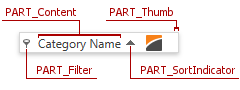
<ControlTemplate x:Key="{dxgt:GridColumnHeaderThemeKey ResourceKey=Layout, IsThemeIndependent=True}">
   <Grid>
      <!---->
   </Grid>
</ControlTemplate>
Add the required elements to the specified layout. You can use predefined elements with the following names:
- PART_Content - a column header content.
- PART_Filter - a filter button.
- PART_SortIndicator - a sort glyph.
- PART_Thumb - a thumb that is used to resize columns.