Paint a custom control
- 2 minutes to read
Color Themes allow you to assign a color value to a name and then use this name as an individual/multiple elements’ color value. When you change the color value assigned to a name, the color of all the elements with this name changes to the newly assigned color.
Color themes allow you to use palette colors as resources in code. This feature allows you to paint custom controls with the DevExpress Theme colors to make application’s style consistent. You can find the theme resource keys in the following files:
DevExpressControlsInstallationPath\Components\Sources\DevExpress.Xpf.Themes\Theme_Name\Core\Core\Themes\Theme_Name\Palettes.xaml
DevExpressControlsInstallationPath\Components\Sources\DevExpress.Xpf.Themes\Theme_Name\Core\Core\Themes\Theme_Name\Palettes_Base.xaml
The following themes are available:
- Office2016BlackSE
- Office2016ColorfulSE
- Office2016DarkGraySE
- Office2016WhiteSE
- VS2017Blue
- VS2017Dark
- VS2017Light
The code example below demonstrates how to bind the VS2017Blue theme’s Border palette resource to a custom control’s BorderBrush property:
<Window
    xmlns="http://schemas.microsoft.com/winfx/2006/xaml/presentation"
    xmlns:local="clr-namespace:WpfApp36"
    xmlns:x="http://schemas.microsoft.com/winfx/2006/xaml"
    x:Class="WpfApp36.MainWindow">
    <Grid>
        <Grid.RowDefinitions>
            <RowDefinition/>
        </Grid.RowDefinitions>
        <local:CustomControl1 Grid.Row="0" Margin="5" Text="Custom control binding to a theme name"/>
    </Grid>
</Window>
Add the XPF.Core and VS2017Blue theme references to run this project.
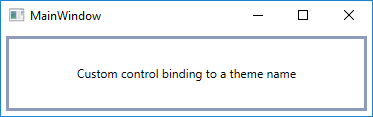
The following image displays the application window:
Note
The complete sample project is available at https://github.com/DevExpress-Examples/Binding-Custom-Controls-to-a-Palette-Resource.