Filter Elements
- 3 minutes to read
Filter Elements allows you to filter the GridControl / TreeListControl‘s data. Filter Elements are separate controls within your application that automatically retrieve available values, format settings, and other information from the bound control.
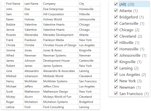
Using Filter Elements, you can build your own UI to filter control data. As an example, here is a UI that uses Filter Elements for a filtering panel displayed next to the GridControl:

Create a Filter Element
- Add a filter element (the FilterElement class descendants) to the markup.
- Set the attached FilterElement.Context property to associate the filter element with the GridControl‘s filter context.
- Specify the field name of the column you want to filter using the FilterElement.FieldName property.
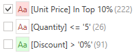
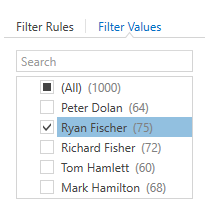
The following code sample uses the CheckedListFilterElement to filter the GridControl‘s data by the City column values:
<dxg:GridControl x:Name="grid" ... />
<!-- ... -->
<dxfui:CheckedListFilterElement Context="{Binding FilteringContext, ElementName=grid}" FieldName="City"/>
The image below shows the result:
Filter Element Types
Filter Element | Description |
|---|---|
|
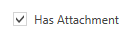
| Allows a user to filter by boolean values. |
|
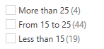
| Allows a user to select one filter value from a set. |
|
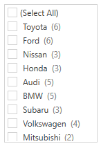
| Allows a user to select multiple filter values from a set. Use the SelectAllWhenFilterIsNull property to specify whether to select all filter values when the filter is null. |
|
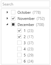
| Allows a user to filter by hierarchical values.
|
|
| Allows a user to apply a column’s Predefined Filters. Use the ColumnBase.PredefinedFilters property to specify predefined filters. |
|
| Allows a user to apply a column’s Conditional Formatting Filters. Use the TableView.FormatConditions / TreeListView.FormatConditions property to define conditional formatting rules. |
|
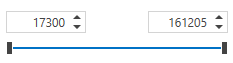
| Allows a user to filter by numeric values. |
|
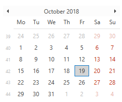
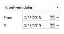
| Allows a user to specify a date interval. |
|
| Allows a user to filter by date values. |
|
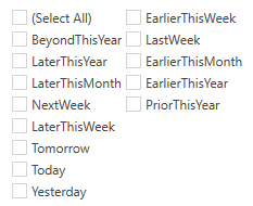
| Allows a user to apply predefined date filters. |
|
| Allows a user to choose filter conditions. |
|
| Consists of two tabs. The first tab allows a user to apply filter conditions. The second tab provides an Excel-style checklist.
|


Limitations
In Virtual Sources and Server Mode, record counts are not displayed by default. To display record counts, handle the DataControlBase.CustomUniqueValues event. For Virtual Sources, you can alternatively handle the GetUniqueValues event.
In Virtual Sources and Server Mode, the RangeFilterElement and DateRangeFilterElement are not supported.