TaskbarButtonService
- 8 minutes to read
TaskbarButtonService is a ITaskbarButtonService implementation that allows you to customize an application taskbar button.
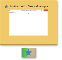
The image below demonstrates possible variants of taskbar button customization.

- Getting Started with TaskbarButtonService
- Defining Thumb Buttons
- Clipping Thumbnail Image
- Displaying an Icon over the Taskbar Button
- Example
Getting started with TaskbarButtonService
Assume that you need to dynamically animate a progress bar or modify the taskbar button background to, for instance, set it to red (error), yellow (pause), etc. To accomplish this task, you can use the TaskbarButtonService class.
Define the TaskbarButtonService in the Interaction.Behaviors collection.
<UserControl x:Class="DXSampleTaskbarButtonService.View.MainView"
    ...
    xmlns:dxmvvm="http://schemas.devexpress.com/winfx/2008/xaml/mvvm"
    xmlns:ViewModel="clr-namespace:DXSampleTaskbarButtonService.ViewModel"
    DataContext="{dxmvvm:ViewModelSource Type={x:Type ViewModel:MainViewModel}}">
    ...
    <dxmvvm:Interaction.Behaviors>
        <dxmvvm:TaskbarButtonService ProgressValue="{Binding ProgressValue}" ProgressState="Normal" ... />
    </dxmvvm:Interaction.Behaviors>
    ...
</UserControl>
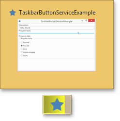
The TaskbarButtonService defined in the code snippet above displays a progress bar which represents the View Model’s ProgressValue property value.
The TaskbarButtonService’s properties can be set from XAML, but since they’re meant to be updated at runtime, setting them directly in code often makes more sense.
To learn how to obtain the TaskbarButtonService if ViewModel is a POCO object, see Services in POCO objects. If it’s a ViewModelBase descendant, refer to Services in ViewModelBase descendants.
Suppose we have a POCO View Model defined in the following manner.
[POCOViewModel]
public class MainViewModel {
    public virtual double ProgressValue { get; set; }
    protected virtual ITaskbarButtonService TaskbarButtonService { get { return null; } }

    public MainViewModel() {
        ProgressValue = 0.5;
    }
    ...
}
In this case, you can add extra properties to the View Model and change the states of the TaskbarButtonServices states, depending on the newly added property values. Consider the following example.
[POCOViewModel]
public class MainViewModel {
    public virtual string Description { get; set; }
    public virtual double ProgressValue { get; set; }
    [BindableProperty(OnPropertyChangedMethodName = "UpdateProgressState")]
    public virtual bool IsNormalProgressState { get; set; }
    [BindableProperty(OnPropertyChangedMethodName = "UpdateProgressState")]
    public virtual bool IsPausedProgressState { get; set; }
    [BindableProperty(OnPropertyChangedMethodName = "UpdateProgressState")]
    public virtual bool IsErrorProgressState { get; set; }
    [BindableProperty(OnPropertyChangedMethodName = "UpdateProgressState")]
    public virtual bool IsIndetermintateProgressState { get; set; }
    [BindableProperty(OnPropertyChangedMethodName = "UpdateProgressState")]
    public virtual bool IsNoneProgressState { get; set; }

    protected virtual ITaskbarButtonService TaskbarButtonService { get { return null; } }

    public MainViewModel() {
        Description = "Hello, World!";
        ProgressValue = 0.5;
        IsNormalProgressState = true;
    }

    protected void UpdateProgressState() {
        if (TaskbarButtonService == null) return;
        if (IsNormalProgressState)
            TaskbarButtonService.ProgressState = TaskbarItemProgressState.Normal;
        else if (IsPausedProgressState)
            TaskbarButtonService.ProgressState = TaskbarItemProgressState.Paused;
        else if (IsErrorProgressState)
            TaskbarButtonService.ProgressState = TaskbarItemProgressState.Error;
        else if (IsIndetermintateProgressState)
            TaskbarButtonService.ProgressState = TaskbarItemProgressState.Indeterminate;
        else if (IsNoneProgressState)
            TaskbarButtonService.ProgressState = TaskbarItemProgressState.None;
        else
            throw new NotImplementedException();
    }
}
The resulting taskbar button is shown in the screenshot below.
Defining Thumb Buttons
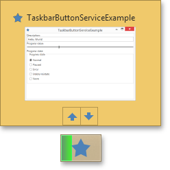
To customize the thumb buttons of the taskbar, use the TaskbarButtonService.ThumbButtonInfos property.
<dxmvvm:TaskbarButtonService.ThumbButtonInfos>
    <dxmvvm:TaskbarThumbButtonInfo ImageSource="{dx:DXImageOffice2013 Image=MoveUp_16x16.png}" Command="{Binding IncereaseProgressCommand}"/>
    <dxmvvm:TaskbarThumbButtonInfo ImageSource="{dx:DXImageOffice2013 Image=MoveDown_16x16.png}" Command="{Binding DecreaseProgressCommand}"/>
</dxmvvm:TaskbarButtonService.ThumbButtonInfos>
The TaskbarThumbButtonInfo class implements the functionality of an individual button that can be displayed within the thumb button of the taskbar.
TaskbarThumbButtonInfo provides the following properties.
- Action - gets or sets the Action called when thumb button is clicked.
- Command - gets or sets the command to invoke when this thumbnail button is clicked.
- CommandParameter - gets or sets the parameter to pass to the Command property.
- Description - gets or sets the text to display for the thumbnail button tooltip.
- DismissWhenClicked - gets or sets a value that indicates whether to close the taskbar thumbnail when the thumbnail button is clicked.
- ImageSource - gets or sets the image that is displayed on the thumbnail button.
- IsBackgroundVisible - gets or sets a value that indicates whether a border and highlight are displayed around the thumbnail button.
- IsEnabled - gets or sets a value that indicates whether the thumbnail button is enabled.
- IsInteractive - gets or sets a value that indicates whether the user can interact with the thumbnail button.
- Visibility - gets or sets a value that specifies the display state of the thumbnail button.
Clipping Thumbnail Image
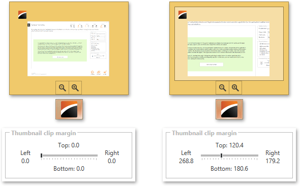
If you need to call a user’s attention to a relevant section of the application window, use the TaskbarButtonService.ThumbnailClipMargin property to control the window clipping of the thumbnail image and handle the TaskbarButtonService.ThumbnailClipMarginCallback event raised when the window is resized.
The following image is an example of clipping. The original window thumbnail is on the left and the clipped version is on the right.
Showing an Icon over the Taskbar Button
To show an icon over the taskbar button, use the TaskbarButtonService.OverlayIcon property.
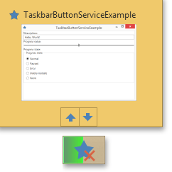
Example
Note
A complete sample project is available at https://github.com/DevExpress-Examples/how-to-use-taskbarbuttonservice-t207589.
<UserControl x:Class="DXSampleTaskbarButtonService.View.MainView"
    xmlns="http://schemas.microsoft.com/winfx/2006/xaml/presentation"
    xmlns:x="http://schemas.microsoft.com/winfx/2006/xaml"
    xmlns:mc="http://schemas.openxmlformats.org/markup-compatibility/2006"
    xmlns:d="http://schemas.microsoft.com/expression/blend/2008"
    xmlns:dx="http://schemas.devexpress.com/winfx/2008/xaml/core"
    xmlns:dxmvvm="http://schemas.devexpress.com/winfx/2008/xaml/mvvm"
    xmlns:ViewModel="clr-namespace:DXSampleTaskbarButtonService.ViewModel"
    mc:Ignorable="d" d:DesignHeight="300" d:DesignWidth="300"
    DataContext="{dxmvvm:ViewModelSource Type={x:Type ViewModel:MainViewModel}}">
    <dxmvvm:Interaction.Behaviors>
        <dxmvvm:TaskbarButtonService Description="{Binding Description}" ProgressValue="{Binding ProgressValue}" ProgressState="Normal">
            <dxmvvm:TaskbarButtonService.ThumbButtonInfos>
                <dxmvvm:TaskbarThumbButtonInfo Description="Increase progress value" ImageSource="{dx:DXImageOffice2013 Image=MoveUp_16x16.png}" Command="{Binding IncreaseProgressCommand}"/>
                <dxmvvm:TaskbarThumbButtonInfo Description="Decrease progress value" ImageSource="{dx:DXImageOffice2013 Image=MoveDown_16x16.png}" Command="{Binding DecreaseProgressCommand}"/>
            </dxmvvm:TaskbarButtonService.ThumbButtonInfos>
        </dxmvvm:TaskbarButtonService>
    </dxmvvm:Interaction.Behaviors>
    <Grid x:Name="LayoutRoot" Background="White" Margin="2">
        <StackPanel>
            <TextBlock Text="Description:"/>
            <TextBox Text="{Binding Description, Mode=TwoWay, UpdateSourceTrigger=PropertyChanged}"/>
            <TextBlock Text="Progress value:" Grid.Row="1" Grid.Column="0"/>
            <Slider Minimum="0" Maximum="1" Value="{Binding ProgressValue, Mode=TwoWay, UpdateSourceTrigger=PropertyChanged}" VerticalAlignment="Center"/>
            <TextBlock Text="Progress state:"/>
            <GroupBox Header="Progress state">
                <StackPanel Orientation="Vertical">
                    <RadioButton Content="Normal" GroupName="progressState" IsChecked="{Binding IsNormalProgressState, Mode=TwoWay, UpdateSourceTrigger=PropertyChanged}"/>
                    <RadioButton Content="Paused" GroupName="progressState" IsChecked="{Binding IsPausedProgressState, Mode=TwoWay, UpdateSourceTrigger=PropertyChanged}"/>
                    <RadioButton Content="Error" GroupName="progressState" IsChecked="{Binding IsErrorProgressState, Mode=TwoWay, UpdateSourceTrigger=PropertyChanged}"/>
                    <RadioButton Content="Indetermintate" GroupName="progressState" IsChecked="{Binding IsIndetermintateProgressState, Mode=TwoWay, UpdateSourceTrigger=PropertyChanged}"/>
                    <RadioButton Content="None" GroupName="progressState" IsChecked="{Binding IsNoneProgressState, Mode=TwoWay, UpdateSourceTrigger=PropertyChanged}"/>
                </StackPanel>
            </GroupBox>
        </StackPanel>
    </Grid>
</UserControl>