Lesson 3 - Customize Editors
- 8 minutes to read
Open the previously created project or RegistrationForm.Lesson2 to follow along. The RegistrationForm.Lesson3 project from the DXEditorsTutorial example contains the results of this part.
- Step 1 - Customize the FirstName, LastName, and Gender editor fields
- Step 2 - Customize the Email field
- Step 3 - Customize the Birthday field
- Step 4 - Customize the Gender field
- Result
Step 1 - Customize the FirstName, LastName, and Gender editor fields
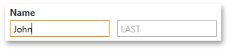
If you run the application, you will notice the editor boxes are empty. For instance, there are two unnamed editors in the first LayoutItem (Name), and end-users have to guess that the left and right editors refer to the First Name and Last Name fields, respectively. If you take a look at the Google registration form, you can see the input boxes display gray indicator text when editor values are blank. The NullText feature of DXEditors supports the same.
There are four properties, available on every DevExpress editor, which effect the displayed NullText.
- BaseEdit.NullValue is the value interpreted by the editor as its blank value (null or System.DBNull.Value by default).
- BaseEdit.NullText specifies the display text when the editor’s value equals NullValue.
- BaseEdit.ShowNullText determines whether the editor will display a NullText in the blank condition.
- BaseEdit.AllowNullInput controls whether an end-user can clear the editor.
Use the NullText feature for the FirstName, LastName, and Gender editors by setting the NullText properties for the editors.
<dxlc:LayoutControl Orientation="Vertical" ItemStyle="{StaticResource itemStyle}" ItemSpace="10">
    <dxlc:LayoutGroup ItemSpace="10">
        <dxlc:LayoutItem Label="Name">
            <dxe:TextEdit EditValue="{Binding FirstName}" NullText="FIRST" />
        </dxlc:LayoutItem>
        <dxe:TextEdit VerticalAlignment="Bottom" EditValue="{Binding LastName}" NullText="LAST" />
    </dxlc:LayoutGroup>
    ...
    <dxlc:LayoutItem Label="Gender">
        <dxe:ComboBoxEdit EditValue="{Binding Gender}" NullText="I am..." />
    </dxlc:LayoutItem>
    ...
</dxlc:LayoutControl>
If you run the application right now, you will see that the FirstName and LastName editors correctly show gray text, but the Gender editor does not. This is due to the fact that the Gender ComboBoxEdit is bound to the RegistrationViewModel.Gender property whose default value is -1. The ComboBoxEdit does not know to interpret this value as blank, so set the ComboBoxEdit.NullValue property to -1.
<UserControl ... xmlns:sys="clr-namespace:System;assembly=mscorlib">
    ...
        <dxlc:LayoutItem Label="Gender">
            <dxe:ComboBoxEdit EditValue="{Binding Gender}" NullText="I am...">
                <dxe:ComboBoxEdit.NullValue>
                    <sys:Int32>-1</sys:Int32>
                </dxe:ComboBoxEdit.NullValue>
            </dxe:ComboBoxEdit>
        </dxlc:LayoutItem>
    ...
</UserControl>
Please note the NullValue property is set with the full XAML property element syntax. An attribute syntax of the form NullValue=”-1” would be processed as the -1 string value.
Step 2 - Customize the Email field
The email field should be specially formatted to restrict invalid input. The Masked Input feature of the DXEditors provides restricted data input as well as formatted data output. Before continuing, please open the Mask Types documentation article in a separate window. This article describes each Mask Type. Email addresses use a complex string format, so the RegEx mask will be useful. Review the Mask Type: Extended Regular Expressions topic for a table of meta-characters you will use to build the Email mask.
- Set the TextEdit.MaskType property to RegEx.
It is necessary to format each of the text sections (<sometext>@<sometext>.<sometext>).
- The first section of the address pattern accepts lowercase and capital letters, digits, dots, the percentage symbol, underscore, apostrophe and the plus and minus symbols: [a-zA-Z0-9.’_%+-].
- The “@” symbol is the second element of the pattern.
- The second text section forming the email domain name accepts lowercase and capital letters, digits, period, and hyphen: [a-zA-Z0-9.-].
- A period “.” immediately follows the domain name section.
- The final text section admits lowercase and capital letters. This section is 2, 3, or 4 characters in length: [a-zA-Z]{2,4}.
- Combine the mask section patterns and assign the result to the TextEdit.Mask property: Mask=“[a-zA-Z0-9.‘_%+-]+@[a-zA-Z0-9.-]+\.[a-zA-Z]{2,4}”.
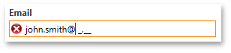
To suppress validation errors when the editor is empty, set the TextEdit.MaskIgnoreBlank property to True.
To permit focus to leave the editor while in a validation error state, set the BaseEdit.InvalidValueBehavior property to AllowLeaveEditor. If this property is assigned to the InvalidValueBehavior.WaitForValidValue, the editor locks the application until a correct value is entered.
The resulting code is the following.
<dxlc:LayoutItem Label="Email">
    <dxe:TextEdit EditValue="{Binding Email}" MaskType="RegEx"
                  Mask="[a-zA-Z0-9.'_%+-]+@[a-zA-Z0-9.-]+\.[a-zA-Z]{2,4}"
                  MaskIgnoreBlank="True" InvalidValueBehavior="AllowLeaveEditor" />
</dxlc:LayoutItem>
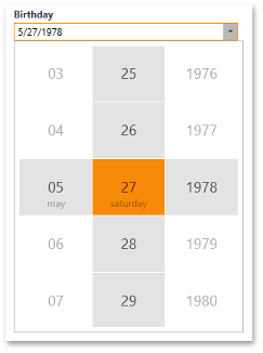
Step 3 - Customize the Birthday field
You will need to limit the input to a particular range of acceptable birthdates. DateEdit supports a DateEdit.MinValue and DateEdit.MaxValue property. Set corresponding properties in the RegistrationViewModel class and then bind the DateEdit.MinValue and DateEdit.MaxValue properties to the ViewModel properties.
[POCOViewModel]
public class RegistrationViewModel {
    protected RegistrationViewModel() {
        MinBirthday = new DateTime(DateTime.Now.Year - 100, 12, 31);
        MaxBirthday = new DateTime(DateTime.Now.Year - 1, 12, 31);
        if(this.IsInDesignMode())
            InitializeInDesignMode();
        else InitializeInRuntime();
    }
    public virtual DateTime MinBirthday { get; set; }
    public virtual DateTime MaxBirthday { get; set; }
    ...
}
<dxlc:LayoutItem Label="Birthday">
    <dxe:DateEdit EditValue="{Binding Birthday}" MinValue="{Binding MinBirthday}" MaxValue="{Binding MaxBirthday}" />
</dxlc:LayoutItem>
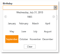
Running the application and clicking the Drop Down button of the Birthday field displays a calendar for selecting dates from the defined range. It is necessary to extend the input capability to support typing dates directly in the input box. Text input of dates is enabled by default with the caveat that the date range specified by the DateEdit MaxDate and MinDate is not applied. Additionally, the DateEdit will lock the application until a valid date is inputted; the default value of the DateEdit.InvalidValueBehavior property is WaitForValidValue. Setting this property to the AllowLeaveEditor allows focus to leave the editor even when its input has not been validated.
<dxlc:LayoutItem Label="Birthday">
    <dxe:DateEdit EditValue="{Binding Birthday}" InvalidValueBehavior="AllowLeaveEditor"
                  MinValue="{Binding MinBirthday}" MaxValue="{Binding MaxBirthday}"/>
</dxlc:LayoutItem>
The DateEdit dropdown can alternatively display the DatePicker control instead of the Calendar. To use the DatePicker, set the BaseEdit.StyleSettings property to DateEditPickerStyleSettings.
<dxlc:LayoutItem Label="Birthday">
    <dxe:DateEdit EditValue="{Binding Birthday}" InvalidValueBehavior="AllowLeaveEditor"
                  MinValue="{Binding MinBirthday}" MaxValue="{Binding MaxBirthday}"/>
        <dxe:DateEdit.StyleSettings>
            <dxe:DateEditPickerStyleSettings/>
        </dxe:DateEdit.StyleSettings>
    </dxe:DateEdit>
</dxlc:LayoutItem>
Step 4 - Customize the Gender field
The Gender field is represented by a ComboBoxEdit control which provides two options: Male, Female. The Gender.cs file in your project contains code that provides a list of these possible options.
public class Gender {
    public int ID { get; set; }
    public string Description { get; set; }
}
public class GenderList : List<Gender> {
    static readonly GenderList source;
    public static GenderList Source { get { return source; } }

    static GenderList() {
        source = new GenderList();
        source.Add(new Gender() { ID = 0, Description = "Female" });
        source.Add(new Gender() { ID = 1, Description = "Male" });
    }
}
Bind the GenderList to the ComboBoxEdit.ItemsSource property:
<UserControl ... xmlns:DataModel="clr-namespace:RegistrationForm.DataModel"  ... >
    ...
    <dxlc:LayoutItem Label="Gender">
        <dxe:ComboBoxEdit EditValue="{Binding Gender}" NullText="I am..."
                          ItemsSource="{x:Static Member=DataModel:GenderList.Source}"
                          ValueMember="ID" DisplayMember="Description">
            <dxe:ComboBoxEdit.NullValue>
                <sys:Int32>-1</sys:Int32>
            </dxe:ComboBoxEdit.NullValue>
        </dxe:ComboBoxEdit>
    </dxlc:LayoutItem>
    ...
</UserControl>
As seen above, the ListBoxEdit.ValueMember and ListBoxEdit.DisplayMember properties are also set for the ComboBoxEdit control . The ValueMember sends the property value of the ComboBoxEdit.SelectedItem (a Gender in this case) with the matching property name to the ComboBoxEdit.EditValue. The DisplayMember shows the property value with the matching property name on the screen.
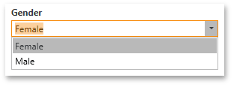
If you run the application right now, you can see that the Gender ComboBoxEdit does not allow values to be directly typed into its input box. You will want to correct this. The end-user will need the following input capabilities.
- Clicking a value from the drop down.
- Typing a value in the editor box.
- Displaying the drop down list as a value is being typed.
- The Drop Down list remains unchanged when the user is typing input.
- Pressing the Enter key to submit typed input.
Implement the necessary behavior.
- The editor already supports selecting values from the drop down list.
- Typing in the Gender ComboBoxEdit is disabled because the BaseEdit.ValidateOnTextInput property is set to True by default. For now, set the ValidateOnTextInput property to False. In the next lesson, you will know how the ValidateOnTextInput property functions in greater detail.
- Set the LookUpEditBase.ImmediatePopup property to True to display the drop down list as the end-user is typing.
- DXEditors may filter a drop down list for matches to the input value. To disable this behavior, set the LookUpEditBase.IncrementalFiltering property to False.
- DXEditors support an AutoComplete feature. The text typed by an end-user in an edit box is automatically completed for a value matching a drop down item.
The markup for the Gender ComboBox is shown below.
<dxlc:LayoutItem Label="Gender">
                <dxe:ComboBoxEdit EditValue="{Binding Gender}" NullText="I am..."
                                  ItemsSource="{x:Static Member=DataModel:GenderList.Source}" ValueMember="ID" DisplayMember="Description"
                                  ValidateOnTextInput="False" ImmediatePopup="True" IncrementalFiltering="False" AutoComplete="True">
                    <dxe:ComboBoxEdit.NullValue>
                        <sys:Int32>-1</sys:Int32>
                    </dxe:ComboBoxEdit.NullValue>
                </dxe:ComboBoxEdit>
            </dxlc:LayoutItem>
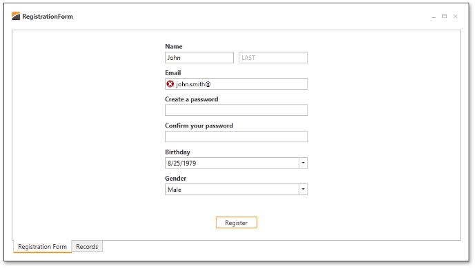
Result
The resulting form is displayed below.