Lesson 3 - Customize Editors
- 4 minutes to read
Open the previously created project or RegistrationForm.Lesson2 to follow along.
The RegistrationForm.Lesson3 project contains the results of this part.
Step 1 - Customize FirstName and LastName Editor Fields
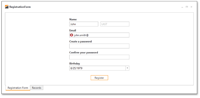
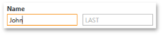
If you run the application, you will notice the editor boxes are empty. For instance, there are two unnamed editors in the first LayoutItem (Name), and end-users have to guess that the left and right editors refer to the First Name and Last Name fields, respectively. You can use the NullText feature of DXEditors to display gray indicator text in input boxes when editor values are blank.
There are four properties, available on every DevExpress editor, which effect the displayed NullText.
- BaseEdit.NullValue is the value interpreted by the editor as its blank value (null or System.DBNull.Value by default).
- BaseEdit.NullText specifies the display text when the editor’s value equals NullValue.
- BaseEdit.ShowNullText determines whether the editor will display a NullText in the blank condition.
- BaseEdit.AllowNullInput controls whether an end-user can clear the editor.
Use the NullText feature for the FirstName and LastName editors by setting the NullText properties for the editors.
<dxlc:LayoutControl Orientation="Vertical" ItemStyle="{StaticResource itemStyle}" ItemSpace="10">
    <dxlc:LayoutGroup ItemSpace="10">
        <dxlc:LayoutItem Label="Name">
            <dxe:TextEdit EditValue="{Binding FirstName}" NullText="FIRST" />
        </dxlc:LayoutItem>
        <dxe:TextEdit VerticalAlignment="Bottom" EditValue="{Binding LastName}" NullText="LAST" />
    </dxlc:LayoutGroup>
    ...
</dxlc:LayoutControl>
Please note the NullValue property is set with the full XAML property element syntax. An attribute syntax of the form NullValue=”-1” would be processed as the -1 string value.
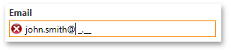
Step 2 - Customize the Email field
The email field should be specially formatted to restrict invalid input. The Masked Input feature of the DXEditors provides restricted data input as well as formatted data output.
Invoke the Quick Actions for the Email TextEdit editor. Click the ellipsis button next to the Mask property to invoke the Mask Editor.
Use the Mask Editor to configure the mask:
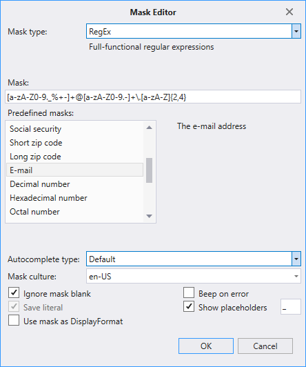
To suppress validation errors when the editor is empty, set the TextEdit.MaskIgnoreBlank property to True.
To permit focus to leave the editor while in a validation error state, set the BaseEdit.InvalidValueBehavior property to AllowLeaveEditor. If this property is assigned to the InvalidValueBehavior.WaitForValidValue, the editor locks the application until a correct value is entered.
The resulting code is the following.
<dxlc:LayoutItem Label="Email">
    <dxe:TextEdit EditValue="{Binding Email}" MaskType="RegEx"
                  Mask="[a-zA-Z0-9.'_%+-]+@[a-zA-Z0-9.-]+\.[a-zA-Z]{2,4}"
                  MaskIgnoreBlank="True" InvalidValueBehavior="AllowLeaveEditor" />
</dxlc:LayoutItem>
Step 3 - Customize the Birthday field
You will need to limit the input to a particular range of acceptable birthdates. DateEdit supports a DateEdit.MinValue and DateEdit.MaxValue property. Set corresponding properties in the RegistrationViewModel class and then bind the DateEdit.MinValue and DateEdit.MaxValue properties to the ViewModel properties.
[POCOViewModel]
public class RegistrationViewModel {
    protected RegistrationViewModel() {
        MinBirthday = new DateTime(DateTime.Now.Year - 100, 12, 31);
        MaxBirthday = new DateTime(DateTime.Now.Year - 1, 12, 31);
        if(this.IsInDesignMode())
            InitializeInDesignMode();
        else InitializeInRuntime();
    }
    public virtual DateTime MinBirthday { get; set; }
    public virtual DateTime MaxBirthday { get; set; }
    ...
}
<dxlc:LayoutItem Label="Birthday">
    <dxe:DateEdit EditValue="{Binding Birthday}" MinValue="{Binding MinBirthday}" MaxValue="{Binding MaxBirthday}" />
</dxlc:LayoutItem>
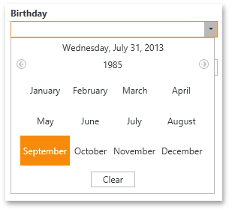
Running the application and clicking the Drop Down button of the Birthday field displays a calendar for selecting dates from the defined range. It is necessary to extend the input capability to support typing dates directly in the input box. Text input of dates is enabled by default with the caveat that the date range specified by the DateEdit MaxDate and MinDate is not applied. Additionally, the DateEdit will lock the application until a valid date is inputted; the default value of the DateEdit.InvalidValueBehavior property is WaitForValidValue. Setting this property to the AllowLeaveEditor allows focus to leave the editor even when its input has not been validated.
<dxlc:LayoutItem Label="Birthday">
    <dxe:DateEdit EditValue="{Binding Birthday}" InvalidValueBehavior="AllowLeaveEditor"
                  MinValue="{Binding MinBirthday}" MaxValue="{Binding MaxBirthday}"/>
</dxlc:LayoutItem>
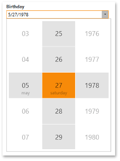
The DateEdit dropdown can alternatively display the DatePicker control instead of the Calendar. To use the DatePicker, set the BaseEdit.StyleSettings property to DateEditPickerStyleSettings.
<dxlc:LayoutItem Label="Birthday">
    <dxe:DateEdit EditValue="{Binding Birthday}" InvalidValueBehavior="AllowLeaveEditor"
                  MinValue="{Binding MinBirthday}" MaxValue="{Binding MaxBirthday}"/>
        <dxe:DateEdit.StyleSettings>
            <dxe:DateEditPickerStyleSettings/>
        </dxe:DateEdit.StyleSettings>
    </dxe:DateEdit>
</dxlc:LayoutItem>
Result
The resulting form is displayed below.