Lesson 2 - Creating a Table View
- 6 minutes to read
Step 1 - Creating a new Blank View
Now that the ContactCollectionViewModel class has been created, you can go ahead and create the first View, which displays a data table.
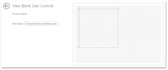
Right-click the project in the Solution Explorer and select Add DevExpress Item | New Item… to invoke the DevExpress Template Gallery. Select the View (Blank User Control) template and specify the name as ContactCollectionTableView.
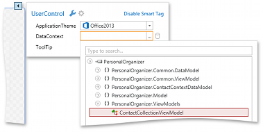
Open the designer and place the ContactCollectionViewModel in the DataContext of the created View.
<UserControl x:Class="PersonalOrganizer.Views.ContactCollectionTableView"
    xmlns:ViewModels="clr-namespace:PersonalOrganizer.ViewModels"
    xmlns:dxmvvm="http://schemas.devexpress.com/winfx/2008/xaml/mvvm"
    DataContext="{dxmvvm:ViewModelSource Type={x:Type ViewModels:ContactCollectionViewModel}}" ...>
    ...
</UserControl>
Note
Since ContactCollectionViewModel is a POCO class, it is necessary to create its instance with ViewModelSource.
Step 2 - Adding a RibbonControl
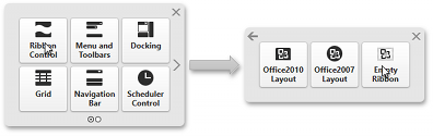
The View will contain a GridControl that shows table data and several commands for working with this data. The commands will be displayed in the Ribbon. Add a Ribbon Control with the DevExpress Instant Layout Assistant, which appears in the center of the white space on the design surface. Select Ribbon Control | Empty Ribbon.
Using the smart tag menu, you can customize the RibbonControl - modify properties, add bar items, etc. BarItem Glyphs can be set from the DevExpress.Images library.
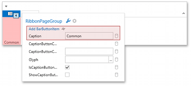
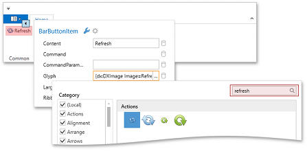
Continue customizing the RibbonControl to get the following layout.
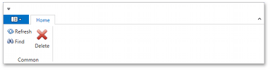
<dxb:BarButtonItem x:Name="barButtonItem1" Content="Refresh" RibbonStyle="SmallWithText"
Glyph="{dx:DXImage Image=Refresh_16x16.png}" LargeGlyph="{dx:DXImage Image=Refresh_32x32.png}"/>

<dxb:BarButtonItem x:Name="barButtonItem2" Content="Find" RibbonStyle="SmallWithText"
Glyph="{dx:DXImage Image=Find_16x16.png}" LargeGlyph="{dx:DXImage Image=Find_32x32.png}"/>

<dxb:BarButtonItem x:Name="barButtonItem3" Content="Delete"
Glyph="{dx:DXImage Image=Delete_16x16.png}" LargeGlyph="{dx:DXImage Image=Delete_32x32.png}"/>
Step 3 - Adding a GridControl
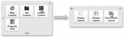
Next, add a GridControl with a detail form. To arrange the GridControl and detail form, select LayoutControl | Grid Details Layout in the Instant Layout Assistant. The Instant Layout Assistant provides a predefined template with the required layout.
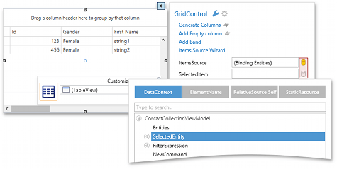
The DataContext property of our View contains a ContactCollectionViewModel object. This ViewModel provides two properties: Entities and SelectedEntity. The first property provides database records and the second one provides the current record. Bind GridControl.ItemsSource and GridControl.SelectedItem to these ViewModel properties.
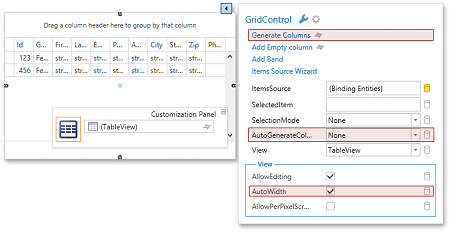
Currently, the GridControl shows all columns. These columns are not defined in XAML; they are generated by the GridControl based on the data source type. To hide unnecessary columns, it is necessary to strongly define the columns in XAML.
Click the Generate Columns action in the GridControl’s smart tag menu. Then, disable runtime column generation by setting the AutoGenerateColumns property to None, and disable horizontal scrolling by setting the AutoWidth property to True.
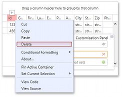
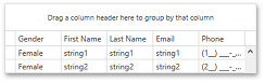
Remove unnecessary columns…
…to get the following layout.
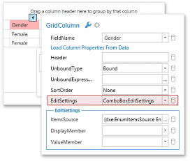
The Gender Column should use a drop-down list, so use ComboBoxEditSettings.
ComboBoxEditSettings should show an icon in its drop-down menu instead of text. To do this, define a DataTemplate that will be used as a ComboBoxEditSettings.ItemTemplate.
<Application.Resources>
    <dxmvvm:ObjectToObjectConverter x:Key="genderToGlyphConverter">
        <dxmvvm:MapItem Source="Male">
            <dxmvvm:MapItem.Target>
                <BitmapImage UriSource="/PersonalOrganizer;component/Model/Images/Male.png"/>
            </dxmvvm:MapItem.Target>
        </dxmvvm:MapItem>
        <dxmvvm:MapItem Source="Female">
            <dxmvvm:MapItem.Target>
                <BitmapImage UriSource="/PersonalOrganizer;component/Model/Images/Female.png"/>
            </dxmvvm:MapItem.Target>
        </dxmvvm:MapItem>
    </dxmvvm:ObjectToObjectConverter>
    <DataTemplate x:Key="genderTemplate">
        <Image Width="16" Height="16" UseLayoutRounding="True" RenderOptions.BitmapScalingMode="NearestNeighbor"
Source="{Binding Path=Id, Converter={StaticResource genderToGlyphConverter}}"/>
    </DataTemplate>
</Application.Resources>
Assign the defined template to ComboBoxEditSettings and set the ApplyItemTemplateToSelectedItem property to True. Also set the PopupWidth property to 100.
<dxg:GridColumn FieldName="Gender" IsSmart="True" VisibleIndex="1">
    <dxg:GridColumn.EditSettings>
        <dxe:ComboBoxEditSettings
DisplayMember="Value" IsTextEditable="False" TextWrapping="NoWrap" TextTrimming="CharacterEllipsis" ValueMember="Id"
ItemsSource="{dxe:EnumItemsSource EnumType={x:Type Model:Gender}, NameConverter={x:Null}, SplitNames=True, UseNumericEnumValue=False}"
ItemTemplate="{StaticResource genderTemplate}" ApplyItemTemplateToSelectedItem="True" PopupWidth="100"/>
     </dxg:GridColumn.EditSettings>
</dxg:GridColumn>
Bind the grid’s DataControlBase.ShowLoadingPanel property to IsLoading, so the Loading Panel is shown only while waiting for the callback response.
The GridControl customization is almost done. All that is left to do is set some properties for the TableView element and the Gender column, as well as set the initial sort order.
<dxg:GridControl x:Name="gridControl" ShowLoadingPanel="{Binding IsLoading}">

    <dxg:GridColumn FieldName="Gender" IsSmart="True" VisibleIndex="1" Header=" " Width="42" FixedWidth="True">
    <dxg:GridColumn FieldName="FirstName" IsSmart="True" VisibleIndex="2" SortIndex="0"/>
    <dxg:GridColumn FieldName="LastName" IsSmart="True" VisibleIndex="3" SortIndex="1"/>

    <dxg:TableView ShowTotalSummary="False" ShowGroupPanel="False" AutoWidth="True" NewItemRowPosition="Top"/>
</dxg:GridControl>
Step 4 - Customizing the Detail Form
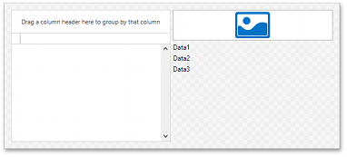
The right side of the ContactCollectionTableView is a LayoutGroup with some editors and labels.
<dxlc:LayoutGroup Orientation="Vertical" VerticalAlignment="Top">
     <dxe:ImageEdit/>
     <TextBlock Text="Data1"/>
     <TextBlock Text="Data2"/>
     <TextBlock Text="Data3"/>
</dxlc:LayoutGroup>
Bind them to data and set the following appearance properties.
<dxlc:LayoutGroup Orientation="Vertical" VerticalAlignment="Top" Width="200" Margin="10" TextBlock.FontSize="18"
                          TextBlock.Foreground="{DynamicResource {x:Static SystemColors.ControlDarkDarkBrushKey}}">
    <dxe:ImageEdit EditValue="{Binding Path=SelectedEntity.Photo, Mode=TwoWay, UpdateSourceTrigger=PropertyChanged}"/>
    <TextBlock TextWrapping="NoWrap" TextTrimming="CharacterEllipsis">
        <Run Text="{Binding SelectedEntity.FirstName}"/> <Run Text="{Binding SelectedEntity.LastName}"/>
    </TextBlock>
    <TextBlock TextWrapping="Wrap">
        <Run Text="{Binding SelectedEntity.Address}"/>
    </TextBlock>
    <TextBlock TextWrapping="Wrap">
        <Run Text="{Binding SelectedEntity.City}"/> <Run Text="{Binding SelectedEntity.State}"/>
    </TextBlock>
</dxlc:LayoutGroup>
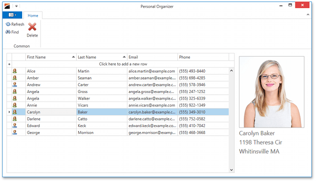
Finally, add the ContactCollectionTableView to the MainWindow and run the application to see the results.
<dxr:DXRibbonWindow x:Class="PersonalOrganizer.MainWindow" ...>
    <Grid>
        <Views:ContactCollectionTableView/>
    </Grid>
</dxr:DXRibbonWindow>
Step 5 - Implementing Interaction
You have now built the layout and added several buttons to the RibbonControl. Now, you will bind these buttons to commands.
Start with the Refresh bar item. When an end-user clicks this button, the GridControl should reload records. For this purpose, use the RefreshCommand in the ContactCollectionViewModel.
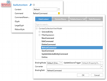
<dxb:BarButtonItem Content="Refresh" Command="{Binding RefreshCommand}" .../>
Next, bind the Find BarButtonItem. When an end-user clicks it, GridControl shows a Search Panel. The TableView.TableViewCommands provides a command for this purpose – ShowSearchPanel. This command takes a Boolean parameter that controls whether or not the Search Panel should be focused on showing. Always pass the True value to the command.
Bind the Find BarButtonItem to get the following code.
<dxb:BarButtonItem Content="Find" Command="{Binding TableViewCommands.ShowSearchPanel, ElementName=tableView}" CommandParameter="True" ... />
The Delete BarButtonItem, which provides the DeleteCommand, should be bound to the ViewModel. This command requires a parameter – the row to be deleted. Thus, CommandParameter should be bound to the SelectedEntity property of the ViewModel. (This property is bound to GridControl.SelectedItem.)
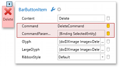
<dxb:BarButtonItem Content="Delete" Command="{Binding DeleteCommand}" CommandParameter="{Binding SelectedEntity}" .../>
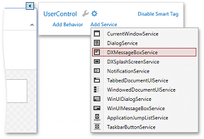
Run the application and check the results. Notice that the New and Find commands work properly, but if you click the Delete button, there is an error in ContactCollectionViewModel because its MessageBoxService property is Null. To fix this issue, add DXMessageBoxService.
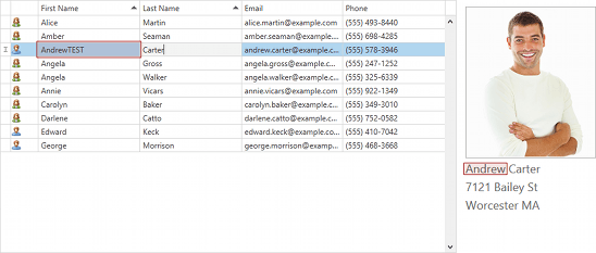
Only two issues are left unresolved. The first is that the Model (the Contact class) does not support the INotifyPropertyChanged interface. As a result, when a user changes a cell value in the GridControl, the detail form is not updated.
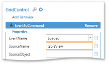
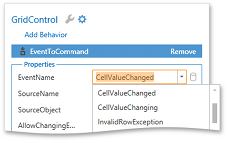
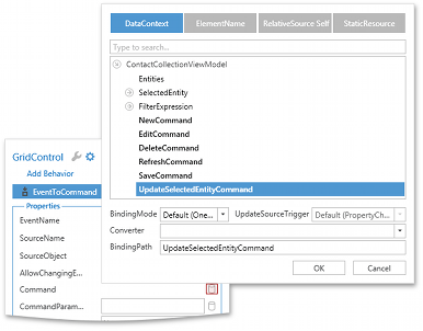
ContactCollectionViewModel provides the UpdateSelectedEntityCommand, which raises the PropertyChanged event for the SelectedEntity property. Since the detail form is bound via the SelectedEntity property, we can call UpdateSelectedEntityCommand when a cell value is changed (i.e., in the TableView.CellValueChanged event handler). To accomplish this task using the MVVM pattern, use the EventToCommand. Open the designer and invoke the GridControl’s smart tag menu, switch to the Services tab and add an EventToCommand.
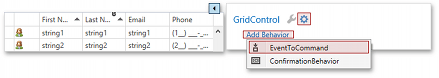
First, you will need to set the source element – the element that provides the event you wish to handle. In this example it is the TableView. Enter the name of the TableView in the SourceName box (if the TableView does not yet have a name, set it first), select the CellValueChanged event in the EventName box, and bind the EventToCommand.Command property.
The last issue that needs to be resolved is saving changes to the database. When an end-user modifies a row, the modifications should be saved. To fix this issue, call ContactCollectionViewModel.SaveCommand when the TableView.RowUpdated event is raised.
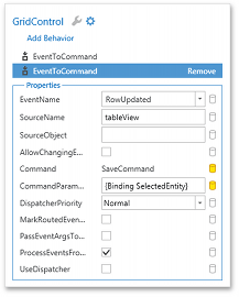
Note that the SaveCommand requires a row as a parameter. For this purpose, bind CommandParameter to SelectedEntity.
The resulting code is shown below.
<dxg:GridControl x:Name="gridControl" ...>
    <dxmvvm:Interaction.Behaviors>
        <dxmvvm:EventToCommand SourceName="tableView" EventName="CellValueChanged" Command="{Binding UpdateSelectedEntityCommand}"/>
        <dxmvvm:EventToCommand SourceName="tableView" EventName="RowUpdated" Command="{Binding SaveCommand}" CommandParameter="{Binding SelectedEntity}"/>
    </dxmvvm:Interaction.Behaviors>
    ...
    <dxg:GridControl.View>
        <dxg:TableView x:Name="tableView" .../>
    </dxg:GridControl.View>
</dxg:GridControl>