Funnel Series
- 2 minutes to read
Short Description
Funnel charts are often used to indicate stages in a sales process, e.g., to show the amount of potential revenue for each stage. This type of chart can also be useful in identifying potential problem areas in current processes, such as with an organization’s sales.
In particular, the funnel chart indicates where the biggest bottlenecks are in your data. The funnel shows a process that starts at 100% and ends with a lower percentage, where it indicates the occurrence and rate of notable transitions in the data flow.
Normally, a funnel chart displays values as progressively decreasing proportions, which are expressed in the funnel series points’ top widths. So, the data point which has the greatest value in the collection is considered to be 100%, and it is represented as the widest polygon, built on top of the funnel. The next series point value is represented by the subsequent polygon, whose top width represents its value’s ratio to the previous point’s value and so on, up to the last point, whose bottom width is equal to its top.
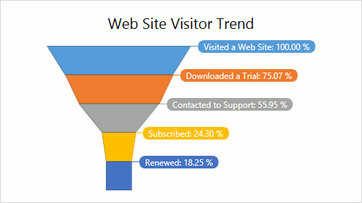
A funnel chart can be used to display Web site visitor trends, as the following image demonstrates.
Series Characteristics
The table below lists the main characteristics of this chart type.
| Feature | Value |
|---|---|
| Series View type | FunnelSeries2D |
| Diagram type | SimpleDiagram2D |
| Number of arguments per series point | 1 |
| Number of values per series point | 1 |
For information on which series view types can be combined with the Funnel Series view, refer to the Series Types Compatibility document.
Example
The following example demonstrates how to create a 2D Funnel Series chart.