Spreadsheet Chart Overview
- 4 minutes to read
The WPF Spreadsheet control allows you to create charts. Use charts to analyze large amounts of data and show relationships between different data sets.
The Spreadsheet control uses DevExpress WPF Charts to render charts. Chart types and layouts are compatible with those of Microsoft® Excel®.
The following section contains examples that demonstrate how to create and modify a chart in code: Spreadsheet Chart Examples. You can insert a chart into a worksheet that contains chart data or create a standalone chart on a chart sheet.
Note
You can also embed small charts (or sparklines) in worksheet cells. Refer to the following section for details on how to create sparkline groups of different types and define their appearance: Sparklines.
End users can select a chart on the Insert tab in the Charts group.
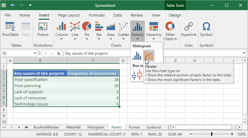
Supported Chart Types
Chart Type | Chart Subtypes |
|---|---|
Column Charts
| 2-D Column Charts:
3-D Column Charts:
Cylinder Charts:
Cone Charts:
Pyramid Charts:
|
Line Charts
| 2-D Line Charts:
3-D Line Charts:
|
Pie Charts
| 2-D Pie Charts:
3-D Pie Charts:
|
Doughnut Charts
|
|
Bar Charts
| 2-D Bar Charts:
3-D Bar Charts:
Cylinder Charts:
Cone Charts:
Pyramid Charts:
|
Area Charts
| 2-D Area Charts:
3-D Area Charts:
|
Scatter Charts
|
|
Bubble Charts
|
|
Stock Charts
|
|
Radar Charts
|
|
Excel 2016 Charts
|
|
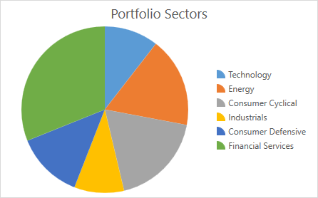
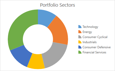
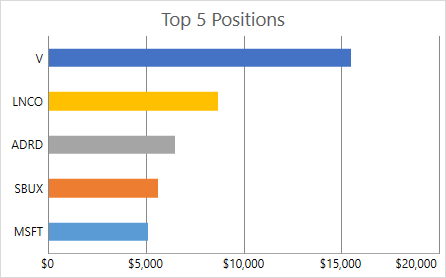
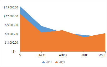
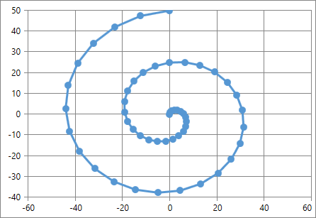
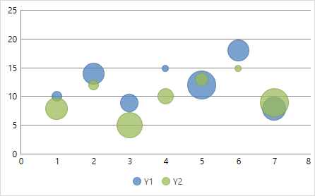
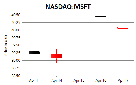
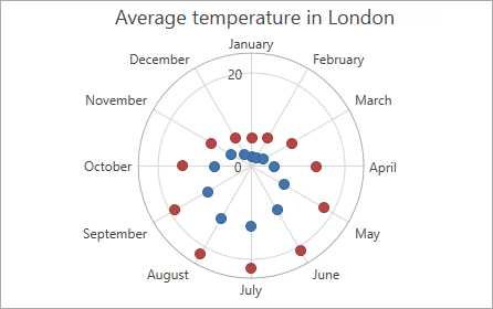
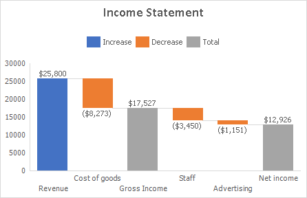
Chart Elements
The following image displays chart elements:
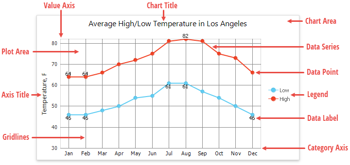
- Chart Area - contains an entire chart and all its elements.
- Plot Area - a chart area that displays data series, axes, gridlines, and data labels.
- Data Point - a single value plotted on a chart.
- Data Series - a group of related data points. Each data series has a unique color to distinguish between individual series on a chart with multiple series.
- Horizontal and Vertical Axes - two perpendicular lines that run along the chart edges. Axes display category labels and measurement units. Most charts have two axes: the category axis (X-axis) that usually runs horizontally at the bottom of the plot area, and the value axis (Y-axis) that runs vertically on the plot area’s left side. 3-D charts also have the depth (series) axis that displays series names. Bubble and scatter charts have two value axis. Pie and doughnut charts have no axes at all.
- Legend - identifies each data series with a color or fill pattern. A chart can have only one legend.
- Chart Title - a text header that explains a chart’s purpose.
- Axis Title - explanatory text used to label an axis.
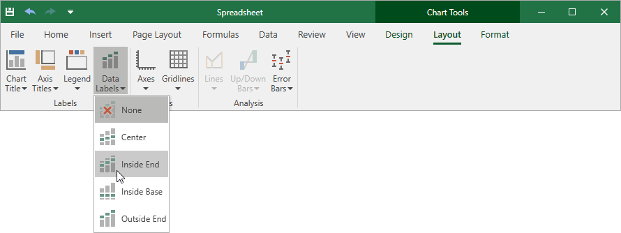
- Data Label - identifies a data point with its actual value.
- Gridlines - a series of horizontal and vertical lines that run across the plot area. You can add gridlines to a chart to improve its readability.
You can add or remove chart elements, as described in these topics: Create and Modify a Chart Programmatically and Spreadsheet Chart Examples.
End users can use commands on the Chart Tools contextual tab to apply one of the predefined chart layouts or manually select elements to display on a chart.
Select a predefined chart layout
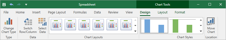
Show or hide chart elements