AppBar Control
- 12 minutes to read
The AppBar control is a Windows 8-style bar used to display application commands to end-users. The app bar is visible only when required by the end-user. When this bar is not used, it is hidden from view, allowing the end-user to conserve screen space.
This document deals with the app bar features and consists of the following sections.
- Overview
- Adding an App Bar
- Showing and Hiding an App Bar
- App Bar Buttons
- Predefined Buttons
- Arranging Buttons in an App Bar
- WPF Themes
- Applying Data Templates to App Bar Buttons
- Applying Styles to App Bar Buttons
Overview
You can use Windows Modern UI controls to create modern interfaces similar to the ones implemented in Windows Store applications. This bar can be placed at the top, bottom, left or right of a window, to display navigation, commands, and options to end-users only when necessary, saving valuable screen space. By default, the app bar is hidden from view, and seamlessly appears on the screen by right clicking in the application area. The app bar disappears from view when an end-user resumes interaction with the application anywhere outside the app bar.
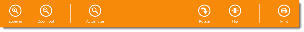
In the following image, the app bar is displayed at the bottom of the application window and provides a set of buttons.
Adding an App Bar
Create a Windows Modern UI style application that consists of one or more screens using the NavigationFrame and NavigationPage objects. Use the NavigationPage.BottomAppBar or NavigationPage.TopAppBar property to display the app bar at the bottom or top of the page. Use both properties to display two app bars simultaneously.
The following example shows how to place a simple app bar at the bottom of the NavigationPage:
xmlns="http://schemas.microsoft.com/winfx/2006/xaml/presentation"
xmlns:x="http://schemas.microsoft.com/winfx/2006/xaml"
xmlns:dx="http://schemas.devexpress.com/winfx/2008/xaml/core"
xmlns:dxwui="http://schemas.devexpress.com/winfx/2008/xaml/windowsui"
...
<dxwui:NavigationPage>
<dxwui:NavigationPage.BottomAppBar>
<dxwui:AppBar x:Name="appBar" IsOpen="True" HideMode="Sticky" IsExitButtonEnabled="True">
<dxwui:AppBarButton Label="Zoom in" Glyph="{dx:DXImageGrayscale Image=ZoomIn_32x32.png}" />
<dxwui:AppBarButton Label="Zoom out" Glyph="{dx:DXImageGrayscale Image=ZoomOut_32x32.png}" />
<dxwui:AppBarSeparator />
<dxwui:AppBarButton Label="Actual Size" Glyph="{dx:DXImageGrayscale Image=Zoom_32x32.png}" />
<dxwui:AppBarButton Label="Rotate" HorizontalAlignment="Right" Glyph="{dx:DXImage Image=DrillDown_32x32.png}" >
<dxwui:AppBarButton.Flyout>
<dxwui:MenuFlyout ShowIndicator="True">
<dxwui:MenuFlyoutItem Content="90° clockwise"/>
<dxwui:MenuFlyoutItem Content="90° counter clockwise" />
<dxwui:MenuFlyoutSeparator />
<dxwui:MenuFlyoutItem Content="Reset"/>
</dxwui:MenuFlyout>
</dxwui:AppBarButton.Flyout>
</dxwui:AppBarButton>
<dxwui:AppBarSeparator HorizontalAlignment="Right" />
<dxwui:AppBarToggleButton Label="Pin" HorizontalAlignment="Right"></dxwui:AppBarToggleButton>
<dxwui:AppBar.Resources>
<Style TargetType="dxwui:AppBarButton">
<Setter Property="AllowGlyphTheming" Value="True" />
<Setter Property="GlyphHeight" Value="24" />
</Style>
</dxwui:AppBar.Resources>
</dxwui:AppBar>
</dxwui:NavigationPage.BottomAppBar>
</dxwui:NavigationPage>
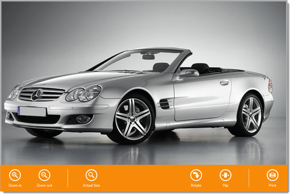
The following image illustrates the result of this markup.
Even if you do not use the NavigationPage, you can still add the AppBar to your interface. It is possible to add the AppBar to XAML markup as a child of any FrameworkElement (e.g., a Grid). Use the AppBar.Alignment property to define the side of the parent FrameworkElement at which the app bar appears. The following example demonstrates how to place the AppBar at the bottom of the window containing a Grid with a SlideView:
xmlns="http://schemas.microsoft.com/winfx/2006/xaml/presentation"
xmlns:dxwui="http://schemas.devexpress.com/winfx/2008/xaml/windowsui"
...
<Grid>
    <dxwui:AppBar Alignment="Bottom">
        <!--App bar buttons-->
    </dxwui:AppBar>
    <dxwui:SlideView .../>
</Grid>
Showing and Hiding an App Bar
By default, the app bar is hidden from view and appears when an end-user right-clicks on the application area. The app bar provides the AppBar.IsOpen property to specify if the app bar is visible. You can set this property in XAML to define the app bar’s initial state. You can respond to end-user actions, and show or hide the app bar by setting the AppBar.IsOpen property in code.
Handle the AppBar.Opened and AppBar.Closed events to respond to app bar visibility changes.
By default, the app bar is hidden from view when an end-user resumes interaction with the application, outside of the app bar area. It is possible to override the default behavior and specify how the app bar is closed using the AppBar.HideMode property.
App Bar Buttons
Buttons in the app bar are represented by the AppBarButton and AppBarToggleButton classes. The app bar buttons are round buttons with labels that invoke an associated action on click. You can assign a Command to its Command property or handle the Click event to implement an action.
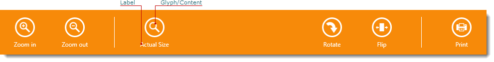
A label can be set from the AppBarButton.Label property of the Object type. In most cases, you use a String value to specify the button’s label, but it is possible to use any Object. If an assigned object is not derived from the UIElement class, the ToString method is used to display the label. Thus, you can override this method to customize the return value, if necessary. Use the AppBarButton’s FontFamily and FontSize properties to define the label’s text attributes. It is also possible to apply data templates to render the button’s label. For this purpose, the AppBarButton provides the AppBarButton.LabelTemplate and AppBarButton.LabelTemplateSelector properties.
You can display an icon in the app bar button. For this purpose, use its CommandButton.Glyph property. The CommandButton.GlyphWidth and CommandButton.GlyphHeight properties specify the dimensions of the frame into which the icon is fitted. The CommandButton.GlyphStretch property specifies how the icon is stretched to fill the frame. To paint the icon according to the currently applied theme, set the CommandButton.AllowGlyphTheming property to True.
Using the CommandButton.Glyph property is the recommended approach to specifying the button icon, but it is also possible to use the Content property. Any object can be assigned to this property. The following is a list of typical objects that can be used as button content.
- String — Displays any text or a single character. Use the AppBarButton.ContentFontFamily and AppBarButton.ContentFontSize properties to define the content’s text attributes. The Segoe UI Symbol font provides numerous symbols you may need.
- Path — Allows you to define a Shape as the button’s glyph.
- Image — Allows you to display a custom image. You can also use an image from the DX Image Gallery.
See the example below to learn how to implement each of these approaches.
xmlns:dx="http://schemas.devexpress.com/winfx/2008/xaml/core"
...
<dxwui:AppBarButton Label="Path">
<Path Width="27" Height="27" Stretch="Uniform">
<Path.Data>
<!--A Geometry that specifies the shape to be drawn-->
</Path.Data>
</Path>
</dxwui:AppBarButton>
<dxwui:AppBarButton Label="Segoe UI Symbol">

</dxwui:AppBarButton>
<dxwui:AppBarButton Label="Image">
<Image Source="{dx:DXImageGrayscale Image=ZoomIn_32x32.png}"/>
</dxwui:AppBarButton>
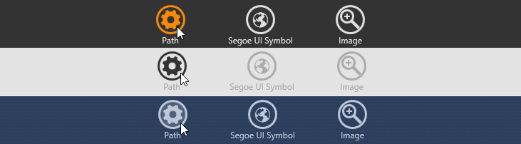
The following image illustrates buttons with different content.

The AppBarToggleButton is a button that supports two states (checked and unchecked), using the AppBarToggleButton.IsChecked property. The AppBarToggleButton is typically used to represent Boolean options.
When an end-user toggles the AppBarToggleButton, its IsChecked property of the Boolean type changes accordingly. To respond to a check state toggle, handle the AppBarToggleButton.Checked and AppBarToggleButton.Unchecked events.

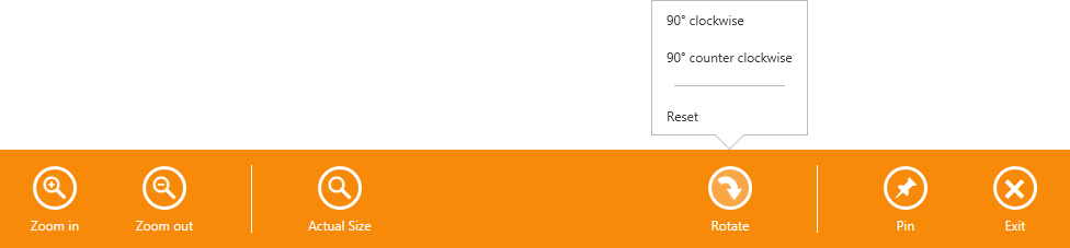
The app bar buttons are capable of displaying flyouts when clicked. The button’s Flyout property allows you to associate the Flyout or MenuFlyout control with the button. See sample code below.
<dxwui:AppBarButton Label="Rotate" Glyph="{dx:DXImage Image=DrillDown_32x32.png}" >
    <dxwui:AppBarButton.Flyout>
        <dxwui:MenuFlyout ShowIndicator="True">
            <dxwui:MenuFlyoutItem Content="90° clockwise"/>
            <dxwui:MenuFlyoutItem Content="90° counter clockwise" />
            <dxwui:MenuFlyoutSeparator />
            <dxwui:MenuFlyoutItem Content="Reset"/>
        </dxwui:MenuFlyout>
    </dxwui:AppBarButton.Flyout>
</dxwui:AppBarButton>
Predefined Buttons
The app bar provides two predefined buttons: the Back button and the Exit button. The label, content, position in the app bar, and action of these buttons are predefined. To display these buttons, use the AppBar.IsBackButtonEnabled and AppBar.IsExitButtonEnabled properties.
In multi-screen applications, if you use the NavigationFrame to implement navigation between screens, you can display the Back button in the app bar. The Back button returns an end-user to the previous page of the application. To enable the Back button, set the AppBar.IsBackButtonEnabled property to true. If it is possible to return to the previous page, the Back button is displayed at the leftmost position of the app bar; otherwise, the Back button is hidden. See the Navigation topic to learn more about navigation between screens.
When you implement a Windows Store style application, you may wish to display your window without a border by setting the Window‘s WindowStyle property to None. When a window is rendered without its border, the common Minimize, Maximize, Restore and Close buttons are not displayed. In this case, you can provide an end-user with the predefined app bar Exit button. If the AppBar.IsExitButtonEnabled property is set to true, the Exit button is displayed at the rightmost position of the app bar and closes the window on button click.

Arranging Buttons in an App Bar
The AppBar.ItemSpacing property allows you to adjust the distance between items in the AppBar. In normal mode, buttons in the AppBar are displayed with labels and spacing between them is specified by the AppBar.ItemSpacing property. The AppBar can also be rendered in compact mode. In this mode, buttons in the AppBar are displayed without labels and the spacing between them is reduced. To display the AppBar in compact mode, set the AppBar.IsCompact property to true. The following images demonstrate the same app bar displayed in regular mode and compact mode.


The AppBarSeparator allows you to separate sets of app bar buttons, if the app bar displays a large number of commands.

To specify alignment of app bar buttons and separators relative to the app bar, use the AppBarButton.Alignment and AppBarSeparator.Alignment properties.
WPF Themes
The app bar and its buttons are colored according to the Theme applied in the application. Here is the same app bar displayed in different themes: MetropolisDark, Office2013DarkGray and VS2010.
If you do not apply a Theme explicitly, the default Theme is used.

To learn more, see the List of DevExpress WPF Themes topic.
Applying Data Templates to App Bar Buttons
If you assign an Object other than a String to the AppBarButton.Label property, you may wish to apply a data template to render the label. The AppBarButton.LabelTemplate property provides this functionality.
To implement this feature, first declare a data template in XAML. Then assign this template to the AppBarButton.LabelTemplate property and set the AppBarButton.Label property to an object representing the label.
The following example shows how to declare a custom data template that renders the button’s label as a StackPanel containing two TextBlocks. The contents of these TextBlocks are obtained from a custom Label class:
namespace AppBar_LabelTemplate {
    // ...
    public class Label {
        public string LabelText { get; set; }
        public string LabelHint { get; set; }
        public Label() { }
        public Label(string text, string hint) {
            LabelText = text;
            LabelHint = hint;
        }
    }
}
If you wish to create several data templates and apply one of them according to your own logic, use the AppBarButton.LabelTemplateSelector property. To implement this approach, create a DataTemplateSelector descendant and override the SelectTemplate method in code. Then declare distinct templates in XAML. Assign the DataTemplateSelector descendant to the AppBarButton.LabelTemplateSelector property and set the AppBarButton.Label property to an object representing the label.
The following example shows how to declare several data templates that render the button’s label in different ways and implement the data template selector.
namespace AppBar_LabelTemplate {
    // ...
    public class Label {
        public string LabelText { get; set; }
        public string LabelHint { get; set; }
        public Label() { }
        public Label(string text, string hint) {
            LabelText = text;
            LabelHint = hint;
        }
    }
    public class MyLabelTemplateSelector : DataTemplateSelector {
        public DataTemplate DefaultTemplate { get; set; }
        public DataTemplate NoHintTemplate { get; set; }
        public override DataTemplate SelectTemplate(object item, DependencyObject container) {
            if (item != null & item is Label) {
                Label l = item as Label;
                return l.LabelHint == null ? NoHintTemplate : DefaultTemplate;
            }
            else return DefaultTemplate;
        }
    }
}
Applying Styles to App Bar Buttons
You can apply Styles to the AppBarButton and AppBarToggleButton. The Style class allows you to set common settings for several instances of buttons. By using Styles, you can create a set of buttons with predefined content, and use these buttons in multiple places in your application. The following example shows how to implement this approach. A base Style (with the AppBarButtonStyle key) specifies the AppBarButton.FontFamily and AppBarButton.FontSize properties. Two other Styles (with the HomeAppBarButtonStyle and FindAppBarButtonStyle keys), based on this one, specify the AppBarButton.Content and AppBarButton.Label properties.
<!--Define Styles in a resources dictionary-->
<Window.Resources>
<Style x:Key="AppBarButtonStyle" TargetType="dxwui:AppBarButton">
<Setter Property="FontFamily" Value="Segoe UI Symbol"/>
<Setter Property="FontSize" Value="14"/>
</Style>
<Style x:Key="HomeAppBarButtonStyle"
TargetType="dxwui:AppBarButton"
BasedOn="{StaticResource AppBarButtonStyle}">
<Setter Property="Content" Value=""/>
<Setter Property="Label" Value="Home"/>
</Style>
<Style x:Key="FindAppBarButtonStyle"
TargetType="dxwui:AppBarButton"
BasedOn="{StaticResource AppBarButtonStyle}">
<Setter Property="Content" Value=""/>
<Setter Property="Label" Value="Find"/>
</Style>
</Window.Resources>
<!--Use defined Styles in your application-->
<dxwui:AppBar>
<dxwui:AppBarButton Style="{StaticResource ResourceKey=HomeAppBarButtonStyle}"/>
<dxwui:AppBarButton Style="{StaticResource ResourceKey=FindAppBarButtonStyle}"/>
</dxwui:AppBar>