RangeControl (legacy)
- 5 minutes to read
Note
You are viewing documentation for the legacy WPF Scheduler control. If you’re starting a new project, we strongly recommend that you use a new control declared in the DevExpress.Xpf.Scheduling namespace. If you decide to upgrade an existing project in order to switch to the updated scheduler control, see the Migration Guidelines document.
RangeControl is a control designed to help end-users select intervals and data ranges. When it is integrated with the SchedulerControl, it behaves like the timeline track bar, and allows quick timeline navigation and selection of date intervals.
The picture below illustrates a Range Control bound to a Scheduler Control.
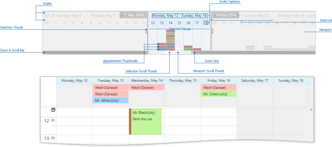
The elements of the RangeControl are described below.
Viewport
The visual area that represents the time range that is currently visible in the Range Control. To change the visible time range in the viewport, do the following:
- Scroll the mouse wheel or drag the Viewport Scroll Thumb.
- Use Zoom Grips to stretch and reduce Range Control scales, and change the visible range.
Scales
Rulers with different time scales that are displayed at the top of the Range Control when it is bound to the SchedulerControl. Range Control scales specify a timeline to be used by end-users for navigating within the current view of the SchedulerControl.
Intervals
The most detailed scale divides the viewport area into intervals. Each interval displays information about appointment data contained within the corresponding time interval in the scheduler (via appointment thumbnails representing the number of appointments). Use the ScaleBasedRangeControlClientOptions.MinIntervalWidth property to specify the minimum interval width that can be displayed when resizing or zooming the viewport.
Selected Range
The time span selected by an end-user. It is highlighted in the RangeControl viewport and marked by Selection Thumbs.
There is two-way synchronization between the Range Control’s selected range and the time interval that is visible in the SchedulerControl view. Changing the visible interval or active view of the scheduler automatically selects the corresponding range in the Range Control, and vice versa - selecting a time range in the Range Control changes the scheduler’s visible interval and optionally switches the active view. To disable automatic synchronization, set the SchedulerOptionsRangeControl.AutoAdjustMode to false. To intercept auto adjustment, handle the SchedulerControl.RangeControlAutoAdjusting event.
The selected range can include a single time interval or multiple time intervals defined by the most detailed scale.
You can navigate through the scheduler and change its visible interval by selecting the time range in the Range Control in the following ways:
- To select a single interval, click the required interval area.
- To select continuous intervals, click and drag the mouse.
- To resize the selected range in both directions, drag the Selection Thumbs.
- To select another range by moving the currently Selected Range, drag the Selected Range area or Selection Scroll Thumb.
- To select the corresponding time range, click the scale header.
Range
The total range that is available in the Range Control. Its boundaries are specified by the ScaleBasedRangeControlClientOptions.RangeMinimum and ScaleBasedRangeControlClientOptions.RangeMaximum properties.
Zoom&Scroll Bar
Indicates the visible and selected ranges within the total range of the Range Control. Use the visual elements of the Zoom&Scroll Bar to scroll and zoom the visible range, and move the selected range.
- Selection Scroll Thumb - marks the selected range within the total range. Scroll it to move the selected range.
- Viewport Scroll Thumb - marks the visible range within the total range. Scroll the Viewport Scroll Thumb by dragging it, or resize it via the Zoom Grips to change the visible range.
- Zoom Grip - the outer edges of the Viewport Scroll Thumb. Use them to zoom in to and zoom out of the visible range.
Appointment Thumbnails
When bound to the SchedulerControl, the Range Control displays appointment data in its viewport. Each Range Control interval shows colored Appointment Thumbnails that represent appointment labels in the corresponding time interval of the scheduler.
The color of the thumbnail is the same as the label color of the corresponding appointment. To paint a thumbnail with a custom color, bind the thumbnail template to a custom color converter, as illustrated in the How to: Set the Color of the RangeControl Thumbnails (legacy) example.
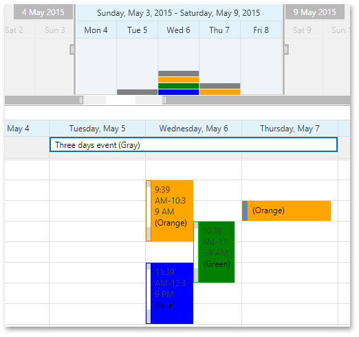
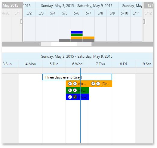
The order in which thumbnails are displayed may differ from the order in which appointments are shown in the view. When the SchedulerControl uses Timeline View, the following criteria are applied to place thumbnails from bottom to top:
- Duration
- Start
As a rule, thumbnails for long appointments which occupy several days are placed at the bottom.
However, for views other than the Timeline, only appointment Start is taken into account for thumbnail ordering. An appointment which spans several days can be represented with different thumbnails, as illustrated below.
|
|
Note
Do not use the Range Control if the Timeline view has a custom scale whose intervals are too small. This may result in slow response and visual artifacts.