Navigation
- 9 minutes to read
This topic describes the base navigation concepts implemented in the WPF WindowsUI.
Navigation and Parameters
Navigation within a WPF WindowsUI-based application allows you to navigate between different application views. To navigate through views, your application must contain the NavigationFrame control. Modify the Slide View sample created in the How To: Create a SlideView and Populate It with Data example (follow this link to download the complete sample), so that end-users can navigate to a view containing detailed employee information when they click a SlideViewItem header.
- Open the SlideView sample and add the following UserControls to your project: MainView.xaml and EmployeeView.xaml.
Move all the static resources, data context and layout markup from the main application window to the MainView.xaml. This view’s markup should appear as follows:
(MainView.xaml)
<UserControl x:Class="SlideViewSample.MainView"
             xmlns="http://schemas.microsoft.com/winfx/2006/xaml/presentation"
             xmlns:x="http://schemas.microsoft.com/winfx/2006/xaml"
             xmlns:mc="http://schemas.openxmlformats.org/markup-compatibility/2006"
             xmlns:d="http://schemas.microsoft.com/expression/blend/2008"
             xmlns:local="clr-namespace:SlideViewSample"
             xmlns:dxwui="http://schemas.devexpress.com/winfx/2008/xaml/windowsui"
             mc:Ignorable="d"
             d:DesignHeight="300" d:DesignWidth="300">
    <UserControl.DataContext>
        <local:EmployeesData/>
    </UserControl.DataContext>
    <UserControl.Resources>
        <DataTemplate x:Key="ItemHeaderTemplate">
            <Grid>
                <TextBlock Text="{Binding FirstName}"/>
            </Grid>
        </DataTemplate>
        <DataTemplate x:Key="ItemContentTemplate">
            <Grid x:Name="Grid_Content" Margin="100, 0, 100, 0">
                <Grid>
                    <Grid.RowDefinitions>
                        <RowDefinition Height="auto" />
                        <RowDefinition Height="auto" />
                        <RowDefinition Height="auto" />
                        <RowDefinition Height="auto" />
                    </Grid.RowDefinitions>
                    <Border HorizontalAlignment="Center" VerticalAlignment="Center" Background="White" BorderBrush="Black" BorderThickness="0" Margin="0">
                        <Image Margin="1" Source="{Binding Photo}" Stretch="None" />
                    </Border>

                    <TextBlock HorizontalAlignment="Center" VerticalAlignment="Center" Text="{Binding FullName}" TextWrapping="Wrap" Grid.Row="1" FontFamily="Times New Roman" FontSize="22.667" Foreground="#FF1059A3" Margin="0,15,0,5" />
                    <Grid Grid.Row="2">
                        <Grid.RowDefinitions>
                            <RowDefinition Height="auto"/>
                            <RowDefinition Height="auto"/>
                            <RowDefinition Height="auto"/>
                            <RowDefinition Height="auto"/>
                            <RowDefinition Height="auto"/>
                            <RowDefinition Height="auto"/>
                            <RowDefinition Height="auto"/>
                        </Grid.RowDefinitions>
                        <Grid.ColumnDefinitions>
                            <ColumnDefinition Width="auto"/>
                            <ColumnDefinition Width="auto"/>
                        </Grid.ColumnDefinitions>
                        <TextBlock Text="Job Title:" Grid.Column="0" Grid.Row="0"/>
                        <TextBlock Text="City:" Grid.Column="0" Grid.Row="1"/>
                        <TextBlock Text="Country:" Grid.Column="0" Grid.Row="2"/>
                        <TextBlock Text="E-mail:" Grid.Column="0" Grid.Row="3"/>
                        <TextBlock Text="Birth Date:" Grid.Column="0" Grid.Row="4"/>
                        <TextBlock Text="Hire Date:" Grid.Column="0" Grid.Row="5"/>
                        <TextBlock Text="Martial Status:" Grid.Column="0" Grid.Row="6"/>
                        <TextBlock Text="{Binding JobTitle}" TextWrapping="Wrap"  Foreground="#FF1059A3" Margin="10,0" Grid.Column="1" Grid.Row="0"/>
                        <TextBlock Text="{Binding City}" TextWrapping="Wrap" Foreground="#FF1059A3" Margin="10,0" Grid.Column="1" Grid.Row="1"/>
                        <TextBlock Text="{Binding CountryRegionName}" TextWrapping="Wrap" Foreground="#FF1059A3" Margin="10,0" Grid.Column="1" Grid.Row="2"/>
                        <TextBlock Text="{Binding EmailAddress}" TextWrapping="Wrap" Foreground="#FF1059A3" Margin="10,0" Grid.Column="1" Grid.Row="3"/>
                        <TextBlock Text="{Binding BirthDate}" TextWrapping="Wrap" Foreground="#FF1059A3" Margin="10,0" Grid.Column="1" Grid.Row="4"/>
                        <TextBlock Text="{Binding HireDate}" TextWrapping="Wrap" Foreground="#FF1059A3" Margin="10,0" Grid.Column="1" Grid.Row="5"/>
                        <TextBlock Text="{Binding MaritalStatus}" TextWrapping="Wrap" Foreground="#FF1059A3" Margin="10,0" Grid.Column="1" Grid.Row="6"/>
                    </Grid>
                    <Grid Grid.Row="3" Margin="0,20,0,0">
                        <Grid.RowDefinitions>
                            <RowDefinition Height="auto" />
                            <RowDefinition Height="auto" />
                        </Grid.RowDefinitions>
                        <Rectangle Fill="#FFA4A7BD" StrokeThickness="0" Height="1" Margin="0" VerticalAlignment="Top" />
                        <TextBlock Margin="10" Grid.Row="1" TextWrapping="Wrap" Foreground="#FF3B3D60" Text="{Binding Phone}" />
                    </Grid>
                </Grid>
            </Grid>
        </DataTemplate>
    </UserControl.Resources>
    <Grid  Background="White">
        <dxwui:SlideView ItemsSource="{Binding DataSource}" Header="Slide View" ItemTemplate="{StaticResource ItemContentTemplate}" ItemHeaderTemplate="{StaticResource ItemHeaderTemplate}"/>
    </Grid>
</UserControl>
You have now created the main application view. Add the NavigationFrame to the main application window and specify its NavigationFrame.Source property to set the default startup view.
(MainWindow.xaml)
<Window x:Class="SlideViewSample.MainWindow"
        xmlns:dxwui="http://schemas.devexpress.com/winfx/2008/xaml/windowsui"
        xmlns="http://schemas.microsoft.com/winfx/2006/xaml/presentation"
        xmlns:x="http://schemas.microsoft.com/winfx/2006/xaml"
        xmlns:dxc="http://schemas.devexpress.com/winfx/2008/xaml/core"
        xmlns:local="clr-namespace:SlideViewSample"
        Title="MainWindow" Height="841.85" Width="1423.369"
        dxc:ThemeManager.ThemeName="Office2013">
    <Grid  Background="White">
        <dxwui:NavigationFrame Source="MainView"/>
    </Grid>
</Window>
If you launch the application now, you will see the same result as in the How To: Create a SlideView and Populate It with Data example.
Next, modify the employee details page. The first thing to do is provide the capability to navigate back from this view. To do so, a Back button must be created. Slide View and Page View controls include an embedded Back button, which is visible if an end-user navigates to this control. If your view layout is based on other controls, use the PageAdornerControl.
(EmployeeDetail.xaml)
<UserControl x:Class="SlideViewSample.EmployeeDetails"
             xmlns:dxwui="http://schemas.devexpress.com/winfx/2008/xaml/windowsui"
             xmlns="http://schemas.microsoft.com/winfx/2006/xaml/presentation"
             xmlns:x="http://schemas.microsoft.com/winfx/2006/xaml"
             xmlns:mc="http://schemas.openxmlformats.org/markup-compatibility/2006"
             xmlns:d="http://schemas.microsoft.com/expression/blend/2008"
             mc:Ignorable="d"
             Height="841.85" Width="1423.369">
    <Grid>
        <StackPanel>
            <dxwui:PageAdornerControl Header="Details" />
            <TextBlock HorizontalAlignment="Center" VerticalAlignment="Center" Name="textBlock1"/>
        </StackPanel>
    </Grid>
</UserControl>
After all required views are ready, you can build the navigation tree. Clicking a SlideViewItem header will take you to a page containing detailed information. If the SlideView content was not automatically generated from the DataSource, you can explicitly set the navigation target for each SlideViewItem from the Navigation.NavigateTo property:
(MainView.xaml)
<UserControl x:Class="SlideViewSample.MainView"
             . . .
             xmlns:dxwui="http://schemas.devexpress.com/winfx/2008/xaml/windowsui"
             xmlns:dxwuin="http://schemas.devexpress.com/winfx/2008/xaml/windowsui/navigation"
             . . . >
    . . .
    <Grid  Background="White">
        <dxwui:SlideView Header="Slide View">
            <dxwui:SlideViewItem dxwuin:Navigation.NavigateTo="UserControl1"/>
            <dxwui:SlideViewItem dxwuin:Navigation.NavigateTo="UserControl2"/>
            <dxwui:SlideViewItem dxwuin:Navigation.NavigateTo="UserControl3"/>
            . . .
        </dxwui:SlideView>
    </Grid>
</UserControl>
Since the SlideView receives its content from the ItemsSource property, you can use another approach - create a new style that affects SlideViewItem objects, and assign it to the ItemContainerStyle property.
(MainView.xaml)
 <dxwui:SlideView Header="Slide View" ItemsSource="{Binding DataSource}" ItemTemplate="{StaticResource ItemContentTemplate}" ItemHeaderTemplate="{StaticResource ItemHeaderTemplate}">
     <dxwui:SlideView.ItemContainerStyle>
         <Style TargetType="dxwui:SlideViewItem">
             <Setter Property="dxwuin:Navigation.NavigateTo" Value="EmployeeDetails" />
         </Style>
     </dxwui:SlideView.ItemContainerStyle>
 </dxwui:SlideView>
Optionally, you can specify the animation used when navigating through containers. To do so, use the NavigationFrame.AnimationType property.
<dxwui:NavigationFrame Source="MainView" AnimationType="SlideHorizontal"/>When you navigate from one view to another, you can pass required data using the Navigation.NavigationParameter property. In this example, you will pass the employee’s full name to our details page. To do so, bind the NavigationParameter property of SlideViewItems to the FullName field:
<dxwui:SlideView ItemsSource="{Binding DataSource}" Header="Slide View" ItemTemplate="{StaticResource ItemContentTemplate}" ItemHeaderTemplate="{StaticResource ItemHeaderTemplate}">
    <dxwui:SlideView.ItemContainerStyle>
        <Style TargetType="dxwui:SlideViewItem">
            <Setter Property="dxwuin:Navigation.NavigateTo" Value="EmployeeDetails" />
            <Setter Property="dxwuin:Navigation.NavigationParameter" Value="{Binding FullName}" />
        </Style>
    </dxwui:SlideView.ItemContainerStyle>
</dxwui:SlideView>
To receive and manage this data in our details page, implement the INavigationAware interface for your user control and use its INavigationAware.NavigatedTo method.
If you do not wish to manually implement the INavigationAware interface, you can use the NavigationPage container instead of the standard UserControl. To use the data passed by the NavigationParameter, override the OnNavigatedTo and/or OnNavigatedFrom methods. In this case, the details page will appear as follows:
(EmployeeDetailsNavigationPage.xaml)
<dxwui:NavigationPage x:Class="SlideViewSample.EmployeeDetailsNavigationPage"
             xmlns="http://schemas.microsoft.com/winfx/2006/xaml/presentation"
             xmlns:x="http://schemas.microsoft.com/winfx/2006/xaml"
             xmlns:mc="http://schemas.openxmlformats.org/markup-compatibility/2006"
             xmlns:d="http://schemas.microsoft.com/expression/blend/2008"
             xmlns:dxwui="http://schemas.devexpress.com/winfx/2008/xaml/windowsui"
             xmlns:dxwuin="http://schemas.devexpress.com/winfx/2008/xaml/windowsui/navigation"
             mc:Ignorable="d"
             d:DesignHeight="300" d:DesignWidth="300"
             Name="frame">
    <Grid>
        <StackPanel>
            <dxwui:PageAdornerControl Header="Details" />
            <TextBlock HorizontalAlignment="Center" VerticalAlignment="Center" Name="textBlock1"/>
        </StackPanel>
    </Grid>
</dxwui:NavigationPage>
Navigation Buttons
Another way to navigate through application views is to use NavigationButton objects.
- Start Visual Studio and create a new WPF project. Add a new user control called MainView to your project. This view will serve as the application startup screen.
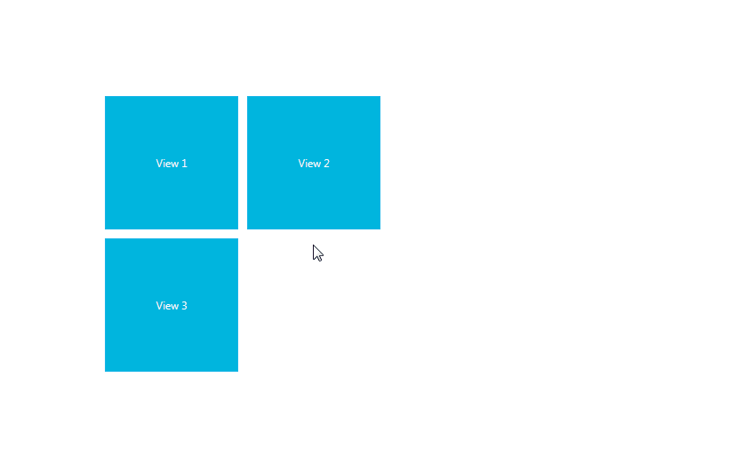
Drop a TileLayoutControl onto your MainView and create three Tiles.
<UserControl x:Class="NavigationButtons.MainView"
             xmlns="http://schemas.microsoft.com/winfx/2006/xaml/presentation"
             xmlns:x="http://schemas.microsoft.com/winfx/2006/xaml"
             xmlns:mc="http://schemas.openxmlformats.org/markup-compatibility/2006"
             xmlns:d="http://schemas.microsoft.com/expression/blend/2008"
             xmlns:lc="http://schemas.devexpress.com/winfx/2008/xaml/layoutcontrol"
             xmlns:dxwuin="http://schemas.devexpress.com/winfx/2008/xaml/windowsui/navigation"
             mc:Ignorable="d"
             d:DesignHeight="300" d:DesignWidth="300">
    <Grid>
        <lc:TileLayoutControl>
            <lc:Tile Size="Small">
                <TextBlock Text="View 1" HorizontalAlignment="Center" VerticalAlignment="Center"/>
            </lc:Tile>
            <lc:Tile Size="Small">
                <TextBlock Text="View 2" HorizontalAlignment="Center" VerticalAlignment="Center"/>
            </lc:Tile>
            <lc:Tile Size="Small">
                <TextBlock Text="View 3" HorizontalAlignment="Center" VerticalAlignment="Center"/>
            </lc:Tile>
        </lc:TileLayoutControl>
    </Grid>
</UserControl>
Each Tile will link to a corresponding view when clicked. Specify the navigation target for all Tiles from the NavigateTo attached property.
<lc:Tile Size="Small" dxwuin:Navigation.NavigateTo="View1"> . . . <lc:Tile Size="Small" dxwuin:Navigation.NavigateTo="View2"> . . . <lc:Tile Size="Small" dxwuin:Navigation.NavigateTo="View3"> . . .- Add three UserControls to your project - View1, View2 and View3. These UserControls will represent views related to corresponding Tiles.
- Add a PageAdornerControl to each of the detailed views. The complete code for all views can be found at the end of this article.
Customize all three PageAdornerControl headers via the DataTemplate, which is assigned to the HeaderTemplate property. Each DataTemplate should contain two NavigationButtons. The XAML mark-up for View1 is listed below.
<Grid>
    <Grid.RowDefinitions>
        <RowDefinition Height="auto"/>
        <RowDefinition Height="*"/>
    </Grid.RowDefinitions>
    <dxwui:PageAdornerControl Header="View 1" Grid.Row="0">
        <dxwui:PageAdornerControl.HeaderTemplate>
            <DataTemplate>
                <Grid>
                    <Grid.ColumnDefinitions>
                        <ColumnDefinition Width="Auto" />
                        <ColumnDefinition />
                    </Grid.ColumnDefinitions>
                    <ContentPresenter Content="{Binding}" />
                    <StackPanel Orientation="Horizontal" HorizontalAlignment="Right" Grid.Column="1">
                        <dxwui:NavigationButton FontSize="14" Margin="10, 0, 0, 0" Content="View 2" NavigateTo="View2"/>
                        <dxwui:NavigationButton FontSize="14" Margin="10, 0, 0, 0" Content="View 3" NavigateTo="View3"/>
                    </StackPanel>
                </Grid>
            </DataTemplate>
        </dxwui:PageAdornerControl.HeaderTemplate>
    </dxwui:PageAdornerControl>
    <Border Background="Orange" Grid.Row="1">
        <TextBlock HorizontalAlignment="Center" VerticalAlignment="Center" Name="textBlock1" Text="Use the back button or navigation buttons to move through the views"/>
    </Border>
</Grid>
Drop a NavigationFrame onto your main application window and specify its Source property, to set up the startup screen. Optionally, you can change the view transition animation from the NavigationFrame.AnimationType property.
<dxwui:NavigationFrame Source="MainView" AnimationType="SlideHorizontal"/>Launch the application to see the result.
The complete application code is listed at the end of this topic.
Journal
Each NavigationFrame has a related Journal object. Whenever navigation within a WindowsUI application is performed, previously visited Views are written to JournalEntry objects and stored within a Journal as navigation history. This allows you and your end-users to sequentially navigate in both backward and forward directions. A Journal has two collections that store entries.
- Journal.ForwardStack collection - stores the sequence of Views from which an end-user navigated via the Back button. You can navigate forward to these Views via the NavigationFrame.GoForward method.
- Journal.BackStack collection - stores the sequence of Views from which an end-user navigated forward (for example, using a navigation button that calls the NavigationFrame.GoForward method). To navigate back through these Views, use the NavigationFrame.GoBack method.
The BackStack and ForwardStack collections are closely associated. For example, each time an end-user clicks a Back button, the previous View is placed as a JournalEntry object at the end of the ForwardStack collection. If you now call the NavigationFrame.GoForward method, the ForwardStack collection’s last entry will move to the BackStack collection. The View that this entry contains can now be displayed via the NavigationFrame.GoBack method. In this case, the entry will move to the ForwardStack again. To get the entry corresponding to the currently displayed View, use the Journal.Current property.
Journals also provide methods for navigation through their entries.
- Journal.GoForward - navigates through the Journal.ForwardStack collection of a Journal. It takes effect if the ForwardCollection is not empty. You can use the Journal.CanGoForward property to get whether or not the GoForward method is currently available. It is similar to the Frame’s NavigationFrame.GoForward method.
- Journal.GoBack - navigates through the Journal.BackStack collection of a Journal. It does not depend on the Frame’s NavigationFrame.BackNavigationMode property value like the NavigationFrame.GoBack method does. This property only takes effect if the BackStack collection contains more than one entry (the very first entry contains information about initial navigation to the root View, which cannot be undone via the GoBack method). Use the Journal.CanGoBack method to determine the current GoBack method’s availability.
- Journal.GoHome - navigates to the Frame’s root View (see the NavigationFrame.Source property).
The Journal’s BackStack and ForwardStack collections are IEnumerable objects. See the IEnumerable Interface topic in MSDN to learn how to access and modify these collections. For example, to get a View contained within the third JournalEntry of the BackStack collection, use the following code.
if ((frame1 as INavigationFrame).Journal.BackStack.Count() >= 3) {
    Object myView = frame1.Journal.BackStack.ElementAt(2).Content;
    . . .
}
Example
This example demonstrates how to use NavigationButtons to navigate through views in WPF WindowsUI applications.
Note
A complete sample project is available at https://github.com/DevExpress-Examples/how-to-use-navigationbuttons-to-navigate-in-wpf-windowsui-applications-e4663.