Crosshair Cursor Customization
- 8 minutes to read
You can format the Crosshair Cursor content and configure Crosshair Cursor appearance and behavior.
This topic explains how to:
- Format Crosshair Content
- Show Crosshair Content in a Legend
- Change Crosshair Element Visibility
- Display Individual Labels for Each Series
- Customize Crosshair Cursor Element Appearance
- Custom Draw the Crosshair Cursor
Format Crosshair Content
Format patterns allow you to manage how crosshair elements display their content. You can specify these patterns for the elements labeled in the following image.
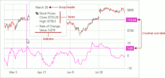
The following code specifies patterns the Crosshair Cursor should apply to its elements’ text:
<dxc:ChartControl x:Name="chartControl">
<dxc:ChartControl.CrosshairOptions>
<dxc:CrosshairOptions GroupHeaderPattern="{}{A:MMMM d}"
ShowOnlyInFocusedPane="False"
ShowValueLabels="True"
ShowValueLine="True"/>
</dxc:ChartControl.CrosshairOptions>
<dxc:XYDiagram2D>
<dxc:StockSeries2D DisplayName="Stock Prices"
CrosshairLabelPattern="{}{S}:
Close: ${CV:.###}
High: ${HV:.###}">
<dxc:StockSeries2D.Indicators>
<dxc:RateOfChange DisplayName="Rate of Change"
CrosshairEnabled="True"
CrosshairLabelPattern="{}{I}:
Value: {V:F3}">
</dxc:RateOfChange>
</dxc:StockSeries2D.Indicators>
</dxc:StockSeries2D>
<dxc:XYDiagram2D.AxisY>
<dxc:AxisY2D>
<dxc:AxisY2D.CrosshairAxisLabelOptions>
<dxc:CrosshairAxisLabelOptions Pattern="{}{V:.##}"/>
</dxc:AxisY2D.CrosshairAxisLabelOptions>
</dxc:AxisY2D>
</dxc:XYDiagram2D.AxisY>
<dxc:XYDiagram2D.SecondaryAxesY>
<dxc:SecondaryAxisY2D>
<dxc:SecondaryAxisY2D.CrosshairAxisLabelOptions>
<dxc:CrosshairAxisLabelOptions Pattern="{}{V:.##}"/>
</dxc:SecondaryAxisY2D.CrosshairAxisLabelOptions>
</dxc:SecondaryAxisY2D>
</dxc:XYDiagram2D.SecondaryAxesY>
</dxc:XYDiagram2D>
</dxc:ChartControl>
Use the following properties to format Crosshair Cursor element content:
| Property | Description |
|---|---|
| XYSeries2D.CrosshairLabelPattern | Specifies a format string the Crosshair Cursor should apply to the text that identifies the series. |
| Indicator.CrosshairLabelPattern | Specifies a format string the Crosshair Cursor should apply to the text that identifies the indicator. |
| ChartControl.CrosshairOptions | Defines the settings that relate to the Crosshair Cursor. |
| CrosshairOptions.GroupHeaderPattern | Specifies a string that formats group header text. Use it when the Crosshair has data to display in the Crosshair Cursor’s label. |
| Axis2D.CrosshairAxisLabelOptions | Defines the axis label settings that relate to the Crosshair Cursor. |
| CrosshairAxisLabelOptions.Pattern | Specifies a string that formats the Crosshair’s axis labels. |
Patterns can comprise plain text and placeholders with format specifiers. The following table lists available placeholders:
| Pattern | Description |
|---|---|
| {S} | Displays the Series.DisplayName value. |
| {A} | Displays a series point argument. |
| {V} | Displays series point values. |
| Stacked series-specific placeholders | |
| {VP} | Displays series point values as percentages. |
| {G} | Displays the name of a stacked group. |
| {TV} | Displays a total group value. |
| Bubble series-specific placeholders | |
| {W} | Displays the weight. |
| Range series-specific placeholders | |
| {V1} | Displays the first value. |
| {V2} | Displays the second value. |
| {VD} | Displays the duration between the first and second data point values formatted using a common time format (e.g. HH:MM:SS for date time values and #.## for numeric values). |
| {VDTD} | Displays the duration between the first and second date-time data point values in days. |
| {VDTH} | Displays the duration between the first and second date-time data point values in hours. |
| {VDTM} | Displays the duration between the first and second date-time data point values in minutes. |
| {VDTS} | Displays the duration between the first and second date-time data point values in seconds. |
| {VDTMS} | Displays the duration between the first and second date-time data point values in milliseconds. |
| Financial series specific placeholders | |
| {OV} | Displays the open value. |
| {HV} | Displays the high value. |
| {LV} | Displays the low value. |
| {CV} | Displays the close value. |
| Indicator specific placeholders | |
| {I} | Displays an indicator name. |
| {A} | Displays an indicator point’s argument. |
| {V} | Displays a single-line indicator or MACD indicator point’s value. |
| {SV} | Displays a MACD indicator signal line’s point value. |
| {AV} | Displays the MovingAverage indicator value. |
| {LV} | Displays the MovingAverage indicator lower envelope line point’s value. |
| {UV} | Displays the Moving Average indicator upper envelope line point’s value. |
| {T} | Displays the Error Bar indicator point’s top value. |
| {B} | Displays the Error Bar indicator point’s bottom value. |
| X-axis label specific placeholders | |
| {A} | Displays a series point argument. |
| Y-axis label specific placeholders | |
| {V} | Displays series point values. |
| {VP} | Displays series point values as percentages. |
In XAML, insert empty brackets into the beginning of a pattern if it starts with a placeholder.
When the Chart control or a series is bound to data, the pattern may contain data field values in addition to placeholders. For example, the data source contains the Discount field and the pattern may look like: {S}: {V:F2} (Discount: {Discount:P0}).
Additional examples:
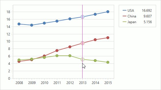
Show Crosshair Content in a Legend
The Crosshair Cursor can display its content in a legend instead of the Crosshair label. The Crosshair Cursor uses a legend the Series.Legend or Indicator.Legend property specifies. If these properties are not defined, the Crosshair Cursor uses the first legend in the ChartControlBase.Legends collection.
The code below makes the Crosshair Cursor to display its content in a legend and configures legend settings:
<dxc:ChartControl>
    <dxc:ChartControl.CrosshairOptions>
        <dxc:CrosshairOptions ContentShowMode="Legend"/>
    </dxc:ChartControl.CrosshairOptions>
    <dxc:ChartControl.Legends>
    <dxc:Legend MaxCrosshairContentWidth="50"
                MaxCrosshairContentHeight="20"
                Orientation="Vertical"/>
    </dxc:ChartControl.Legends>
    <!-- ... -->
</dxc:ChartControl>
The following table lists the API members the code above uses:
| Member | Description |
|---|---|
| CrosshairOptions.ContentShowMode | Specifies the element the Crosshair Cursor uses to show its content. |
| CrosshairContentShowMode | Lists elements the Crosshair can use. |
| Legend.MaxCrosshairContentWidth | Defines a maximum width of area that the Crosshair’s content can occupy. |
| Legend.MaxCrosshairContentHeight | Defines a maximum height of area that the Crosshair’s content can occupy. |
Note
Use the XYSeries2D.CrosshairContentShowMode and Indicator.CrosshairContentShowMode properties to specify an element the Crosshair Cursor should use for an individual series/indicator to display related information.
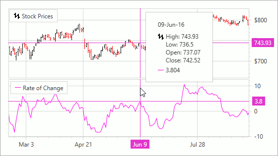
Change Crosshair Element Visibility
The Chart control can display the Crosshair Cursor with argument axis labels, value lines, and value axis labels in addition to the Crosshair Cursor’s label and argument line:
The code below enables visibility of elements mentioned previously:
<dxc:ChartControl.CrosshairOptions>
    <dxc:CrosshairOptions ShowCrosshairLabels="True"
                          ShowArgumentLabels="True"
                          ShowArgumentLine="True"
                          ShowValueLabels="True"
                          ShowValueLine="True"
                          ShowOnlyInFocusedPane="False"/>
</dxc:ChartControl.CrosshairOptions>
The following table lists the API members the code above uses:
| Member | Description |
|---|---|
| CrosshairOptionsBase.ShowCrosshairLabels | Specifies whether to show the Crosshair Cursor’s labels. |
| CrosshairOptions.ShowArgumentLabels | Defines whether to display argument axis labels. |
| CrosshairOptions.ShowArgumentLine | Defines whether to display argument lines. |
| CrosshairOptions.ShowValueLabels | Specifies whether to show value axis labels. |
| CrosshairOptionsBase.ShowValueLine | Specifies whether to show value lines. |
| CrosshairOptions.ShowOnlyInFocusedPane | Defines whether to show the Crosshair Cursor only in a focused pane. |
Display Individual Labels for Each Series/Indicator
The Crosshair Cursor can display individual labels for each series/indicator instead of a common label:
The following code demonstrates how to enable individual labels:
<dxc:ChartControl.CrosshairOptions>
    <dxc:CrosshairOptions CrosshairLabelMode="ShowForEachSeries"/>
</dxc:ChartControl.CrosshairOptions>
The following table lists the API members the code above uses:
| Member | Description |
|---|---|
| CrosshairOptions.CrosshairLabelMode | Specifies how to show the Crosshair Cursor’s label for each series or indicator. |
| CrosshairLabelMode | Lists modes that define how to show the Crosshair Cursor’s label for each series or indicator. |
Note
The crosshair label is automatically displayed with a beak in the CrosshairLabelMode.ShowForEachSeries and CrosshairLabelMode.ShowForNearestSeries modes.
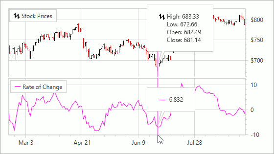
Customize Crosshair Cursor Element Appearance
The Chart control allows you to fine-tune the appearance of Crosshair Cursor elements:
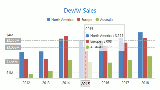
The example below configures the Crosshair Cursor’s appearance to resemble to the one in the image above:
  <dxc:ChartControl>
      <dxc:ChartControl.CrosshairOptions>
          <dxc:CrosshairOptions ArgumentLineBrush="Orange" ValueLineBrush="DarkGray"
                              ShowArgumentLabels="True" ShowValueLabels="True"
                              ShowValueLine="True">
              <dxc:CrosshairOptions.ArgumentLineStyle>
                  <dxc:LineStyle Thickness="2">
                      <dxc:LineStyle.DashStyle>
                          <DashStyle Dashes="2 5"/>
                      </dxc:LineStyle.DashStyle>
                  </dxc:LineStyle>
              </dxc:CrosshairOptions.ArgumentLineStyle>
              <dxc:CrosshairOptions.ValueLineStyle>
                  <dxc:LineStyle Thickness="2">
                      <dxc:LineStyle.DashStyle>
                          <DashStyle Dashes="2 2"/>
                      </dxc:LineStyle.DashStyle>
                  </dxc:LineStyle>
              </dxc:CrosshairOptions.ValueLineStyle>
              <dxc:CrosshairOptions.PopupTemplate>
                  <DataTemplate>
                      <Border Background="#C0FFFFFF" BorderBrush="#C0C0C0C0"
                              BorderThickness="1" Padding="4">
                          <ItemsControl ItemsSource="{Binding PresentationData}">
                              <ItemsControl.ItemTemplate>
                                  <DataTemplate>
                                      <ContentPresenter Content="{Binding}"
                                          ContentTemplate="{Binding Path=CrosshairSeriesLabelTemplate}"/>
                                  </DataTemplate>
                              </ItemsControl.ItemTemplate>
                          </ItemsControl>
                      </Border>
                  </DataTemplate>
              </dxc:CrosshairOptions.PopupTemplate>
          </dxc:CrosshairOptions>
      </dxc:ChartControl.CrosshairOptions>
      <dxc:XYDiagram2D>
          <dxc:XYDiagram2D.SeriesTemplate>
              <dxc:BarSideBySideSeries2D>
                  <dxc:BarSideBySideSeries2D.LegendMarkerTemplate>
                      <DataTemplate>
                          <StackPanel Orientation="Horizontal">
                              <Grid Width="12"  Height="12">
                                  <Ellipse Stretch="Uniform" Fill="{Binding Path=MarkerBrush}"
                                          Stroke="{Binding Path=MarkerLineBrush}" StrokeThickness="2"/>
                              </Grid>
                              <TextBlock Text="{Binding Path=Text}" Margin="4,0,0,0"
                                      VerticalAlignment="Center" Width="55"/>
                          </StackPanel>
                      </DataTemplate>
                  </dxc:BarSideBySideSeries2D.LegendMarkerTemplate>
              </dxc:BarSideBySideSeries2D>
          </dxc:XYDiagram2D.SeriesTemplate>
          <dxc:XYDiagram2D.AxisX>
              <dxc:AxisX2D>
                  <dxc:AxisX2D.CrosshairLabelTemplate>
                      <DataTemplate>
                          <Grid>
                              <Border BorderThickness="1">
                                  <Border.Background>
                                      <SolidColorBrush Color="Lavender" />
                                  </Border.Background>
                                  <Label BorderThickness="1" BorderBrush="DarkGray"
                                      FontStyle="Italic" Content="{Binding Path=Text}"
                                      Padding="1" Foreground="Black"
                                      FontSize="14"/>
                              </Border>
                          </Grid>
                      </DataTemplate>
                  </dxc:AxisX2D.CrosshairLabelTemplate>
              </dxc:AxisX2D>
          </dxc:XYDiagram2D.AxisX>
      </dxc:XYDiagram2D>
  </dxc:ChartControl>
The following table lists API members you can use to customize crosshair appearance:
| Member | Description |
|---|---|
| CrosshairOptions.ArgumentLineBrush | Specifies the brush with which to draw the argument line. |
| CrosshairOptionsBase.ValueLineBrush | Specifies the brush with which to draw the value line. |
| CrosshairOptions.ArgumentLineStyle | Defines the style to be applied to an argument line. |
| CrosshairOptionsBase.ValueLineStyle | Defines the style to be applied to a value line. |
| CrosshairOptionsBase.PopupTemplate | Gets or sets the template that specifies Crosshair Cursor appearance. |
| Series.LegendMarkerTemplate | Specifies the template that configures the series’s marker in the legend and the Crosshair Cursor’s label |
| Indicator.LegendMarkerTemplate | Specifies the template that configures the indicator’s marker in the legend and the Crosshair Cursor’s label. |
| Axis2D.CrosshairLabelTemplate | Defines the template that configures Crosshair Cursor axis label appearance. |
Note
Use the XYSeries2D.CrosshairLabelTemplate property to specify the series item appearance in the Crosshair Cursor.
Additional examples:
- How to: Customize the Appearance of Crosshair Axis Labels
- How to: Customize the Appearance of Crosshair Series Labels
Custom Draw the Crosshair Cursor
You can use the ChartControl.CustomDrawCrosshair event to customize the Crosshair Cursor’s appearance.
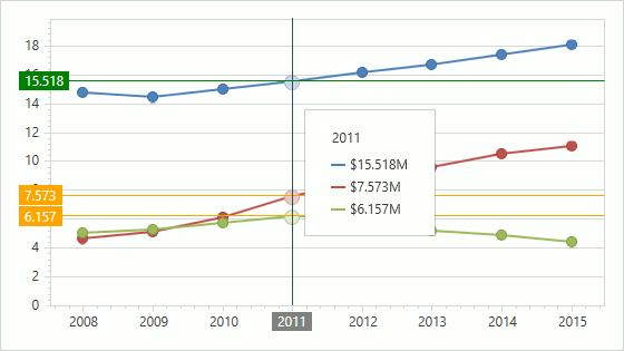
The following example shows how to use the CustomDrawCrosshair event to replicate Crosshair Cursor appearance to resemble the one in the image above:
<dxc:ChartControl CustomDrawCrosshair="ChartControl_CustomDrawCrosshair">
    <dxc:ChartControl.CrosshairOptions>
        <dxc:CrosshairOptions ShowValueLabels="True"
                              ShowValueLine="True"
                              ShowArgumentLabels="True"/>
    </dxc:ChartControl.CrosshairOptions>
<!--...-->
</dxc:ChartControl>
The following table lists the API members the code example above uses:
| Member | Description |
|---|---|
| ChartControl.CustomDrawCrosshair | Occurs before crosshair items are drawn when the chart’s contents are being drawn. |
| CustomDrawCrosshairEventArgs | Provides data for a chart control’s ChartControl.CustomDrawCrosshair event. |
Note
- CrosshairElementGroup.IndicatorElements allows you to access indicator items when CrosshairOptions.ContentShowMode is Label.
- Use the CustomDrawCrosshairEventArgs.CrosshairLegendElements collection to access the crosshair items when CrosshairOptions.ContentShowMode is Legend. For indicators, use CustomDrawCrosshairEventArgs.IndicatorLegendElements.
Additional examples: