Excel-style Drop-down Filter
- 7 minutes to read
The GridControl provides an Excel-style drop-down filter:
Enable Excel-style Drop-down Filter
- For a specific column, set the ColumnBase.FilterPopupMode property to FilterPopupMode.ExcelSmart.
- For all columns, set the DataViewBase.ColumnFilterPopupMode to ColumnFilterPopupMode.ExcelSmart.
Note
Starting from v18.2, the GridControl supports the FilterPopupMode.ExcelSmart / ColumnFilterPopupMode.ExcelSmart mode. In the previous versions, use the FilterPopupMode.Excel / ColumnFilterPopupMode.Excel mode instead.
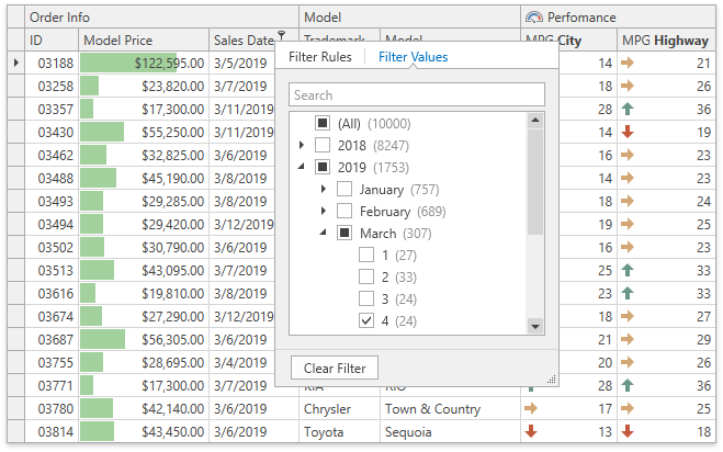
Excel-style Drop-down Filter Elements
The Filter Rules tab shows a list of operators the selected column accepts. A user should select an operator and specify operand values.
The Filter Values tab shows an Excel-style checklist with the filter values. Record counts are displayed next to the filter values. The built-in search panel allows users to find filter values.

Group Filters
You can group filter values in the Filter Values tab to allow users to filter data by multiple columns. Set the ColumnBase.FilterPopupGroupFields property to names of the fields by which filter values should be grouped. Separate names by comma, semicolon, or space. The order of field names determines the hierarchy in the group.
Example 1
The code sample below displays the available cities below each country in the Ship Country column’s drop-down filter:

<dxg:GridControl>
    <dxg:GridControl.Columns>
        <dxg:GridColumn FieldName="ProductName"/>
        <dxg:GridColumn FieldName="ShipCountry" FilterPopupGroupFields="ShipCountry;ShipCity"/>
        <dxg:GridColumn FieldName="ShipCity"/>
    </dxg:GridControl.Columns>
  <!-- ... -->
</dxg:GridControl>
The customized column’s values are displayed at the root level. You can omit its name (“ShipCountry”). The code sample below has the same effect:
<dxg:GridControl>
    <dxg:GridControl.Columns>
        <dxg:GridColumn FieldName="ProductName"/>
        <dxg:GridColumn FieldName="ShipCountry" FilterPopupGroupFields="ShipCity"/>
        <dxg:GridColumn FieldName="ShipCity"/>
    </dxg:GridControl.Columns>
  <!-- ... -->
</dxg:GridControl>
Example 2
The code sample below displays the available cities below each country in the Ship City column’s drop-down filter:

<dxg:GridControl>
    <dxg:GridControl.Columns>
        <dxg:GridColumn FieldName="ProductName"/>
        <dxg:GridColumn FieldName="ShipCountry"/>
        <dxg:GridColumn FieldName="ShipCity" FilterPopupGroupFields="ShipCountry;ShipCity"/>
    </dxg:GridControl.Columns>
  <!-- ... -->
</dxg:GridControl>
The customized column’s values are not displayed at the root level in this case, its name (“ShipCountry”) cannot be omitted.
Conditional Formatting Filters
You can filter data by applying Conditional Formatting rules. The Excel-style Drop-down Filter displays available rules and indicates the number of records that meet rule conditions:

Customize the Excel-style Drop-down Filter
The column’s drop-down filter displays only the values that meet the current filter criteria. To show all values, set the DataControlBase.ShowAllTableValuesInFilterPopup / ColumnBase.ShowAllTableValuesInFilterPopup property to true.
Use the ColumnBase.CustomColumnFilterPopupTemplate property to specify a custom data template. In the template, define a filter element with the PART_FilterElement name and specify its settings.
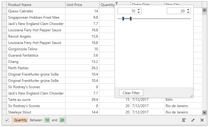
Customize Filter Popup Content
The following code sample uses the RangeFilterElement as a custom data template:
<dxg:GridControl x:Name="grid" ItemsSource="...">
    <dxg:GridControl.Columns>
        <!-- -->
        <dxg:GridColumn FieldName="Quantity">
            <dxg:GridColumn.CustomColumnFilterPopupTemplate>
                <DataTemplate>
                    <dxfui:RangeFilterElement x:Name="PART_FilterElement"/>
                </DataTemplate>
            </dxg:GridColumn.CustomColumnFilterPopupTemplate>
        </dxg:GridColumn>
        <!-- -->
    </dxg:GridControl.Columns>
    <dxg:GridControl.View>
        <dxg:TableView ColumnFilterPopupMode="ExcelSmart" />
    </dxg:GridControl.View>
</dxg:GridControl>
Tip
Topic: Custom Drop-down Filter
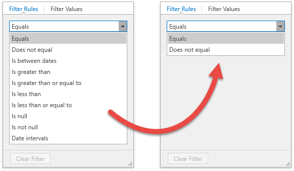
Customize the Operator List
Standard Operators
The Excel-style Drop-down Filter shows a list of operators the selected field accepts. To customize the operator list, use the ExcelStyleFilterElement as a custom data template and handle the ExcelStyleFilterElement.QueryOperators event.
The code sample below removes all operators except Equal and Not Equal:
<dxg:GridColumn FieldName="OrderDate">
    <dxg:GridColumn.CustomColumnFilterPopupTemplate>
        <DataTemplate>
            <dxfui:ExcelStyleFilterElement x:Name="PART_FilterElement" QueryOperators="OnExcelStyleFilterQueryOperators"/>
        </DataTemplate>
    </dxg:GridColumn.CustomColumnFilterPopupTemplate>
</dxg:GridColumn>
void OnExcelStyleFilterQueryOperators(object sender, ExcelStyleFilterElementQueryOperatorsEventArgs e) {
    if(e.FieldName == "OrderDate") {
        e.Operators.Clear();
        e.Operators.Add(new ExcelStyleFilterElementOperatorItem(ExcelStyleFilterElementOperatorType.Equal));
        e.Operators.Add(new ExcelStyleFilterElementOperatorItem(ExcelStyleFilterElementOperatorType.NotEqual));
    }
}
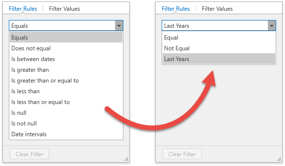
Custom Operators
You can use the ExcelStyleFilterElement.QueryOperators event to add custom operators. The code sample below adds the Last Years operator:
Create a custom function. Do one of the following:
Use the CustomFunctionFactory.Create method.
The CustomFunctionFactory is an extension of the DevExpress.Xpf.Grid.v23.2.Extensions.dll library. Refer to C:\Program Files\DevExpress 23.2\Components\Sources\XPF\DevExpress.Xpf.Grid\DevExpress.Xpf.Grid.Extensions\ for information on how extension methods work.
The CustomFunctionFactory.Create method allows you to create a custom function with a maximum of 4 operands.
Implement the ICustomFunctionOperator interface. Refer to the Implementing Custom Functions topic for more information.
const string CustomFunctionName = "LastYears"; var currentYear = DateTime.Now.Year; ICustomFunctionOperatorBrowsable customFunction = CustomFunctionFactory.Create(CustomFunctionName, (DateTime date, int threshold) => { return currentYear >= date.Year && currentYear - date.Year <= threshold; } );Call the CriteriaOperator.RegisterCustomFunction method to register the custom function.
Create the ExcelStyleFilterElementOperatorItem and add it to the ExcelStyleFilterElementQueryOperatorsEventArgs.Operators collection. Specify the operator item’s edit settings to define its operands:
void OnExcelStyleFilterQueryOperators(object sender, ExcelStyleFilterElementQueryOperatorsEventArgs e) {
    if(e.FieldName == "OrderDate") {
        // ...

        var customFunctionEditSettings = new BaseEditSettings[] {
            new TextEditSettings { MaskType = MaskType.Numeric, Mask = "D", MaskUseAsDisplayFormat = true }
        };
        e.Operators.Add(new ExcelStyleFilterElementOperatorItem(CustomFunctionName, customFunctionEditSettings) { Caption = "Last Years" });
    }
}
Predefined Filters
You can specify Predefined Filters with the ColumnBase.PredefinedFilters property. The Excel-style Drop-Down Filter displays these filters in the Filter Rules tab:

<dxg:GridColumn FieldName="UnitPrice">
<dxg:GridColumn.PredefinedFilters>
<dxfui:PredefinedFilterCollection>
<dxfui:PredefinedFilter Name="Less than 10" Filter="?p < 10" />
<dxfui:PredefinedFilter Name="Between 10 and 50" Filter="?p > 10 and ?p < 50" />
<dxfui:PredefinedFilter Name="Between 50 and 100" Filter="?p > 50 and ?p < 100" />
<dxfui:PredefinedFilter Name="Greater than 100" Filter="?p > 100" />
</dxfui:PredefinedFilterCollection>
</dxg:GridColumn.PredefinedFilters>
</dxg:GridColumn>
Tip
Topic: Predefined Filters
Customize Operand Template
The Excel-style Drop-Down Filter automatically creates operand editors based on the field and operator type. You can customize operand editors.
The following code sample specifies the TrackBarEdit as an operand for the Between and NotBetween operators:

Create a template for the operands. The following models depend on the operator type. Use their properties to bind to operand values in the template:
- ConstantFilterModel (e.g., Is null, Is Yesterday)
- BinaryFilterModel (e.g., Equals, Is greater than)
- TernaryFilterModel (e.g., Is between, Is between dates)
- VariadicFilterModel (e.g., Is any of, Is none of)
<UserControl.Resources> <DataTemplate x:Key="ternaryTemplate"> <dxe:TrackBarEdit Minimum="0" Maximum="300" MinWidth="120" TickPlacement="None"> <dxe:TrackBarEdit.EditValue> <MultiBinding Converter="{local:TrackBarEditRangeConverter}"> <Binding Path="LeftValueItem.Value"/> <Binding Path="RightValueItem.Value"/> </MultiBinding> </dxe:TrackBarEdit.EditValue> <dxe:TrackBarEdit.StyleSettings> <dxe:TrackBarRangeStyleSettings /> </dxe:TrackBarEdit.StyleSettings> </dxe:TrackBarEdit> </DataTemplate> </UserControl.Resources>TrackBarEditRangeConverterpublic class TrackBarEditRangeConverter : BaseMultiValueConverter { public override object Convert(object[] values, Type targetType, object parameter, CultureInfo culture) { if(values.Length != 2) return new TrackBarEditRange(); return new TrackBarEditRange(GetApproptiateValue(values[0]), GetApproptiateValue(values[1])); } short GetApproptiateValue(object value) { if(value is int) return System.Convert.ToInt16(value); return value is short ? (short)value : (short)0; } public override object[] ConvertBack(object value, Type[] targetTypes, object parameter, CultureInfo culture) { var trackBarEditRange = value as TrackBarEditRange; if(trackBarEditRange == null) return new object[] { (short)0, (short)0 }; return new object[] { (short)trackBarEditRange.SelectionStart, (short)trackBarEditRange.SelectionEnd }; } }Handle the ExcelStyleFilterElement.QueryOperators event, get the operator, and assign the created template to the OperatorItemBase.OperandTemplate property.
<dxg:GridColumn FieldName="Quantity"> <dxg:GridColumn.CustomColumnFilterPopupTemplate> <DataTemplate> <dxfui:ExcelStyleFilterElement x:Name="PART_FilterElement" QueryOperators="OnExcelStyleFilterQueryOperators"/> </DataTemplate> </dxg:GridColumn.CustomColumnFilterPopupTemplate> </dxg:GridColumn>void OnExcelStyleFilterQueryOperators(object sender, ExcelStyleFilterElementQueryOperatorsEventArgs e) { if(e.FieldName == "Quantity") { var template = (DataTemplate)FindResource("ternaryTemplate"); e.Operators[ExcelStyleFilterElementOperatorType.Between].OperandTemplate = template; e.Operators[ExcelStyleFilterElementOperatorType.NotBetween].OperandTemplate = template; } }
Limitations
In Virtual Sources and Server Mode, record counts and custom filter items (for example, Blanks) are not displayed by default. To display record counts, handle the DataControlBase.CustomUniqueValues event. For Virtual Sources, you can alternatively handle the GetUniqueValues event.