Themes
- 2 minutes to read
Themes allow you to specify an individual gauge’s and/or the entire window’s appearance. The following gauges support themes:
Applying a Theme
DevExpress WPF themes only affect on gauge appearance when a gauge uses a themeable model. For this, assign a CircularThemeableModel object to the CircularGaugeControl.Model property to apply the theme to the Circular gauge. To apply themes to the Linear gauge, assign a LinearThemeableModel object to the LinearGaugeControl.Model property. Then, you can use ThemeManager to set a specific theme to all the elements in the application’s window or a separate control. For this, specify the required theme’s name using the ThemeManager.ThemeName option.
The following markup shows how to apply the DXStyle theme to the entire window:
<ThemedWindow ...
        xmlns:dx="http://schemas.devexpress.com/winfx/2008/xaml/core"
        dx:ThemeManager.ThemeName="DXStyle">
        ...
    <dxga:CircularGaugeControl Name="circularGauge">
        <dxga:CircularGaugeControl.Model>
            <dxga:CircularThemeableModel/>
        </dxga:CircularGaugeControl.Model>
        ...
    </dxga:CircularGaugeControl>

    <dxga:LinearGaugeControl Name="linearGauge">
        <dxga:LinearGaugeControl.Model>
            <dxga:LinearThemeableModel/>
        </dxga:LinearGaugeControl.Model>
        ...
    </dxga:LinearGaugeControl>
</ThemedWindow>
The following classes and properties allow you to apply themes to gauges:
| Class or property | Description |
|---|---|
| CircularGaugeControl.Model | Gets or sets a model for the circular gauge control that is used to draw its elements. |
| LinearGaugeControl.Model | Gets or sets a model for the linear gauge control that is used to draw its elements. |
| CircularThemeableModel | The model that allows a circular gauge to use themes. |
| LinearThemeableModel | The model that allows a linear gauge to use themes. |
| ThemedWindow | A window that supports DevExpress WPF themes and Ribbon / Tab control integration. |
| ThemeManager | Represents a theme manager, allowing you to apply themes. |
| ThemeManager.ThemeName | Gets or sets the theme’s name. This is a dependency property. |
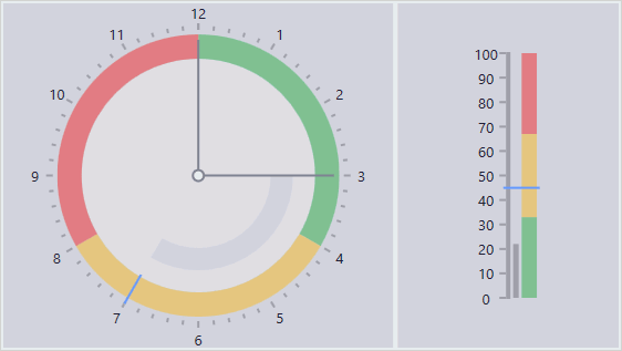
Predefined Themes
The following table lists themes you can apply to gauges using the Theme Manager:
| Theme name | Image |
|---|---|
| VS2017Light | 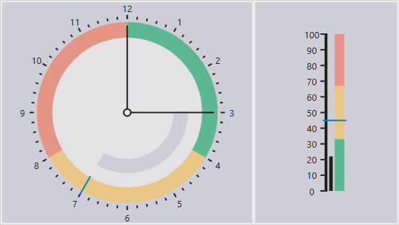 |
| VS2017Blue | 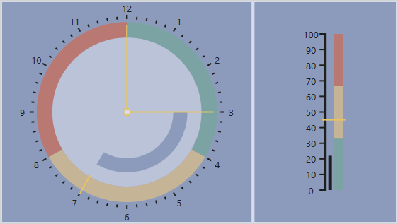 |
| VS2017Dark | 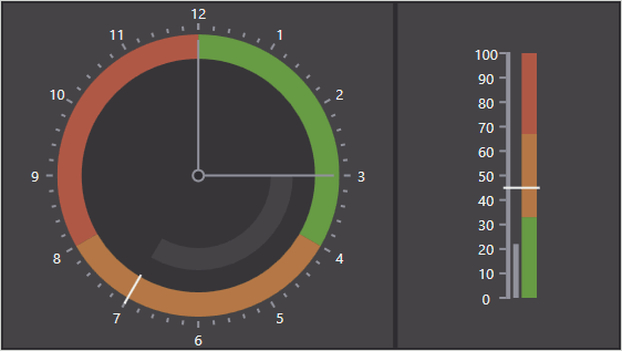 |
| Office2016White | 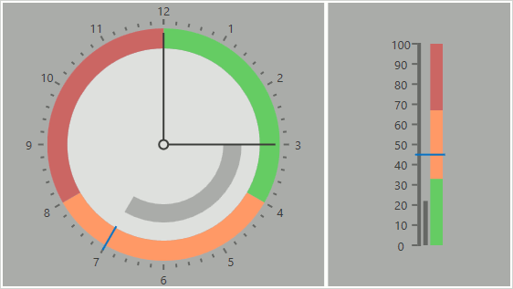 |
| Office2016Black | 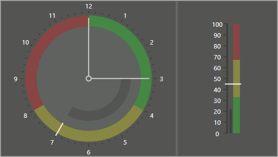 |
| Office2016Colorful | 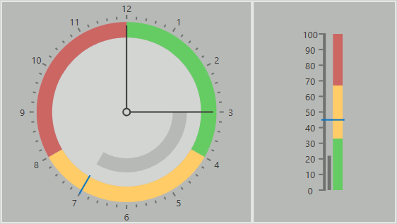 |
| Office2016WhiteSE | 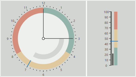 |
| Office2016DarkGraySE | 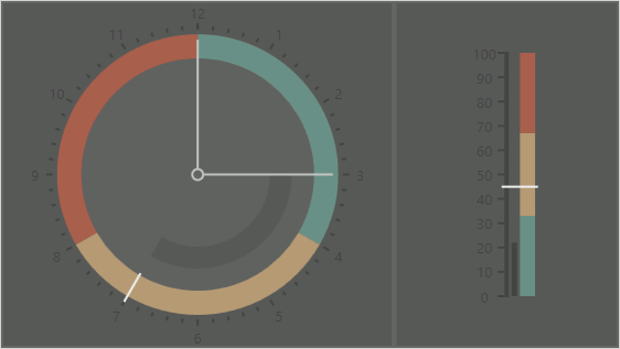 |
| Office2016ColorfulSE | 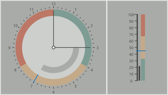 |
| Office2016BlackSE | 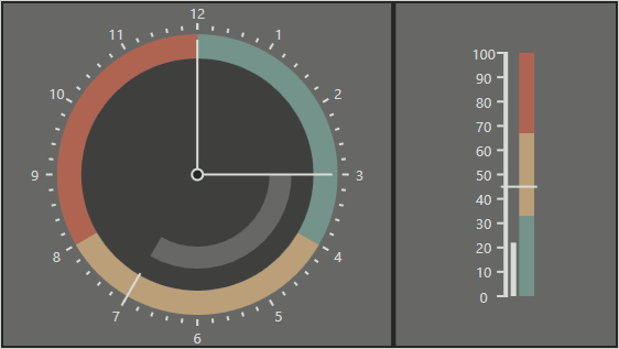 |
| DXStyle | |
| LightGray | 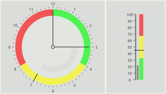 |
| MetropolisDark | 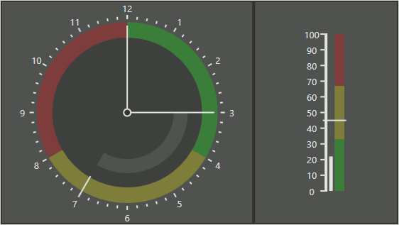 |
| MetropolisLight | 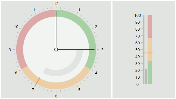 |
| Office2007Black |  |
| Office2007Blue | 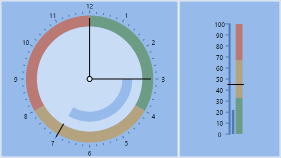 |
| Office2007Silver | 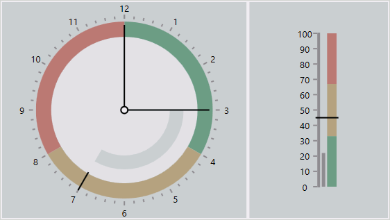 |
| Office2010Black | 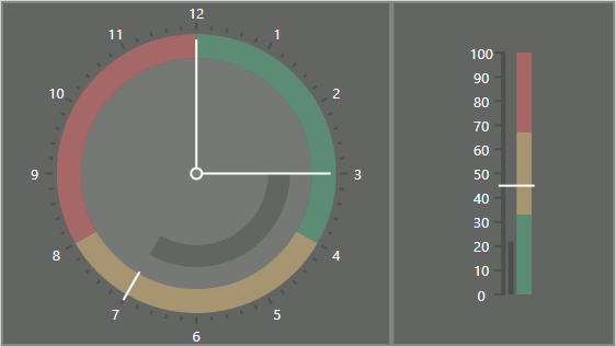 |
| Office2010Blue | 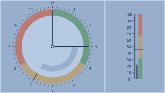 |
| Office2010Silver | 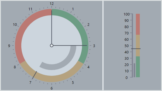 |
| Office2013 | 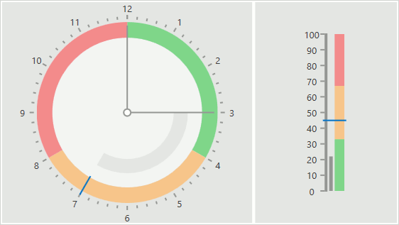 |
| Office2013DarkGray | 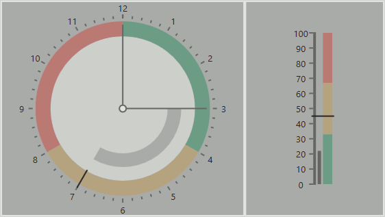 |
| Office2013LightGray | 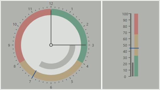 |
| Seven | 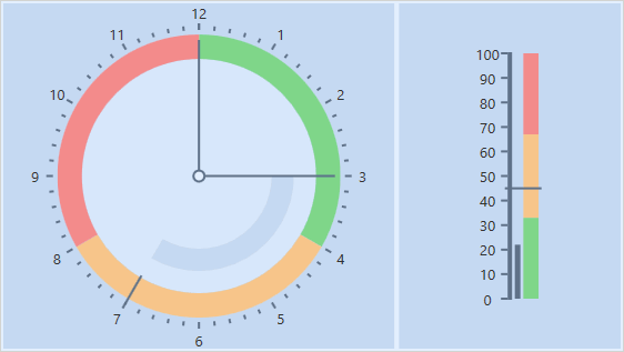 |
| VS2010 | 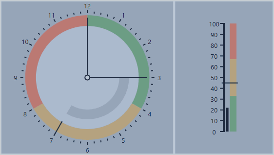 |
| TouchlineDark | 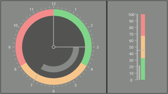 |
Refer to List of DevExpress WPF Themes to get more information about each theme.