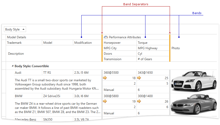
Band Separators
- 2 minutes to read
The GridControl allows you to display band separators - vertical lines between bands.
This topic consists of the following sections:
Enabling Separators
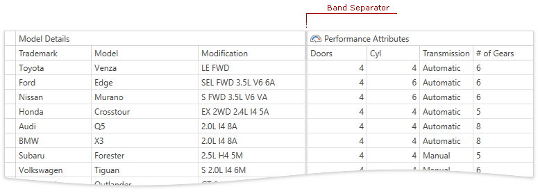
To display band separators, specify a separators’ width using the following properties:
| Property | Description |
|---|---|
| TableView.BandSeparatorWidth, TreeListView.BandSeparatorWidth | Allows you specify the width of separators between bands that are placed within the current view. |
| BandBase.BandSeparatorWidth | Allows you to set the width of separators between bands that are placed within the current band. |
The code sample below shows how to display separators between bands placed within the TableView:
<dxg:GridControl>
    <dxg:GridControl.Bands>
        <dxg:GridControlBand Header="Model Details">
            <dxg:GridColumn FieldName="Trademark.Name" Header="Trademark" />
            <dxg:GridColumn FieldName="Name" Header="Model" />
            <dxg:GridColumn FieldName="Modification" />
        </dxg:GridControlBand>
        <dxg:GridControlBand Header="Performance Attributes">
            <dxg:GridColumn FieldName="Doors" />
            <dxg:GridColumn FieldName="Cylinders" Header="Cyl" />
            <dxg:GridColumn FieldName="TransmissionType.Name" Header="Transmission" />
            <dxg:GridColumn FieldName="TransmissionSpeeds" Header="# of Gears" />
        </dxg:GridControlBand>
    </dxg:GridControl.Bands>
    <dxg:GridControl.View>
        <dxg:TableView BandSeparatorWidth="3" />
    </dxg:GridControl.View>
</dxg:GridControl>
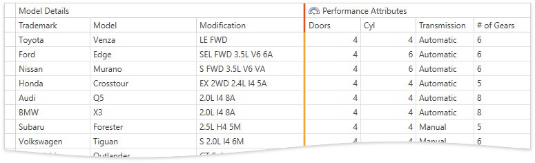
Customizing Separators
You can customize separators’ color using the following properties:
| Property | Description |
|---|---|
| TableView.BandCellSeparatorColor, TreeListView.BandCellSeparatorColor, BandBase.BandCellSeparatorColor | Allows you to set a band separators’ color. |
| TableView.BandHeaderSeparatorColor, TreeListView.BandHeaderSeparatorColor, BandBase.BandHeaderSeparatorColor | Allows you to set the color of the header band separators. |
Note
The BandCellSeparatorColor property applies to the whole band separator (including the header) if the BandHeaderSeparatorColor property is not specified.
The code sample below shows how to specify different colors for the header and cell band separators:
<dxg:GridControl>
    <dxg:GridControl.Bands>
        <!-- -->
    </dxg:GridControl.Bands>
    <dxg:GridControl.View>
        <dxg:TableView BandSeparatorWidth="3"
            BandHeaderSeparatorColor="OrangeRed"
            BandCellSeparatorColor="Orange">
        </dxg:TableView>
    </dxg:GridControl.View>
</dxg:GridControl>
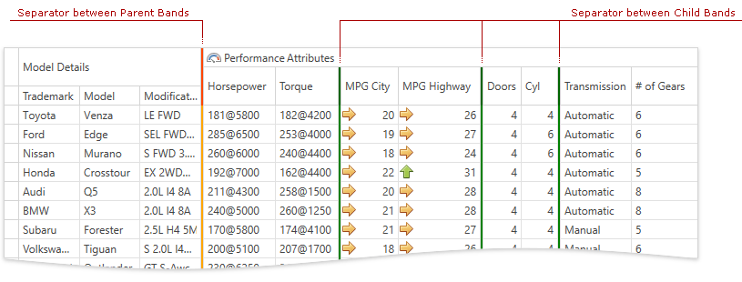
Nested Bands
When using nested bands, you can display different separators for child and parent bands:
<dxg:GridControl>
    <dxg:GridControl.Bands>
        <dxg:GridControlBand Header="Model Details">
            <!-- -->
        </dxg:GridControlBand>
        <dxg:GridControlBand Header="Performance Attributes"
                             BandSeparatorWidth="3" BandHeaderSeparatorColor="DarkGreen" BandCellSeparatorColor="Green">
            <dxg:GridControlBand.Bands>
                <dxg:GridControlBand OverlayHeaderByChildren="True">
                    <dxg:GridColumn FieldName="Horsepower" />
                    <dxg:GridColumn FieldName="Torque" />
                </dxg:GridControlBand>
                <!-- -->
            </dxg:GridControlBand.Bands>
        </dxg:GridControlBand>
    </dxg:GridControl.Bands>
    <dxg:GridControl.View>
        <dxg:TableView BandSeparatorWidth="3" BandHeaderSeparatorColor="OrangeRed" BandCellSeparatorColor="Orange" />
    </dxg:GridControl.View>
</dxg:GridControl>
See Also