Visual Appointment
- 2 minutes to read
This document describes the controls, templates, and styles used to visualize an appointment.
Appointment Controls
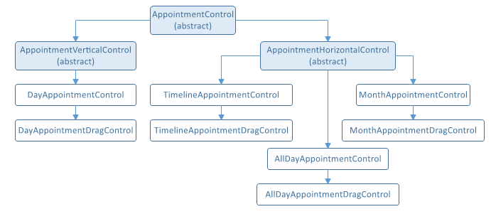
An appointment is visualized using different controls depending on the current view, an operation mode (drag-and-drop) and whether the appointment is an all-day appointment (the AppointmentItem.AllDay property is set to true).
The visual appointment controls’ class diagram is shown below.
Content Presenters
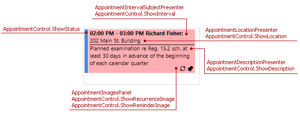
An appointment is visualized using a default content presenter which comprises several presenters. The AppointmentControl properties specify their visibility, as illustrated in the following picture:
Tip
Use content presenters in a custom appointment data template described in the next section.
Data Templates
The XAML code snippets below show the built-in data templates that visually represent appointments . You can modify and assign them to the following view properties:
| Template | Property to Assign |
|---|---|
| Vertical Appointment Control | DayViewBase.AppointmentContentTemplate |
| Horizontal Appointment Control | DayViewBase.AllDayAppointmentContentTemplate,MonthView.AppointmentContentTemplate, TimelineView.AppointmentContentTemplate |
Vertical Appointment Control
<DataTemplate x:Key="VerticalAppointmentControl.ContentTemplate">
    <dxschv:AppointmentContentPanel>
        <dxschv:AppointmentContentPanel.IntervalSubject>
            <dxschv:AppointmentIntervalSubjectPresenter WordWrap="True" />
        </dxschv:AppointmentContentPanel.IntervalSubject>
        <dxschv:AppointmentContentPanel.Location>
            <dxschv:AppointmentLocationPresenter FontWeight="Normal"
                                                    WordWrap="True" />
        </dxschv:AppointmentContentPanel.Location>
        <dxschv:AppointmentContentPanel.Description>
            <dxschv:AppointmentDescriptionPresenter Margin="0,1,0,0"
                                                    FontWeight="Normal"
                                                    SeparatorBrush="Black"
                                                    SeparatorThickness="1"
                                                    WordWrap="True" />
        </dxschv:AppointmentContentPanel.Description>
        <dxschv:AppointmentContentPanel.Images>
            <dxschv:AppointmentImagesPanel />
        </dxschv:AppointmentContentPanel.Images>
    </dxschv:AppointmentContentPanel>
</DataTemplate>
Horizontal Appointment Control
<DataTemplate x:Key="HorizontalAppointmentControl.ContentTemplate">
    <dxschv:AppointmentContentPanel>
        <dxschv:AppointmentContentPanel.IntervalSubject>
            <dxschv:AppointmentIntervalSubjectPresenter />
        </dxschv:AppointmentContentPanel.IntervalSubject>
        <dxschv:AppointmentContentPanel.Location>
            <dxschv:AppointmentLocationPresenter FontWeight="Normal" />
        </dxschv:AppointmentContentPanel.Location>
        <dxschv:AppointmentContentPanel.Description>
            <dxschv:AppointmentDescriptionPresenter Margin="0,1,0,0"
                                                    FontWeight="Normal"
                                                    WordWrap="True" />
        </dxschv:AppointmentContentPanel.Description>
        <dxschv:AppointmentContentPanel.Images>
            <dxschv:AppointmentImagesPanel />
        </dxschv:AppointmentContentPanel.Images>
    </dxschv:AppointmentContentPanel>
</DataTemplate>
Styles
The following code snippet illustrates how to use styles to set the attached properties of an appointment control displayed in the view, to show or hide a specific appointment’s visual elements and change display formats, as illustrated in the following code snippet. To apply the appointment style, use the view’s AppointmentStyle property: the DayViewBase.AppointmentStyle property for the Day View, Work Week View and Week View; the MonthView.AppointmentStyle property for the Month View; the TimelineView.AppointmentStyle property for the Timeline View.
This code snippet sets the AppointmentControl properties to display the appointment’s start and end time, location and description. It also demonstrates how to display an image in the appointment’s bottom right corner.
Note
A complete sample project is available at https://github.com/DevExpress-Examples/how-to-customize-the-appointment-appearance-t545892.
<DataTemplate x:Key="myImageBox">
    <Image Margin="2" Height="16" Width="16"
           Source="{Binding Appointment.CustomFields[FirstVisit], Converter={local:ConditionToImageSourceConverter}}" />
</DataTemplate>
<Style x:Key="appointmentStyle" TargetType="dxschv:AppointmentControl">
    <Setter Property="ShowInterval" Value="True"/>
    <Setter Property="ShowDescription" Value="True"/>
    <Setter Property="ImageBoxTemplate" Value="{StaticResource myImageBox}"/>
</Style>