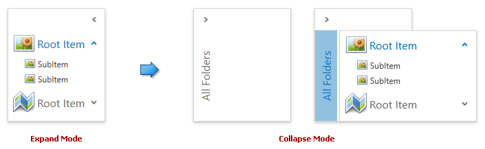
Collapse Mode
- 2 minutes to read
You can collapse the AccordionControl to free up space. The collapsed AccordionControl displays its items in a popup window:
This topic contains the following sections:
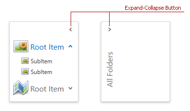
Expand-Collapse Button
End-users can expand/collapse the AccordionControl by clicking the expand-collapse button at the top right corner:
Set the AccordionControl.IsCollapseButtonVisible property to true to show this button:
<dxa:AccordionControl IsCollapseButtonVisible="True"> ... </dxa:AccordionControl>
Specifying Mode in Code
You can specify the AccordionControl.IsExpanded property to show the AccordionControl in the expand or collapse mode.
The code sample below shows the AccordionControl in the collapse mode:
<dxa:AccordionControl IsExpanded="False"> ... </dxa:AccordionControl>
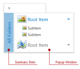
Summary Item
The Summary Item is the AccordionControl‘s element that allows invoking a popup window with all accordion items:
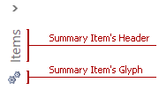
Use the following properties to customize the summary item:
| Property | Description |
|---|---|
| AccordionControl.SummaryItemHeader | Gets or sets the summary item’s header. |
| AccordionControl.SummaryItemGlyph | Gets or sets the summary item’s glyph. |
| AccordionControl.SummaryItemPosition | Gets or sets the summary item’s position. |
The following image shows a custom summary item:
The following code sample demonstrates how to customize the summary item as shown in the image above:
<dxa:AccordionControl IsCollapseButtonVisible="True"
    SummaryItemHeader="Items"
    SummaryItemGlyph="{dx:DXImage Image=Technology_16x16.png}">
    ...
</dxa:AccordionControl>
Accordion Items
You can show accordion items in a collapsed AccordionControl:
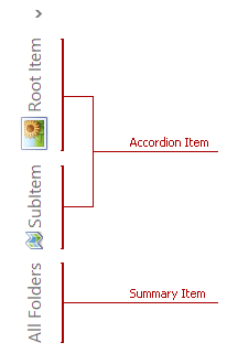
Tip
End-users can click the Summary Item to display all items in a popup window.
Set the AccordionItem.ShowInCollapsedMode property for the items you want to show:
<dxa:AccordionControl IsCollapseButtonVisible="True">
   <dxa:AccordionItem Header="Root Item" Glyph="{dx:DXImage Image=Image_32x32.png}" ShowInCollapsedMode="True">
      <dxa:AccordionItem Header="SubItem" Glyph="{dx:DXImage Image=Image_16x16.png}"/>
      <dxa:AccordionItem Header="SubItem" Glyph="{dx:DXImage Image=Image_16x16.png}"/>
   </dxa:AccordionItem>
   <dxa:AccordionItem Header="Root Item" Glyph="{dx:DXImage Image=Map_32x32.png}">
      <dxa:AccordionItem Header="SubItem" Glyph="{dx:DXImage Image=Map_16x16.png}" ShowInCollapsedMode="True"/>
   </dxa:AccordionItem>
</dxa:AccordionControl>
You can customize the display mode of the items shown in the collapsed mode using the AccordionControl.CollapsedItemDisplayMode property.
The following example demonstrates how to show the collapsed AccordionControl with accordion items’ glyphs:

<dxa:AccordionControl IsCollapseButtonVisible="True" SummaryItemGlyph="{dx:DXImage Image=Technology_16x16.png}"
      CollapsedItemDisplayMode="Glyph">
   <dxa:AccordionItem Header="Root Item" Glyph="{dx:DXImage Image=Image_32x32.png}">
      <dxa:AccordionItem Header="SubItem" Glyph="{dx:DXImage Image=Image_16x16.png}" ShowInCollapsedMode="True"/>
      <dxa:AccordionItem Header="SubItem" Glyph="{dx:DXImage Image=Image_16x16.png}"/>
   </dxa:AccordionItem>
   <dxa:AccordionItem Header="Root Item" Glyph="{dx:DXImage Image=Map_32x32.png}">
      <dxa:AccordionItem Header="SubItem" Glyph="{dx:DXImage Image=Map_16x16.png}" ShowInCollapsedMode="True"/>
   </dxa:AccordionItem>
</dxa:AccordionControl>