Compact Mode
- 2 minutes to read
The GridControl allows you to build adaptive layouts. The control automatically adapts its data rows (or treelist nodes) in a fully customizable compact mode.
You should define the following properties to enable displaying row data in compact mode:
Property | Description |
|---|---|
TableView.DataRowCompactTemplate / TreeListView.DataRowCompactTemplate | A template used to render data rows in compact mode. |
TableView.SwitchToCompactModeWidth / TreeListView.SwitchToCompactModeWidth | GridControl’s maximum width when the compact mode is enabled. |
The GridControl automatically changes its layout when its width is less than or equal to the value specified by the TableView.SwitchToCompactModeWidth (TreeListView.SwitchToCompactModeWidth) property. In this case, the data rows (or nodes) are rendered using the TableView.DataRowCompactTemplate (TreeListView.DataRowCompactTemplate).
Compact Panel
The compact panel replaces the column headers and is used to group, sort and filter grid items in compact mode.
Availability
Use the TableView.CompactPanelShowMode / TreeListView.CompactPanelShowMode property to control the availability of the compact panel when GridControl switches to compact mode. The compact panel is enabled by default.
Tip
The GridControl supports displaying the compact panel in full-sized mode. Set the TableView.CompactPanelShowMode / TreeListView.CompactPanelShowMode property to Always to display the compact panel in the full-sized GridControl.
The code sample below demonstrates how to disable the compact panel.
<dxg:GridControl ItemsSource="{Binding Customers}">
    <dxg:GridControl.View>
        <dxg:TableView CompactPanelShowMode="Never">
            <dxg:TableView.DataRowCompactTemplate>
                <!-- data template --->
            </dxg:TableView.DataRowCompactTemplate>
        </dxg:TableView>
    </dxg:GridControl.View>
</dxg:GridControl>
Customization
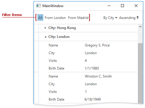
Predefined Filters
The compact panel can display predefined filter items. When clicking a filter item, the GridControl displays only those items that meet the filter criteria. To add filters to the compact panel, pass a collection of filter items (instances of the CompactModeFilterItem class) to the TableView.CompactModeFilterItems (TreeListView.CompactModeFilterItems) property.
The code sample below demonstrates how to define a set of predefined filters.
<dxg:GridControl ItemsSource="{Binding Customers}">
    <dxg:GridControl.View>
        <dxg:TableView CompactPanelShowMode="CompactMode">
            <dxg:TableView.CompactModeFilterItems>
                <dxg:CompactModeFilterItem DisplayValue="All" EditValue="" />
                <dxg:CompactModeFilterItem DisplayValue="From London" EditValue="[City] = 'London'" />
                <dxg:CompactModeFilterItem DisplayValue="From Madrid" EditValue="[City] = 'Madrid'" />
            </dxg:TableView.CompactModeFilterItems>
            <dxg:TableView.DataRowCompactTemplate>
                <!-- data template -->
            </dxg:TableView.DataRowCompactTemplate>
        </dxg:TableView>
    </dxg:GridControl.View>
</dxg:GridControl>
The compact panel can display filter items in the following modes, according to the TableView.CompactFilterElementShowMode property value.
Compact panel does not display its filter items. | |
Compact panel displays filter items as a separate list. | |
Compact panel displays its filter items in a separate menu. | |
Compact panel merges filter items with the sort items in a single menu. |
Header
The GridControl allows you to merge the grid’s header within the compact panel by setting the DataViewBase.HeaderPosition property to HeaderPosition.CompactPanel.