Typed Styles
- 4 minutes to read
The typed style allows you to define element style in a simplified manner.
Starting with v.17.2, the DevExpress WPF subscription provides the DevExpress.Xpf.TypedStyles assembly that contains typed styles for the following controls:
- for controls from base WPF assemblies (WindowsBase, PresentationCore, PresentationFramework);
- DevExpress WPF controls.
This topic consists of the following sections:
Typed Styles vs. Regular Styles
The image below demonstrates the difference between the regular style and typed style.
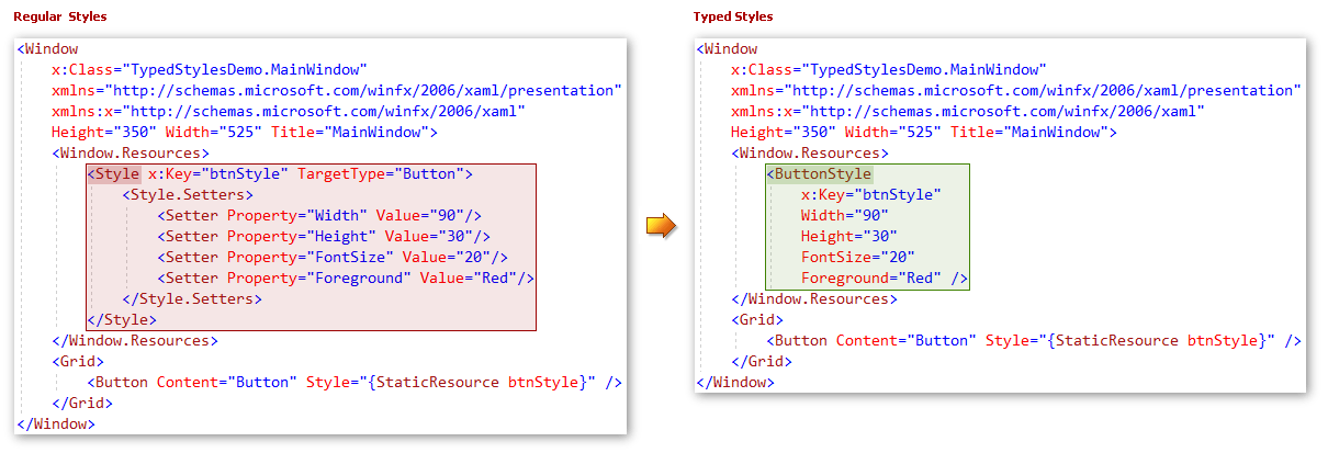
To set a regular style for multiple buttons, you should implement a Style with TargetType=Button and specify each property in a separate Setter.
The typed styles allow you to define a style for all the buttons in the following way:
Create a new resource with a name like {ElementName}Style, where {ElementName} is a target type.
Example: ButtonStyle for the standard Button control, GridControlStyle for the DevExpress GridControl.
- Define the property values directly without setters. Define the typed style‘s x:Name property.
- Assign the typed style to control the same way you assign regular styles.
Supported features
Typed styles support all the regular style features.
Attached properties
Attached properties are collected in MergedStyles property:
<BorderStyle x:Key="styleWithAttachedProperties">
    <KeyboardNavigationStyle IsTabStop="False" />
    <FocusManagerStyle IsFocusScope="False" />
    <TextBlockStyle FontSize="13" FontWeight="Bold"/>
</BorderStyle>
Events
You can specify event handlers without EventSetters:
<BorderStyle x:Key="styleWithEvents" Loaded="BorderStyle_Loaded"/>
Markup Extensions
Markup extensions that return their value immediately (all except BindingBase and DynamicResoureExtension) can be used in typed styles in a regular way:
<SolidColorBrush x:Key="greenBrush">Green</SolidColorBrush>
<ButtonStyle x:Key="styleWithMarkupExtensions" BorderBrush="{StaticResource greenBrush}" Foreground="{x:Null}" />
Use the “*_Source“ properties for the BindingBase and DynamicResourceExtension markup extensions:
<ButtonStyle x:Key="styleWithExpressionExtensions" Content_Source="{Binding FirstName}" Tag_Source="{DynamicResource tag}" />
DevExpress Extensions (DXBinding/DXEvent/DXCommand)
DXBinding/DXCommand work seamlessly with typed styles.
<ButtonStyle x:Key="styleWithDXBinding"
    Content_Source="{DXBinding 'FirstName + @Self.Tag + $Button.TemplateProperty.Name'}"
    Tag="tag"
    Command_Source="{DXCommand 'Click()'}"/>
Note
DXEvent does not work with typed styles.
Base styles
You can define base styles in the following manner:
<ButtonBaseStyle x:Key="baseStyle" Background="Red" />
<ButtonStyle x:Key="styleWithBaseStyle" BasedOn="{StaticResource baseStyle}" ClickMode="Hover"/>
Setters
You can use regular setters by populating the *Style.Setters collection.
<ButtonStyle x:Key="styleWithStandardSetters">
    <ButtonStyle.Setters>
        <Setter Property="DockPanel.Dock" Value="Bottom" />
    </ButtonStyle.Setters>
</ButtonStyle>
Implicit styles
To define implicit styles, use x:Key instead of TargetType:
<ToggleButtonStyle x:Key="{x:Type ToggleButton}" Width="153" />
The target type is set to typed style internally, so you should not set it manually. For example, to define the VirtualizingPanelStyle for ListBox, you need to define the ListBoxStyle first.
<ListBoxStyle x:Key="virtualizingStyle">
    <VirtualizingPanelStyle IsVirtualizing="True" />
</ListBoxStyle>
Triggers
In addition to typed styles, the DevExpress.Xpf.TypedStyles assembly contains typed triggers for each supported control:
<ButtonStyle x:Key="styleWithTriggers" Margin="1,2,3,4">
    <ButtonStyle.Triggers>
        <ButtonTrigger Visibility="Hidden" IsMouseOver="True">
            <TextBlockStyle FontSize="13" />
        </ButtonTrigger>
    </ButtonStyle.Triggers>
</ButtonStyle>
You can use typed triggers in templates. To do this, specify the typed trigger’s SourceName or TemplateName property:
<ControlTemplate x:Key="templateWithTriggers" TargetType="Button">
    <TextBlock x:Name="textBlock" />
    <ControlTemplate.Triggers>
        <TextBlockTrigger FontWeight="Black" SourceName="textBlock">
            <TextBlockStyle TargetName="textBlock" FontStyle="Oblique"/>
        </TextBlockTrigger>
    </ControlTemplate.Triggers>
</ControlTemplate>
If you create triggers for multiple source objects, you can define multiple triggers:
<ControlTemplate x:Key="templateWithDifferentSourceNamesTriggers" TargetType="Button">
            <StackPanel>
                <TextBlock x:Name="textBlock1" />
                <TextBlock x:Name="textBlock2" />
            </StackPanel>
            <ControlTemplate.Triggers>
                <ButtonTrigger>
                    <ButtonTrigger.Triggers>
                        <MultiTriggerCollection>
                            <TextBlockTrigger IsMouseOver="True" SourceName="textBlock1"/>
                            <TextBlockTrigger IsKeyboardFocusWithin="True" SourceName="textBlock2"/>
                        </MultiTriggerCollection>
                    </ButtonTrigger.Triggers>
                    <TextBlockStyle FontWeight="Bold"/>
                </ButtonTrigger>
            </ControlTemplate.Triggers>
        </ControlTemplate>
Data triggers
Use TypedDataTrigger to use typed styles with data triggers.
<ButtonStyle x:Key="styleWithDataTriggers" Margin="1,2,3,4">
    <ButtonStyle.Triggers>
        <TypedDataTrigger Binding="{Binding FirstName}" Value="Jon">
            <TextBlockStyle FontSize="13" />
        </TypedDataTrigger>
    </ButtonStyle.Triggers>
</ButtonStyle>
Using in your code
References and namespaces
All the typed styles and triggers are implemented in the {Corresponding control namespace}.TypedStyles namespaces.
Example: ButtonStyle - System.Windows.Controls.TypedStyles.
The typed styles‘ XAML namespaces are the same as the corresponding controls’ namespaces, so you do not need to add any additional namespace references. To use the typed styles, you need reference the DevExpress.Xpf.TypedStyles assembly in your project.
Limitation
Visual Studio and Blend do not support typed styles. We recommend using typed styles when you edit XAML manually.
Performance
Typed styles have comparable performance to regular styles.
The following regular styles are applied for 200 ms on a testing machine:
<Style x:Key="style00" TargetType="Button">
        <Setter Property="FontFamily" Value="CourierNew"/>
        <Setter Property="FontSize" Value="12"/>
        <Setter Property="FocusVisualStyle" Value="{x:Null}"/>
        <Setter Property="Focusable" Value="False"/>
        <Setter Property="Content" Value="test"/>
        <Setter Property="Background" Value="Red"/>
        <Setter Property="BorderThickness" Value="1"/>
        <Setter Property="Margin" Value="1,2,3,4"/>
        <Setter Property="Cursor" Value="Hand"/>
    </Style>
The following analog implemented via typed styles is applied for 130 ms on a testing machine:
<ButtonStyle x:Key="style00"
    FontFamily="CourierNew"
    FontSize="12"
    FocusVisualStyle="{x:Null}"
    Focusable="False"
    Content="test"
    Background="Red"
    BorderThickness="1"
    Margin="1,2,3,4"
    Cursor="Hand"
/>