Month View
- 3 minutes to read
The Month view displays appointments scheduled for several weeks or months.
To show the view, set the SchedulerControl.ActiveViewIndex property to the corresponding view index in the SchedulerControl.Views collection. This collection stores all views defined in the scheduler.
<dxsch:SchedulerControl ActiveViewIndex="0">
    <dxsch:MonthView
        x:Name="monthView"/>
    <!---->
</dxsch:SchedulerControl>
Note
The SchedulerControl has all views enabled out-of-the-box. If you declare any view in XAML or create views using the SchedulerControl’s smart tag, only the explicitly declared views become available. You can specify any number of views with the same type and different settings.
The Month view is the MonthView class in the Scheduler API. It inherits the ViewBase class.
The Month view features two display modes. Use the ViewMode property to specify the display mode.
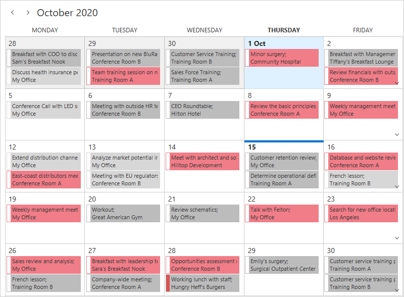
One Month View (CTP)
One Month View is a new display mode introduced in v20.2. It displays an overview of appointments for all resources. Week height changes dynamically depending on the number of appointments.
Set the ViewMode property to Standard to enable One Month View.
To navigate data, use the Date Navigation Panel or Date Navigator.
Set the MonthView.DisplayUnit property to Week to allow the user to select one or multiple weeks instead of a whole month in the Date Navigator.
Use the MonthView.MonthCount property to specify the number of displayed months when the MonthView.DisplayUnit is set to Month.
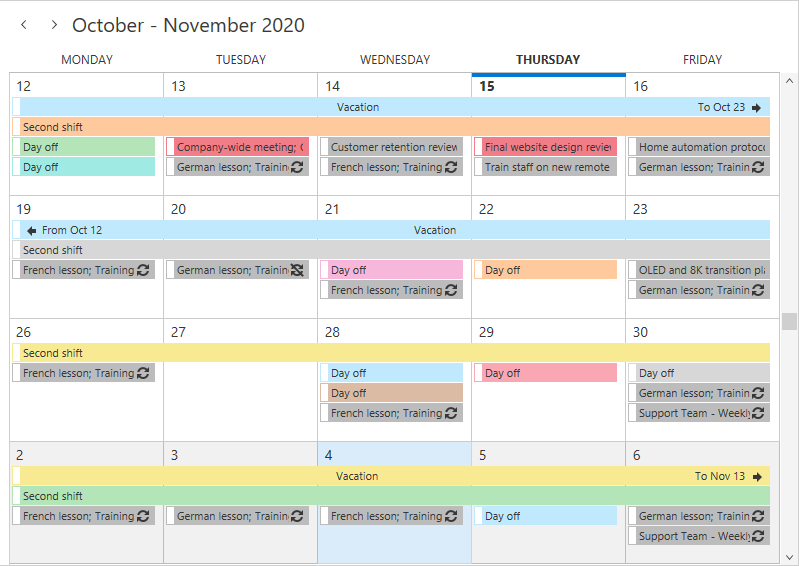
Unlimited Scrolling View
Unlimited Scrolling View supports grouping and allows you to scroll data with scrollbars in addition to the Date Navigation Panel and Date Navigator.
To enable Unlimited Scrolling View, set the ViewMode property to UnlimitedScrolling.
API
The following properties affect the view’s appearance and functionality:
| View Mode | Property | Description |
|---|---|---|
| Both | MonthView.ViewMode | Allows you to select the display mode. |
| Both | MonthView.WeekCount | Gets or sets the number of weeks that are simultaneously displayed in the Month View. This is a dependency property. |
| Both | SchedulerViewBase.ShowDayHeaders | Gets or sets whether to display day headers. This is a dependency property. |
| Both | SchedulerViewBase.ShowResourceNavigator | Gets or sets whether to display the resource navigator. This is a dependency property. |
| Both | SchedulerViewBase.NavigationButtonsVisibility | Gets or sets whether to display navigation buttons. This is a dependency property. |
| Both | SchedulerViewBase.MoreButtonsVisibility | Gets or sets the visibility state of More buttons in the current View. This is a dependency property. |
| Both | MonthView.VerticalScrollBarVisibility | Gets or sets the vertical scrollbar visibility mode. This is a dependency property. |
| Standard | MonthView.DisplayUnit | Specifies whether to round the selection up to a whole week or a whole month. This is a dependency property. |
| Standard | MonthView.MonthCount | Specifies the number of months displayed by the view. This is a dependency property. |
| Standard | MonthView.WeekMaxHeight | Specifies the maximum week height. This is a dependency property. |
| Standard | MonthView.WeekMinHeight | Specifies the minimum week height. This is a dependency property. |
| UnlimitedScrolling | SchedulerViewBase.ShowResourceHeaders | Gets or sets whether to display resource headers. This is a dependency property. |
| UnlimitedScrolling | SchedulerViewBase.ResourcesPerPage | Gets or sets the maximum number of simultaneously displayed resources. This is a dependency property. |
| UnlimitedScrolling | SchedulerControl.GroupType | Gets or sets the type of grouping applied to the Scheduler. This is a dependency property. |
| UnlimitedScrolling | MonthView.StretchAppointments | Gets or sets a value indicating whether appointments in the Month View should be stretched to fill the time cells. This is a dependency property. |
| UnlimitedScrolling | MonthView.HorizontalScrollBarVisibility | Gets or sets the horizontal scrollbar visibility mode. This is a dependency property. |