Header Tooltip Customization
- 2 minutes to read
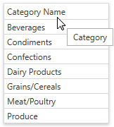
A header tooltip contains the column header’s text by default. The image below shows a grid column with a modified text in the header tooltip:
This topic describes how to customize this tooltip. Specify the BaseColumn.HeaderToolTip property to change the tooltip’s text. The following code sample shows how to use this property to specify custom text:
<dxg:GridColumn FieldName="CategoryName" HeaderToolTip="Category"></dxg:GridColumn>
If the BaseColumn.HeaderToolTip property is specified, a tooltip is automatically displayed when an end-user hovers the mouse pointer over a column header. Otherwise, a tooltip is displayed for a column header if its caption is clipped.
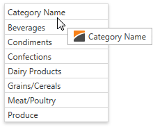
The image below shows a grid column with a header tooltip that contains an image before the text:
Specify the BaseColumn.HeaderToolTipTemplate property to add custom content to an individual column’s tooltip. Use the DataViewBase.ColumnHeaderToolTipTemplate property to specify a common tooltip template for all the columns in the current GridControl’s view. The BaseColumn.HeaderToolTip property is the data context (binding source) for these templates.
The following code sample shows how to add an image to a tooltip using the BaseColumn.HeaderToolTipTemplate property:
<dxg:GridColumn FieldName="CategoryName">
   <dxg:GridColumn.HeaderToolTipTemplate>
      <DataTemplate>
         <WrapPanel>
            <Image Source="Image.png" Margin="0,0,5,0"></Image>
            <TextBlock Text="{Binding TemplatedParent.DataContext.HeaderCaption, RelativeSource={RelativeSource TemplatedParent}}" />
         </WrapPanel>
      </DataTemplate>
   </dxg:GridColumn.HeaderToolTipTemplate>
</dxg:GridColumn>
Use the BaseColumn.ActualHeaderToolTipTemplate property to obtain a column’s current tooltip template.