Visual Elements
- 7 minutes to read
This document describes visual elements of the default WPF Spreadsheet application.
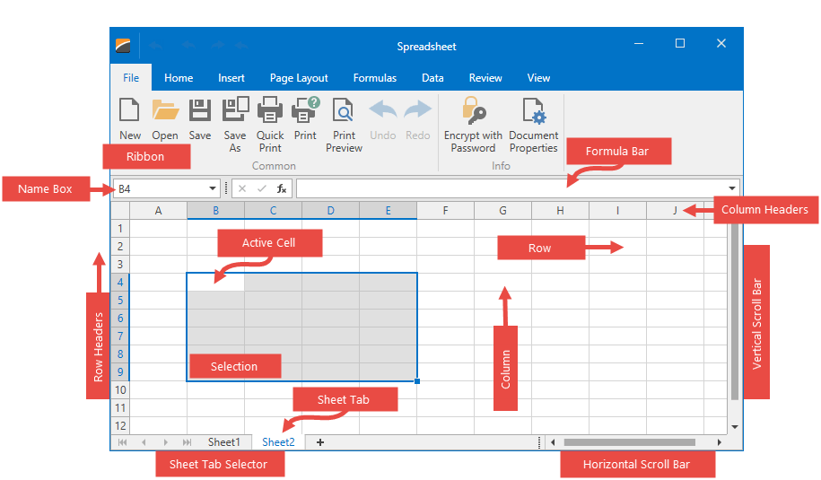
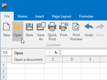
Ribbon | |
| A set of ribbon pages provides the comprehensive functionality of the SpreadsheetControl and allows end-users to perform basic operations in the spreadsheet (create, load, modify, save, and print spreadsheet documents). Ribbon pages are structurally and visually divided into logical groups that include commands with common features. When you create a new WPF Spreadsheet application, it already contains the integrated ribbon with all the available spreadsheet ribbon pages. You can customize the integrated ribbon user interface by adding new ribbon elements, modifying or removing the existing ones. For details, refer to the Lesson 4 - Customize the Integrated Ribbon UI for the Spreadsheet tutorial. |
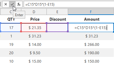
Formula Bar | |
| The Formula Bar is a visual control that displays the content of the active cell and is used to view, enter and edit formulas and cell data in the SpreadsheetControl. You can use a standalone SpreadsheetFormulaBarControl by adding it directly from the Visual Studio Toolbox or display the built-in Formula Bar by setting the SpreadsheetControl.ShowFormulaBar property to true (which is the default value for a new WPF Spreadsheet application). Refer to the Lesson 1 - Create a Simple Spreadsheet tutorial for an example. The SpreadsheetControl also supports the Formula AutoComplete functionality, which displays a drop-down list of matching functions and names as you type a formula. |
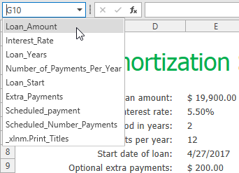
Name Box | |
| The Name Box is a part of the Formula Bar that displays a reference to an active cell or a name for the selected range (if specified), picture or chart. The Name Box also enables end-users to create named ranges, and quickly navigate to cells by their references and names. To display or hide the Name Box, use the SpreadsheetFormulaBarControl.ShowNameBox property, or the SpreadsheetControl.FormulaBarShowNameBox property (for the integrated Formula Bar). |
Worksheet | |
| A worksheet is a single page within a document. A worksheet is represented by a grid of cells and is used to store and manipulate data in the SpreadsheetControl. The default worksheet is blank and has the default name. Use the following properties of the WorksheetView object to specify how a worksheet appears in the SpreadsheetControl:
|
Rows and Columns | |
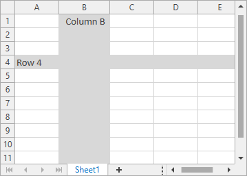
| Each worksheet is divided into 1,048,576 rows and 16,384 columns. Each row is numbered (1, 2, 3, …) and each column is lettered (A, B, C, …) if the A1 reference style is used, or numbered (1, 2, 3, …) if the R1C1 reference style is selected. Row and column headers are displayed at the left and the top of a worksheet, respectively, and are used to identify each row or column in the worksheet. You can hide or show these headers using the SpreadsheetViewOptions.ShowColumnHeaders, SpreadsheetViewOptions.ShowRowHeaders, or WorksheetView.ShowHeadings property. The SpreadsheetControl displays all columns and rows by default, but you can use the WorksheetDisplayArea.SetSize method to restrict the number of visible columns and rows for a worksheet. You can also use the Worksheet.FreezeRows, Worksheet.FreezeColumns, or Worksheet.FreezePanes methods to keep specific rows and columns always visible when the remaining area of the worksheet is scrolled. Use the Row.Height and Column.Width properties to specify the row height and column width. |
Cells | |
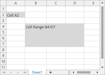
| All worksheet data is stored in cells. An individual cell is a box at the intersection of a column and row. All cells have faint borders around them, which are called gridlines. You can display or hide gridlines using the WorksheetView.ShowGridlines property. Use the SpreadsheetControl.GridLinesColor property to change the default gridline color. A cell reference indicates each cell - the column letter and row number where the column and row intersect. The SpreadsheetControl supports different cell reference styles and types. The SpreadsheetControl.GetCellBounds method allows you to obtain a cell’s x- and y-coordinates relative to the SpreadsheetControl’s top-left corner, and the cell’s width and height. End-users can double-click the required cell, press F2, or just start typing to edit a cell value. They can enter a numeric or text value, or calculate the cell value dynamically by inserting a formula. You can facilitate user input by using custom editors for in-place editing of cell content. Select one of the predefined in-place editors (DateEdit, ComboBoxEdit, or CheckEdit), or handle the SpreadsheetControl.CustomCellEdit event to assign your editor to the required cell. To change the appearance of worksheet cells, do one of the following:
|
Selection | |
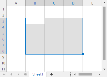
| The SpreadsheetControl allows end-users to select cells, cell ranges, rows, and columns in a worksheet. The currently selected cell used to enter data is called the active cell. When a cell range is selected, the active cell is usually the top left cell of the selected range. However, end-users can specify the position of the active cell by pressing TAB, SHIFT+TAB, ENTER or SHIFT+ENTER. Use the following properties and methods to specify selection in code:
You can also control end-user capabilities to select cells in a worksheet by using properties of the SpreadsheetSelectionBehaviorOptions object.
|
Sheet Tab Selector | |
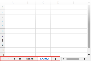
| All worksheets contained in a workbook are displayed on the Sheet Tab Selector at the bottom of the control. An end-user can move to the required worksheet, click the plus button to add a new worksheet, rename, hide or remove the existing worksheet by right-clicking its tab and selecting the corresponding command. To show or hide the Sheet Tab Selector, use the SpreadsheetControl.ShowTabSelector property. To change the tab color for a specific worksheet, use the WorksheetView.TabColor property. |
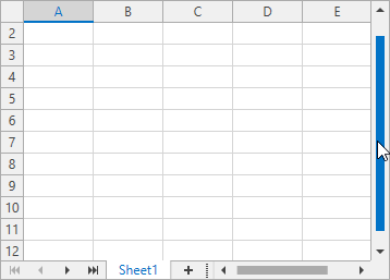
Vertical and Horizontal Scroll Bars | |
| The horizontal and vertical scroll bars allow end-users to navigate through the current worksheet. To control the visibility of scroll bars, use the SpreadsheetControl.VerticalScrollbarVisibility and SpreadsheetControl.HorizontalScrollbarVisibility properties. |
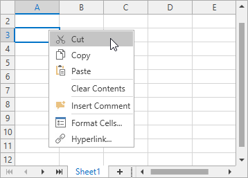
Context Menu | |
| The WPF Spreadsheet supports a context menu, which appears when an end-user right-clicks anywhere on a worksheet (that is, an individual cell, row or column header, picture or chart). The context menu provides basic commands for working with the current object. You can customize the context menu by adding new menu items or removing the existing ones. To do this, use the SpreadsheetControl.MenuCustomizations property or handle the SpreadsheetControl.PopupMenuShowing event. You can also prevent the context menu from being displayed by using the SpreadsheetBehaviorOptions.ShowPopupMenu property. |
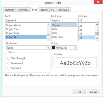
Dialogs | |
| The WPF Spreadsheet includes the built-in dialogs designed to assist end-users in performing a broad range of tasks such as loading a document, formatting cells, entering formulas, creating charts, tables, and pivot tables, specifying print settings, and so forth. Refer to the Dialogs section for a list of all dialogs available in the SpreadsheetControl. |