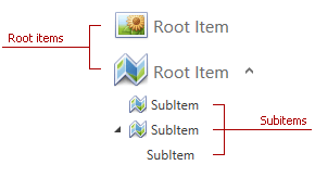
Accordion Item
Accordion items are AccordionItem class instances. An item‘s appearance may vary depending on its hierarchy level.
The table below lists the main properties affecting the element’s behavior and appearance.
Characteristics | Members |
|---|---|
Display mode | |
Content | AccordionItem.Header |
Highlighting | |
Selection | |
Item expandability | |
Root items style | |
Style |
Use standard appearance properties to colorize accordion items: |
An AccordionControl that does not contain any items displays a notification:

Use the EmptySourceText property to change the notification text.
You can customize the notification by changing the EmptySourceTemplate as follows:
<dx:ThemedWindow.Resources>
    <ControlTemplate x:Key="{dxat:AccordionThemeKeys ResourceKey=EmptySourceTemplate,
        IsThemeIndependent = true}">
        <Image Source="{dx:DXImage 'SvgImages/Dashboards/DeleteDataSource.svg'}" Height="64"/>
    </ControlTemplate>
</dx:ThemedWindow.Resources>

The HasItems property indicates whether the AccordionControl contains items.