Chart Control
- 4 minutes to read
The DevExpress Chart Control for WPF (ChartControl) is a powerful tool that helps you to visualize extremely large data sets. The Chart control delivers a comprehensive collection of chart types (bars, areas, lines, funnels, financial, etc.).
Try DevExpress WPF Chart In Your Project
Visit DevExpress.com to learn more about this product’s features, capabilities, and pricing options: WPF Chart Control. To try DevExpress controls and libraries in your projects, download our fully-functional 30-day trial version.
 demo.](/WPF/images/chart-control/root-page-chart-dashboard.png?v=21.2)
Created based on the Selection demo.
 demo.](/WPF/images/chart-control/root-page-real-time-chart.png?v=21.2)
Created based on the Real-Time Chart demo.
 demo.](/WPF/images/chart-control/root-page-fin-chart.png?v=21.2)
Created based on the MVVM Financial Charting demo.
Get Started
Follow these step-by-step tutorials to create your first chart applications:
- Lesson 1 - Bind Chart Series to Data
- Lesson 2 - Create a Chart Using the Designer
- Lesson 3 - Use a Series Template for Auto-Created Series
Series Types
The Charts suite ships with dozens of 2D and pseudo-3D chart types for your data: line, stacked bar, pie, and others.
- 2D Series Types
-
Note: Use the Chart3D Control to plot points and surfaces in true three-dimensional space.
You can also combine multiple series (for example, bar and line) within the same chart: Series View Compatibility.
Load and Shape Data
A chart can operate in bound or unbound modes. In unbound mode, you create and place series points. In bound mode, a chart or an individual series visualizes data from its data source (an object that implements the IList, IListSource, or IBindingList interface and is assigned to the chart or series DataSource property).
The topics below describe how to load data to a chart and configure data representation:
- Create points manually
- Bind a series to a data source
- Generate multiple series based on a template
- Bind to data in MVVM style
- Create a real-time chart
- Display large data
- Create a drill-down chart
- Filter series data
- Aggregate data points
- Calculate summaries
- Display a chart based on calculated field data
- Plot a histogram
- Display top-n points
- Configure working time and workdays
- Handle empty points
Chart Element Configuration
Various chart elements allow you to customize chart behavior and appearance.
- Series
- A collection of related data points on the chart surface is called “series”. The appearance of these data points and the entire series depend on the type. You can also use point colorizers and segment colorizers to create condition-based appearances. The Chart Control can also calculate various indicators based on series data.
- Series Point Labels
- The Chart Control allows you to display labels for all points on the chart. Labels can include different information, for example, argument, value, or source field data. Additionally, you can apply specific settings to labels of side points.
- Legends
- You can add multiple legends, format their content, and specify position.
- Axes
- Axis options depend on the underlying data type. The axis range specifies visible data. If you need to plot different series with separate axes, you can add secondary axes.
- Axis labels
- The Chart Control allows you to format axis labels and customize their appearance based on associated values.
- Panes
- You can distribute multiple series between several panes. The Chart Control ships with two pane layout modes: linear and grid. Add pane titles to allow users to distinguish between panes.
- Constant Lines and Strips
- Add constant lines and strips to a chart to mark a value on an axis and highlight a value range.
- Annotations
- Allow you to display interactive callouts with text and image content on a chart.
To learn more about all chart elements and their hierarchy within a chart, refer to the following help topic: Chart Element Hierarchy.
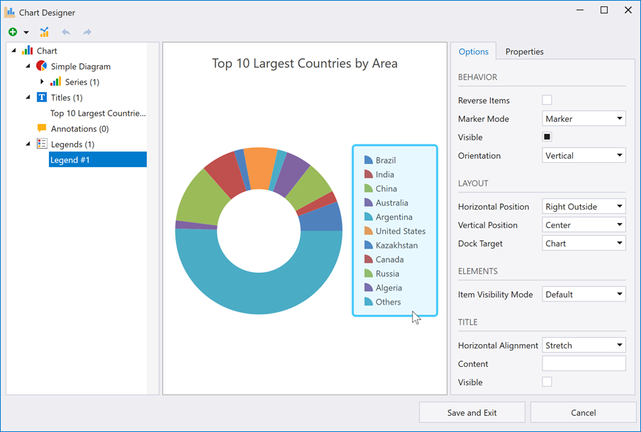
Chart Designer
The Chart Designer can help you or your users create and set up a chart from scratch, or fine-tune an existing chart.
User Interaction
The Chart Control includes the following user interaction features:
- Zoom and Scroll in 2D Charts
- Zoom and Scroll in 3D Charts
- Tooltips
- Crosshair Cursor
- Integrate with a Range Control
- Select and Highlight 2D Chart Elements
- Hit Test Points in a Chart
- Chart Toolbars and Ribbon
Miscellaneous
- Examples
- This section contains code samples that implement most popular charting usage scenarios.
- Deployment
- This topic lists assemblies that applications require in order to use DevExpress Chart Control for WPF functionality.
- Save and Restore Chart Layout
- You can save all the settings applied to a chart to an XML file and then apply them to another chart. Note that source data is not saved.
- Print and Export
- The Chart Control can be printed and exported to various formats.
- Themes and Palettes
- Allow you to customize chart outward appearance.
- Animation
- The Chart Control supports various animation types for series, series points, and indicators.
Demos
Explore Chart demos in the DevExpress Demo Center: