Displaying Glyphs
- 8 minutes to read
You can display icons within bar items. Such icons are called glyphs. This topic explains how to display glyphs and configure their appearance, and contains the following sections.
- Specifying Glyphs
- Glyph Display Mode
- Glyphs Size
- Custom Glyph Size
- Hide and Display Glyphs in Popup Menus
Specifying Glyphs
To specify a bar item’s glyph, use the BarItem.Glyph and BarItem.LargeGlyph properties. The resulting glyph depends on the available space.
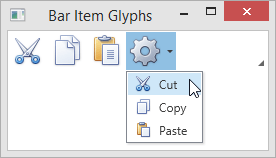
The following example demonstrates a toolbar that displays large glyphs and a submenu that displays small glyphs.
<Window ...
        xmlns:dxb="http://schemas.devexpress.com/winfx/2008/xaml/bars"
        xmlns:dxc="http://schemas.devexpress.com/winfx/2008/xaml/core" >
    <Grid>
        <Grid.RowDefinitions>
            <RowDefinition Height="Auto"/>
            <RowDefinition Height="Auto"/>
        </Grid.RowDefinitions>
        <dxb:ToolBarControl Grid.Row="0" VerticalAlignment="Top">
            <dxb:BarButtonItem Name="itemCut" Content="Cut" Glyph="{dxc:DXImage Image=Cut_16x16.png}" LargeGlyph="{dxc:DXImage Image=Cut_32x32.png}"/>
            <dxb:BarButtonItem Name="itemCopy"  Content="Copy" Glyph="{dxc:DXImage Image=Copy_16x16.png}" LargeGlyph="{dxc:DXImage Image=Copy_32x32.png}"/>
            <dxb:BarButtonItem Name="itemPaste" Content="Paste" Glyph="{dxc:DXImage Image=Paste_16x16.png}" LargeGlyph="{dxc:DXImage Image=Paste_32x32.png}"/>
            <dxb:BarSubItem Content="SubItem" Glyph="{dxc:DXImage Image=Properties_16x16.png}" LargeGlyph="{dxc:DXImage Image=Properties_32x32.png}">
                <dxb:BarButtonItemLink BarItemName="itemCut"/>
                <dxb:BarButtonItemLink BarItemName="itemCopy"/>
                <dxb:BarButtonItemLink BarItemName="itemPaste"/>
            </dxb:BarSubItem>
        </dxb:ToolBarControl>
    </Grid>
</Window>
The following image demonstrates the result.
Glyph Display Mode
You can specify the glyph visibility for individual bar items or entire toolbars and menus using the BarItemDisplayMode properties. The display mode specified for a child object overrides the display mode of a parent. The following table lists the properties that control the display mode of bar items. Properties that have the highest precedence are listed first.
| Property | Description |
|---|---|
| BarItemLinkBase.BarItemDisplayMode | Specifies the glyph visibility for an individual bar item link represented by a BarItemLink descendant. |
| BarItem.BarItemDisplayMode | Specifies the glyph visibility for an individual bar item represented by a BarItem descendant. |
| Bar.BarItemDisplayMode | Specifies the glyph visibility for all items within theBar container. |
| ToolBarControlBase.BarItemDisplayMode | Specifies glyph visibility for all items within a container represented by a ToolBarControlBase descendant. |
| BarContainerControl.BarItemDisplayMode | Specifies the glyph visibility for all items within the BarContainerControl. |
The BarItemDisplayMode property must be set to one of the BarItemDisplayMode enumeration values. The following table lists the available options.
BarItemDisplayMode property value | Bar item appearance |
|---|---|
Default | Bar items display a glyph within toolbars. Bar items display both content and glyph within menus and ribbon. |
Content | Bar items display content only. |
ContentAndGlyph | Bar items display both content and glyph. |
Note
If the BarItemDisplayMode property is set for a container and an item within this container has the Default display mode, the container’s BarItemDisplayMode value is used for the item.
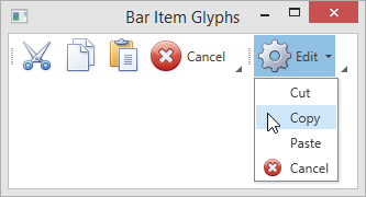
The following example demonstrates glyph visibility customizations and the BarItemDisplayMode property precedence.
<Window ...
        xmlns:dxb="http://schemas.devexpress.com/winfx/2008/xaml/bars"
        xmlns:dxc="http://schemas.devexpress.com/winfx/2008/xaml/core">
    <Grid>
        <Grid.RowDefinitions>
            <RowDefinition Height="Auto"/>
            <RowDefinition Height="Auto"/>
        </Grid.RowDefinitions>
        <dxb:BarContainerControl Grid.Row="0" BarItemDisplayMode="Default">
            <dxb:Bar>
                <!-- The first 3 items display a glyph only-->
                <dxb:BarButtonItem Name="itemCut" Content="Cut" Glyph="{dxc:DXImage Image=Cut_16x16.png}" LargeGlyph="{dxc:DXImage Image=Cut_32x32.png}"/>
                <dxb:BarButtonItem Name="itemCopy"  Content="Copy" Glyph="{dxc:DXImage Image=Copy_16x16.png}" LargeGlyph="{dxc:DXImage Image=Copy_32x32.png}"/>
                <dxb:BarButtonItem Name="itemPaste" Content="Paste" Glyph="{dxc:DXImage Image=Paste_16x16.png}" LargeGlyph="{dxc:DXImage Image=Paste_32x32.png}"/>
                <!-- The "Cancel" item displays both content and glyph -->
                <dxb:BarButtonItem Name="itemCancel" Content="Cancel" Glyph="{dxc:DXImage Image=Cancel_16x16.png}" LargeGlyph="{dxc:DXImage Image=Cancel_32x32.png}" BarItemDisplayMode="ContentAndGlyph"/>
            </dxb:Bar>
            <dxb:Bar BarItemDisplayMode="Default">
                <!-- The "Edit" bar item displays both content and glyph -->
                <dxb:BarSubItem Content="Edit" Glyph="{dxc:DXImage Image=Properties_16x16.png}" LargeGlyph="{dxc:DXImage Image=Properties_32x32.png}" BarItemDisplayMode="ContentAndGlyph">
                    <!-- The first 3 items display content only -->
                    <dxb:BarButtonItemLink BarItemName="itemCut" BarItemDisplayMode="Content"/>
                    <dxb:BarButtonItemLink BarItemName="itemCopy" BarItemDisplayMode="Content"/>
                    <dxb:BarButtonItemLink BarItemName="itemPaste" BarItemDisplayMode="Content"/>
                    <!-- The "Cancel" item displays both content and glyph -->
                    <dxb:BarButtonItemLink BarItemName="itemCancel"/>
                </dxb:BarSubItem>
            </dxb:Bar>
        </dxb:BarContainerControl>
    </Grid>
</Window>
The following image demonstrates the result.
Glyph Size
If you assign both small and large glyphs to a bar item, you can specify the glyph size explicitly.
The following table lists properties that allow you to specify the required glyph size for bar items and item containers.
Property | Description |
|---|---|
Specifies the glyph size for a specific bar item represented by an instance of BarItem or its descendant. | |
Specifies the glyph size for all items within the Bar container. | |
Specifies the glyph size for all bar items within a container that is a ToolBarControlBase descendant. | |
Specifies the glyph size for all subitems within the BarLinkContainerItem container and its descendants. | |
Specifies the glyph size for all bar items within the BarSubItem container. | |
Specifies the glyph size for toolbar items within the BarManager container. | |
Specifies the glyph size for menu items within the BarManager container. | |
|
(via RibbonGalleryBarItem.GlyphSize) | Specifies the glyph size for items within the RibbonGalleryBarItem.DropDownMenuItems collection. |
The GlyphSize properties must be set to one of the GlyphSize enumeration values. The following table lists the available options.
GlyphSize property value | Resulting glyph |
|---|---|
Default | In toolbars, bar items display large glyphs. In menus, bar items display small glyphs. |
Large | A bar item displays a glyph specified by the BarItem.LargeGlyph property. |
Small | A bar item displays a glyph specified by the BarItem.Glyph property. |
Custom | The glyph size is specified by the Size value. See Custom glyph size to learn more. |
Note
If the GlyphSize property is set for a container and an item within this container has the Default glyph size, the container’s GlyphSize value is used for the item.
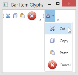
The following example demonstrates the GlyphSize property precedence.
<Window ...
        xmlns:dxb="http://schemas.devexpress.com/winfx/2008/xaml/bars"
        xmlns:dxc="http://schemas.devexpress.com/winfx/2008/xaml/core">
    <Grid>
        <Grid.RowDefinitions>
            <RowDefinition Height="Auto"/>
            <RowDefinition Height="Auto"/>
        </Grid.RowDefinitions>
        <dxb:BarContainerControl Grid.Row="0">
            <!-- Small size is specified for the items within the bar -->
            <dxb:Bar GlyphSize="Small">
                <dxb:BarButtonItem Name="itemCut" Content="Cut" Glyph="{dxc:DXImage Image=Cut_16x16.png}" LargeGlyph="{dxc:DXImage Image=Cut_32x32.png}" GlyphSize="Default"/>
                <dxb:BarButtonItem Name="itemCopy"  Content="Copy" Glyph="{dxc:DXImage Image=Copy_16x16.png}" LargeGlyph="{dxc:DXImage Image=Copy_32x32.png}"/>
                <dxb:BarButtonItem Name="itemPaste" Content="Paste" Glyph="{dxc:DXImage Image=Paste_16x16.png}" LargeGlyph="{dxc:DXImage Image=Paste_32x32.png}"/>
                <!-- The "Cancel" bar item displays a large glyph -->
                <dxb:BarButtonItem Name="itemCancel" Content="Cancel"  Glyph="{dxc:DXImage Image=Cancel_16x16.png}" LargeGlyph="{dxc:DXImage Image=Cancel_32x32.png}" GlyphSize="Large" />
            </dxb:Bar>
            <!-- Large size is specified for the items within the bar -->
            <dxb:Bar GlyphSize="Large">
                <!-- The "Edit" bar item displays a small glyph -->
                <dxb:BarSubItem Content="Edit" Glyph="{dxc:DXImage Image=Properties_16x16.png}" LargeGlyph="{dxc:DXImage Image=Properties_32x32.png}" GlyphSize="Small">
                    <!-- The glyph size is specified by the corresponding bar items -->
                    <dxb:BarButtonItemLink BarItemName="itemCut"/>
                    <dxb:BarButtonItemLink BarItemName="itemCopy"/>
                    <dxb:BarButtonItemLink BarItemName="itemPaste"/>
                    <dxb:BarButtonItemLink BarItemName="itemCancel"/>
                </dxb:BarSubItem>
            </dxb:Bar>
        </dxb:BarContainerControl>
    </Grid>
</Window>
The following image demonstrates the result.
Custom Glyph Size
If the GlyphSize property is set to Custom, you can set the exact width and height of the bar item’s glyph. To specify a custom glyph size, assign a Size value to one of the CustomGlyphSize properties.
The following table lists properties that allow you to specify the custom glyph size. Properties that have the highest precedence are listed first.
Property | Description |
|---|---|
Specifies the exact width and height of the BarItemLink‘s glyph. | |
Specifies the exact width and height of the BarItem‘s glyph. | |
Specifies the exact width and height of the glyph for all bar items within a container that is the ILinksHolder implementation. | |
Specifies the exact width and height of the glyph for all bar items within a container that is a BarItemLinkHolderBase descendant. | |
Specifies the exact width and height of the glyph for all bar items within the BarLinkContainerItem container and its descendants. | |
Specifies the exact width and height of the glyph for all bar items within the BarSubItem container. | |
|
(via RibbonGalleryBarItem.CustomGlyphSize) | Specifies the exact width and height of the glyph for items within the RibbonGalleryBarItem.DropDownMenuItems collection. |
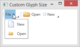
The following example illustrates the bar item glyph size customization capabilities.
<Window
        xmlns="http://schemas.microsoft.com/winfx/2006/xaml/presentation"
        xmlns:x="http://schemas.microsoft.com/winfx/2006/xaml"
        xmlns:d="http://schemas.microsoft.com/expression/blend/2008"
        xmlns:mc="http://schemas.openxmlformats.org/markup-compatibility/2006"
        xmlns:dxb="http://schemas.devexpress.com/winfx/2008/xaml/bars"
        xmlns:dxc="http://schemas.devexpress.com/winfx/2008/xaml/core"
        x:Class="CustomGlyphSizeTestApp.MainWindow"
        mc:Ignorable="d"
        Title="Custom Glyph Size" Height="350" Width="525">
    <Grid>
        <dxb:BarManager VerticalAlignment="Top">
            <dxb:BarManager.Bars>
                <dxb:Bar>
                     <!--BarSubItem.SubItemsCustomGlyphSize property specifies the glyph size for its items. -->
                    <dxb:BarSubItem x:Name="barFile" Content="File"
                                    SubItemsCustomGlyphSize="24,24" SubItemsGlyphSize="Custom" >
                        <!-- The item's glyph size (24x24) is specified by the container's SubItemsCustomGlyphSize property. -->
                        <dxb:BarButtonItem x:Name="barNew" Content="New" Glyph="{dxc:DXImage Image=New_32x32.png}"
                                           BarItemDisplayMode="ContentAndGlyph" GlyphSize="Custom"/>
                        <!-- The BarButtonItem.CustomGlyphSize property has higher precedence than the container's SubItemsCustomGlyphSize property. -->
                        <!-- The item's size is 16x16. -->
                        <dxb:BarButtonItem x:Name="barOpen" Content="Open"  Glyph="{dxc:DXImage Image=Open_32x32.png}"
                                           BarItemDisplayMode="ContentAndGlyph" GlyphSize="Custom" CustomGlyphSize="16,16"/>
                    </dxb:BarSubItem>
                </dxb:Bar>
                <dxb:Bar>
                     <!-- The BarButtonItemLink.CustomGlyphSize property has the highest precedence. -->
                    <dxb:BarButtonItemLink BarItemName="barOpen" CustomGlyphSize="24,24"/>
                    <dxb:BarButtonItemLink BarItemName="barNew" CustomGlyphSize="12,12"/>
                </dxb:Bar>
            </dxb:BarManager.Bars>
        </dxb:BarManager>
    </Grid>
</Window>
Hide and Display Glyphs in Popup Menus
Use the BarManager.ShowGlyphsInPopupMenus attached property to display or hide the popup bar item’s glyph.
You can apply the BarManager.ShowGlyphsInPopupMenus attached property for the following items:
- Bar containers: BarContainerControl, ToolBarControl, MainMenuControl, StatusBarControl.
Nested menu owners: BarSubItem, BarSplitButtonItem, BarSplitCheckItem.
When applied the property to the item, elements in nested menus will show/hide glyphs in accordance with the property value.
Note
Applying the BarManager.ShowGlyphsInPopupMenus attached property to individual items in a popup menu does not cause any changes.
When setting the property on BarSplitButtonItem and on the nested PopupMenu, the value set on the popup menu has the higher priority.
The BarManager.ShowGlyphsInPopupMenus attached property value is not taken into account in the following cases.
- Showing items in the radial menu.
- Showing items horizontally in the simple popup menu (using the BarItemMenuHeader with the Orientation property set to Horizontal).
Tip
You can use the BarManager.ShowGlyphsInPopupMenus property to hide the space reserved for the menu item glyphs when the items’ glyphs are not specified.
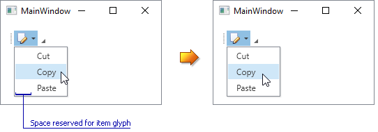
The following example demonstrates the BarManager.ShowGlyphsInPopupMenus property set for a BarSubItem object.
<Window ...
        xmlns:dxc="http://schemas.devexpress.com/winfx/2008/xaml/core"
        xmlns:dxb="http://schemas.devexpress.com/winfx/2008/xaml/bars" x:Class="barmanager.MainWindow">
    <Grid>
        <dxb:BarManager CreateStandardLayout="True" Margin="12" Name="barManager1">
            <dxb:BarManager.Items>
                <dxb:BarSubItem dxb:BarManager.ShowGlyphsInPopupMenus="False" Content="Edit" x:Name="subMenu1"  Glyph="{dxc:DXImage Image=Edit_16x16.png}">
                    <dxb:BarButtonItem x:Name="itemCut" Content="Cut" Glyph="{dxc:DXImage Image=Cut_16x16.png}"/>
                    <dxb:BarButtonItem x:Name="itemCopy" Content="Copy" Glyph="{dxc:DXImage Image=Copy_16x16.png}"/>
                    <dxb:BarButtonItem x:Name="itemPaste" Content="Paste" Glyph="{dxc:DXImage Image=Paste_16x16.png}"  />
                </dxb:BarSubItem>
            </dxb:BarManager.Items>
            <dxb:BarManager.Bars>
                <dxb:Bar x:Name="bar1" Caption="Bar 1">
                    <dxb:Bar.DockInfo>
                        <dxb:BarDockInfo ContainerType="Top" />
                    </dxb:Bar.DockInfo>
                    <dxb:Bar.ItemLinks>
                        <dxb:BarSubItemLink BarItemName="subMenu1" />
                        <dxb:BarButtonItemLink BarItemName="itemCut"/>
                        <dxb:BarButtonItemLink BarItemName="itemCopy"/>
                        <dxb:BarButtonItemLink BarItemName="itemPaste"/>
                    </dxb:Bar.ItemLinks>
                </dxb:Bar>
            </dxb:BarManager.Bars>
        </dxb:BarManager>
    </Grid>
</Window>