ToggleSwitch
- 2 minutes to read
Overview
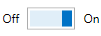
The ToggleSwitch control represents a switch that can be toggled between states. It contains a toggle switch and a content area. In addition to the standard True/False states, ToggleSwitch supports the Indeterminate state.
The ToggleSwitch control offers the following features.
Optional indeterminate state
Setting the ToggleSwitch.IsThreeState property to true allows the ToggleSwitch control to hold a null value. This is called the Indeterminate state.
Multiple content positions
The content area indicates the current state of the toggle switch editor. To specify the content position, use the ToggleSwitch.ContentPlacement property.
Optional toggle flip animation
Set the ToggleSwitch.EnableAnimation property to false to disable toggle flip animation.
Optimized for in-place editing
The ToggleSwitch can be used standalone or as an in-place editor nested in a container control. The ToggleSwitch class implements the in-place editing functionality. See In-place Editors to learn more.
Standalone ToggleSwitch
To add a standalone ToggleSwitch to a Window, drag it from the Toolbox.
The following sample demonstrates how to create a ToggleSwitch using XAML markup.
<dxe:ToggleSwitch HorizontalAlignment="Center" VerticalAlignment="Center"
    CheckedStateContent="ON" UncheckedStateContent="OFF" ContentPlacement="Both"/>
In-Place ToggleSwitch
To embed a ToggleSwitch into a container control, use the ToggleSwitchEditSettings class.
The following sample demonstrates how to embed a ToggleSwitch into a GridControl column.
<dxg:GridControl Name="grid">
    <dxg:GridControl.Columns>
        <dxg:GridColumn FieldName="Processed">
            <dxg:GridColumn.EditSettings>
                <dxe:ToggleSwitchEditSettings CheckedStateContent="Yes" />
            </dxg:GridColumn.EditSettings>
        </dxg:GridColumn>
    </dxg:GridControl.Columns>
</dxg:GridControl>