LookUpEdit
- 2 minutes to read
You can fine-tune a lookup editor by using the BaseEdit.StyleSettings property. This property allows you to alter the appearance and behavior of a lookup editor by adding extra features like searching and multiple item selection. To apply specific settings, assign the lookup’s BaseEdit.StyleSettings property to one of the objects listed in the table below.
LookUpEdit mode | Corresponding settings object | Description |
|---|---|---|
Editor’s dropdown displays a grid. This is a default setting. | ||
Editor’s dropdown displays a grid and a search box. | ||
Editor’s dropdown displays a grid that allows you to select multiple items. | ||
Editor’s dropdown displays a grid that allows you to select multiple items. Selected items are represented by tokens. | ||
Editor’s dropdown displays a grid and a search box. Allows multiple item selection. Selected items are represented by tokens. |
Each of the settings objects has a number of properties that you can use to enable or disable the following grid features.
- Filtering (using the LookUpEditStyleSettings.AllowColumnFiltering property)
- Grouping (using the LookUpEditStyleSettings.AllowGrouping)
- Sorting (using the LookUpEditStyleSettings.AllowSorting)
The code example below shows a lookup editor in the SearchLookUp mode with grouping feature disabled.
<dxg:LookUpEdit>
    <dxg:LookUpEdit.StyleSettings>
        <dxg:SearchLookUpEditStyleSettings AllowGrouping="False"/>
    </dxg:LookUpEdit.StyleSettings>
</dxg:LookUpEdit>
The following sections describe different settings provided by the LookUpEdit control in detail.
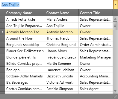
LookUpEdit
LookUpEdit mode is used by default.
Editor’s dropdown displays a fully-functional grid that supports the following features.
- single item selection;
- data filtering;
- data grouping;
- data sorting.
To learn more, see LookUpEditStyleSettings.
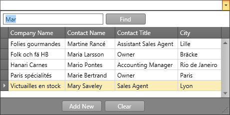
SearchLookUpEdit
In addition to the standard features, SearchLookUpEdit displays a search box.
To learn more, see SearchLookUpEditStyleSettings
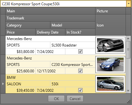
MultiSelectLookUpEdit
In addition to the standard features, MultiSelectLookUpEdit supports multiple item selection.
To learn more, see MultiSelectLookUpEditStyleSettings.
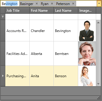
TokenLookUpEdit
TokenLookupEdit mode is inspired by modern mail clients.
In addition to the standard features, TokenLookupEdit supports the following:
- multiple items selection;
- selected items are represented by tokens.
To learn more, see TokenLookUpEditStyleSettings.
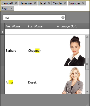
SearchTokenLookUpEdit
SearchTokenLookupEdit mode is inspired by modern mail clients.
In addition to the standard features, SearchTokenLookupEdit supports the following:
- data search;
- multiple items selection;
- selected items are represented by tokens.
To learn more, see SearchTokenLookUpEditStyleSettings.
LookUpEdit Modes Comparison
The table below compares the features of different LookUpEdit operation modes.
| Grouping | Filtering | Sorting | Single Item Selection | Multiple Item Selection | Search | Tokens | Text Editing | |
|---|---|---|---|---|---|---|---|---|
| LookUpEdit |  |
|
|
|
 |
|
|
|
| SearchLookUpEdit | |
|
|
|
|
|
|
|
| MultiselectLookUpEdit | |
|
|
|
|
|
|
|
| TokenLookUpEdit | |
|
|
|
|
|
|
|
| SearchTokenLookUpEdit | |
|
|
|
|
|
|
|